Visualization as Argument
William Playfair's Time-Series Charts
One can only imagine the choice words exclaimed by the Scottish political economist" William Playfair (1759-1823) when he recognized the error that he had inadvertently engraved into the tail end of the data line on his chart of "Exports & Imports to and from all of North America." Engraving was—and still is—an incredibly time-consuming process. Albrecht Dürer, the Renaissance printmaker credited with elevating engraving into an art form, took over three months to complete his famed Knight, Death, and Devil(1513), a print not much larger than an iPad. In the case of Playfair, however, it was not merely the time he had invested in producing the twenty-eight plates he planned to include in the third edition of his Commercial and Political Atlas(1801), a revised version of the volume he first published in 1786; it was also the expense.
Today, Playfair is widely celebrated for his leading role in the development of modern data visualization. His bar charts, pie charts, and time series graphs are frequently heralded as the first of their kind. In the opening lines of The Visual Display of Quantitative Information, Edward Tufte describes Playfair's work as "remarkable."And most other histories of visualization have followed suit.But in his own time, Playfair remained "largely unacknowledged" for his contributions.More to the point, he was almost always nearly broke.Thus while Playfair chose to commission one of the most skilled engravers in all of London, Samuel John Neele, to produce the plates for the third edition of his Atlas, he also likely requested that Neele work at speed so as to minimize the costly detailing and other flourishes for which he was known. It is believed that Neele engraved the charts' decoration, framing, titles, and other lettering, leaving Playfair—who had trained as an engineer—to engrave the lines of imports and exports by himself.
To produce a copperplate engraving such as the one employed to print "Exports & Imports to and from all of North America," a thin copper plate is first coated with a ground: a layer of wax, varnish, chalk, or soot. Using a stylus, the engraver traces an outline of the design in mirror image into the ground. The wax (or equivalent) layer is then removed, and the engraver employs the faint impression that remains to guide the subsequent inscription process. With a metal tool called a burin, the engraver carves the image directly into the copper plate—a process that requires significant strength.
Playfair's error was thus a common one—a slip of a tired hand—but its frequent occurrence would not have made it any more tolerable to the man who was already, by his own account, "long anxious" to be acknowledged as an innovator.Unlike the array of digital processes employed today to create such visualizations—from standalone platforms such as Adobe Illustrator or Tableau to software libraries such as D3.js or Processing—each of which allow for revision (to varying degrees), the engraving process employed by Playfair resulted in an image that was irreversibly inscribed into copper. When considered in the context of the time and money invested in the work, it might as well have been set in the proverbial stone.
This chapter takes up the methods involved in making data visualizations, both past and present, in order to trouble the relationship between data and its visual display. While it's easy to assume that any particular visualization—or, at least, any good one—offers a direct representation of the data underneath; that it is neutral and objective; and that there is no argument associated with its choice of visual form, these are each only assumptions. As we will show, the ability to create a visualization directly from the data is a relatively recent innovation, one that derives from the affordances of the particular tools we now use for visualizing data more than any enduring belief about the direct relationship between a visualization and the data it purports to represent.
As the example of Playfair's time-series charts help us to see, data visualizations are each a form of knowledge in and of themselves. Each data visualization, furthermore, carries with it an argument: about the specific forms of knowledge that it is best suited to convey; and about the specific groups of people who can best benefit from it. These arguments do not invalidate the knowledge produced by any particular image or interaction. But they must be recognized for what they are—arguments—if we as viewers, and as designers, are to make appropriate and informed use of the images that we on the one hand encounter, and on the other create.
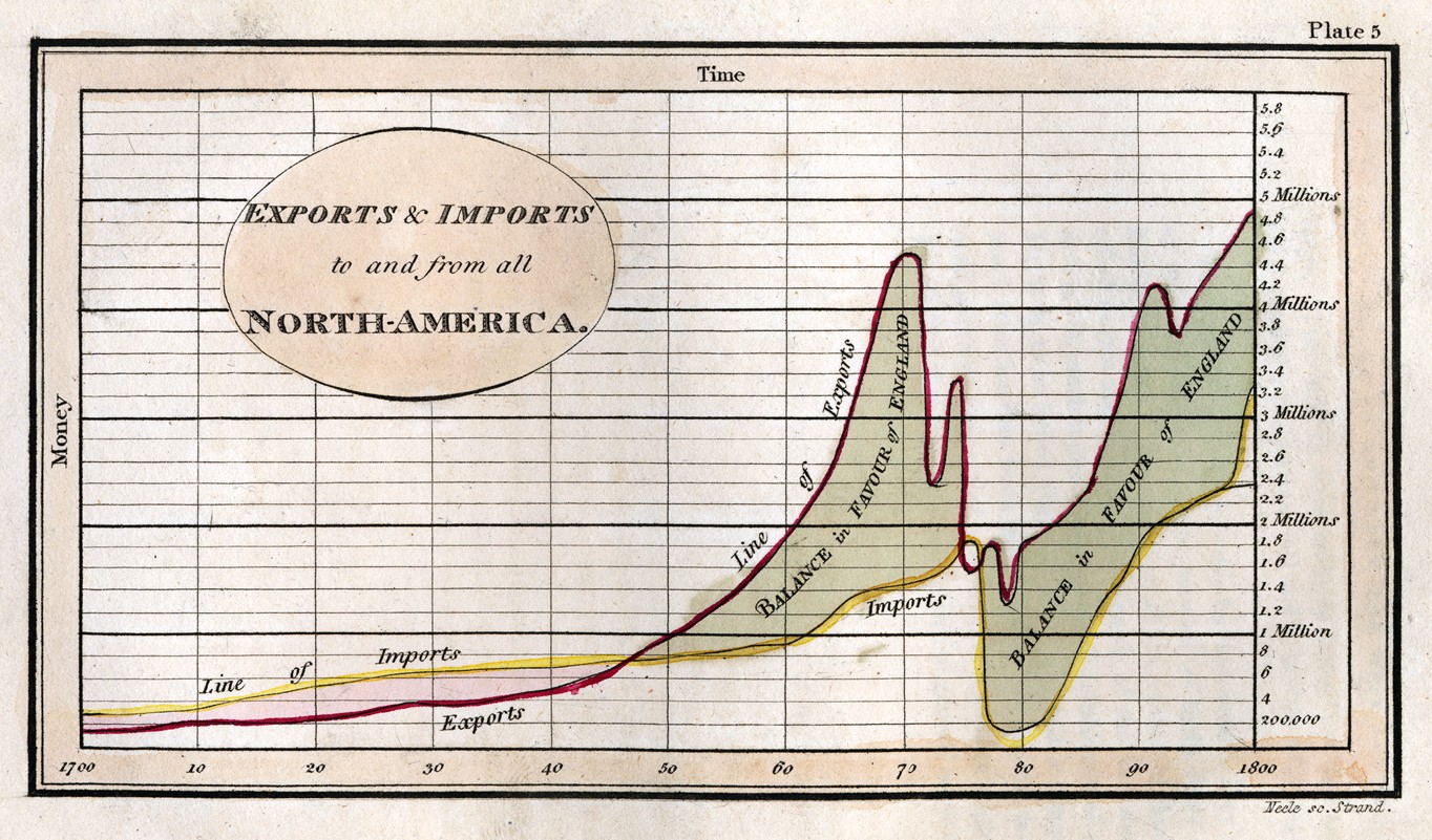
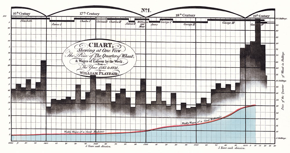
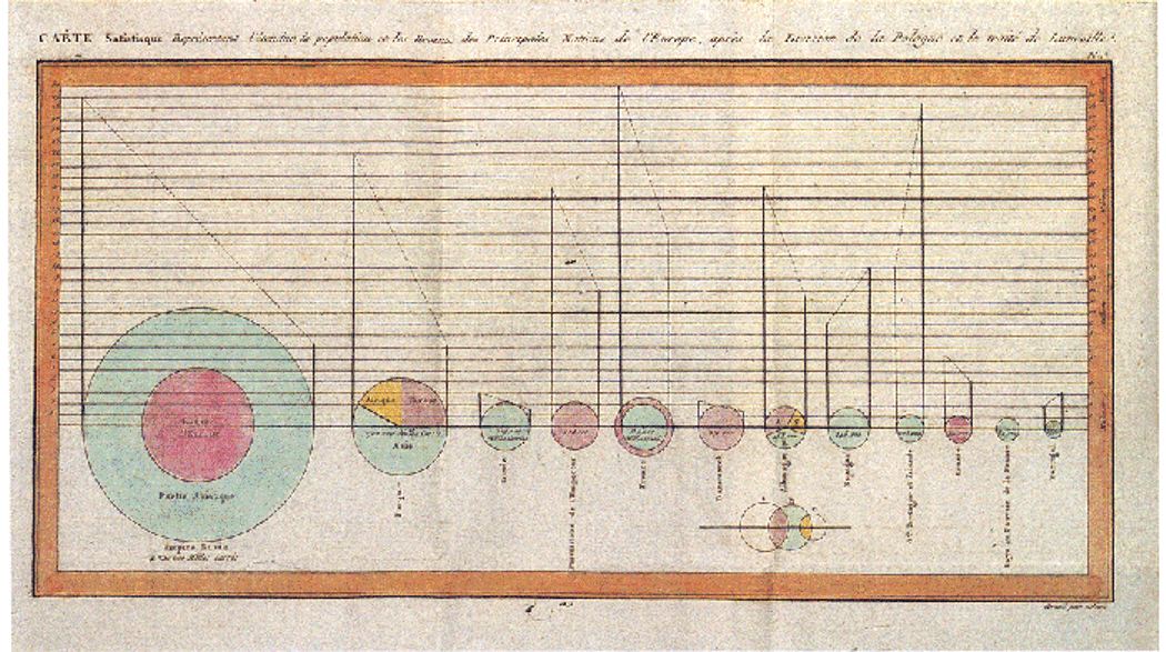
Playfair did not intend to include the charts' underlying data in his book. It was only after soliciting feedback from James Watt, inventor of the steam engine—and for whom Playfair worked in his youth—that he received the advice to include his charts' data in tabular form. "It might be proper," Watt advised, "to give in letter press the Tables from which the Charts have been constructed… for the charts now seem to rest on your own authority, and it will naturally be enquired from whence you have derived our intelligence."Playfair thus dutifully compiled statistical tables to accompany each of his charts, which he included in the first and second editions of the Atlas.
But by the book's third edition, Playfair had gained enough confidence in the form and function of his charts that he no longer felt obligated to include the associated data tables, as Watt had initially advised. Indeed, Playfair understood the function of his charts as quite distinct from that of tables, or "figures," as he termed them. In introduction to the Atlas, he explains:
In explicit contrast to the "more accurate" information conveyed through the form of the data table, Playfair understood the value of his charts as their ability to impart a "simple and permanent idea." In other words, the knowledge conveyed through the charts was different than the knowledge conveyed through the data, and explicitly so. It was admittedly more reductive, but it was also easier to understand—and, as a result, easier to remember.
Playfair's interest in presenting a "simple and permanent idea," over and above any particular data point, is further born out in the liberties he took in interpolating his data. For example, his "Chart of Imports & Exports to and from all of North America" clearly depicts economic instability. But even if that instability could be confirmed by other sources, Playfair did not necessarily possess all of the data to support the line that he engraved.
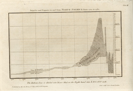
The table in the first edition of the Atlas includes data only for the years between 1770 and 1782.
Playfair nevertheless plotted data lines for the full range of years between 1700 and 1780.
He shaded the area between the two data lines in order to illustrate the balance of trade between the two nations. Stippled dots indicate periods of time when the amount of imports from North America to England exceeded the amount of exports from England to North America. Diagonal lines indicate the times when exports from England to North America exceed imports.
While Playfair includes both major and minor gridlines along the y-axis of the chart, in the version included in the first edition of the Atlas Playfair includes minor gridlines along the x-axis only for the twelve years for which he possesses tabular data.
In the third edition of the Atlas these minor gridlines disappear--along with the data tables.
While Playfair extends the endpoint of the x-axis to 1800, what was then the present, the datalines become less precise. As he plots the lines of imports and exports, they become smoother--as improved engraving technique, or of his desire to convey a more general impression of the economic picture, or both.
In the third edition of the Atlas Playfair also made significant improvements to the charts' design. He replaced the hachure and stippled dots employed in the second edition to indicate the difference between the periods of trade in favor of and against England with hand-stained color
He (or more likely, the master-engraver Neele) also placed the titles in oval superimposed upon the chart, rather than above, and decided to remove the explanatory notes about the charts' scale.
He labeled the axes and modified the scale markers of the charts—each of which also improved legibility.
The overall effect was to solidify the impact "simple impression" that he envisioned from the start.
Clearly, for Playfair, his lack of data was not of concern. His intention was to model a new "mode of painting to the eye," one that—following John Locke and the dominant Enlightenment view—could be first perceived by the senses and then processed by the mind.More specifically, Playfair advances a belief in the role of sensory perception, and of vision in particular—in prompting a particular form of crystalizing insight that can lead to new knowledge: "On inspecting any one of these Charts attentively," Playfair himself explains, "a sufficiently distinct impression will be made, to remain unimpaired for a time, and the idea which does remain will be simple and complete."
Playfair's belief in the clarifying and consolidating capacity of data visualization has carried forward into the present along with his iconic charts. This enduring belief is perhaps most evident in the work of Edward Tufte, who maintains that visualizations of data should be "clear" and "efficient"; that they should present "accurate" representations of the data at hand; and that they should encourage the viewer to think about the "substance" of the data, rather than the "methodology" underneath.In this way, Tufte explains, visualizations can be made to "reveal" the data on display (emphasis in the original).
And while scholars in the field of visualization—a subfield of computer science—have largely moved on from Tufte's basic teachings, they nonetheless still adhere to his claims about the ease and efficiency of data visualization, and about its ability to illuminate aspects of the underlying data that are too large, or too complex, to be perceived by the eye alone. In a recent interview, esteemed visualization scholar Ben Shneiderman analogizes visualization to "a telescope or a microscope that increases your perceptual abilities," allowing people to "understand complex processes so as to support better decisions."Intoning the lessons of his own influential textbook,Readings in Information Visualization: Using Vision to Think, coauthored with Stuart Card and Jock Mackinlay, Shneiderman insists that "the purpose of data visualization is insight."And while acknowledging that both "designers of visualizations, and scholars who study them, have struggled to give a coherent definition of insight," data journalist and visualization designer Alberto Cairo also maintains that clear and accurate images (and, increasingly, interactive graphics), can lead to new knowledge about a subject—knowledge that would otherwise remain hidden from view.
Playfair's goal was not accuracy but inspiration.
His intent was to produce a visual impression—one inspired by the data, but not a direct representation of it—that would, in turn, prompt the insights that lead to new knowledge.
Playfair's charts may thus endure as an ur-example of the insight-producing power of data visualization. And yet, they are not directly dependent upon the data that informs them; they are not even accurate representations of the data at hand. Playfair's goal was not accuracy but inspiration. His intent was to produce a visual impression—one inspired by the data, but not a direct representation of it—that would, in turn, prompt the insights that lead to new knowledge. This was emphatically not the "data-driven knowledge" that defines our current moment, but rather his own interpretation of the data that, through visualization, could become knowledge of a new kind.

Playfair created his charts in an era of intense political change. At the time that he released the third and most widely circulated edition of his book, the French revolution had only just come to a halt, the result of a coup staged by Napoleon Bonaparte (himself an inspiration for another iconic visualization, Charles Minard's map of Napoleon's 1812 Russian campaign). The Haitian Revolution was still underway; it would not resolve until in 1804, with the founding of the Republic of Haiti. Meanwhile, the effects of the American Revolution still lingered in the minds of the European elite, as they continued to consider the possibility of additional colonial revolts. Thus when Playfair explains that he has "chosen the present moment" to re-release his Atlas because of the "singularity of the situation in which Europe is now placed," it was this revolutionary political "situation" to which he refers.
Playfair understood his work as an active political intervention: a means of countering the instability that the so-called Age of Revolutions had brought about. Playfair was openly unsure about what the future might hold. In the preface to the third edition of theAtlas, he speculates that "Europe may probably be convulsed with war for fifty years to come," and professes uncertainty about whether he is witnessing the end of European cultural and economic dominance, or whether its "art and commerce" will prevail.But regardless of the outcome—or, I would contend, precisely because of the uncertainty of the outcome—Playfair identifies tremendous value in the clarity of perspective produced by his charts. As he explains:
If [a future of war] turns out so, a picture of the past will be a valuable thing, if, on the contrary, commerce should still continue its progress, this will make the first part of a great whole, which, when completed on some future day, will be a most valuable work.William Playfair, p. iv.
attr
From these lines, it would seem that Playfair believes that his "simple and complete" images can not only capture the instability of his time, but also guard against the uncertainty of the future.His goal is to cut through complexity, guided by a belief that less detail—and not more—is what will enable more useful and enduring knowledge.
But a pair of questions remains: for whom is this knowledge truly useful, and for what reasons is it necessary that this particular "picture of the past" endure? As Playfair elaborates the impetus behind the "form and manner" of his charts, he makes clear that his intended audience is not "any person" in the world, but rather, the narrower world of "men of high rank, or active business"These men, he continues, "can only pay attention to general outlines; nor is attention to particulars of use."
Their concerns are not with complexity, or with individual impact, because their rank and resources shield them from any personal fallout from the events represented through the charts. The knowledge that is recorded and visualized in the Atlas is valuable to them precisely because it is clear and efficient, and because it allows them to ignore any details that might otherwise cloud their view. The result of this picture of the past is a further consolidation of political and economic power, a result which directly follows from the consolidating design of the charts.
For whom is this knowledge truly useful
and for what reasons is it necessary that this particular "picture of the past" endure?
To be sure, very few of the myriad people who employ time-series charts today do so with a stated aim of consolidating political or economic power. In fact, time-series charts are among the most ubiquitous visual typologies in circulation today. But as a consideration of Playfair's writing about his charts makes clear, they carry very specific ideas about the uses of visualization, as well as about the specific people who are intended to make use of them.
Playfair's import-export charts advance a belief in what can be gained by the "big picture" view without registering any concern about what might be lost in the details, or about who might be impacted by that missing information.The boldly colored data lines, enhanced by the hand-tinting that shades the areas between them, and set against the stark black gridlines, emblematize the graphical authority that theorists such as Tufte identify as among data visualization's greatest affordances. The ornate title and formal frame—design choices made by Playfair or in consultation with the images' engraver, Samuel Neele—further reinforce the impression of an encounter with an authoritative image of enduring significance. As viewers, we are not prompted to question the data that we see visualized on the chart, nor are we pushed to extend our inquiry beyond its "big picture" view.
While we are no longer living in the Age of Revolutions, we nonetheless continue to face social and political crises of significant stakes. What has been shown by several of the most pressing of these—the ongoing coronavirus pandemic and the unfolding of climate change, to name just two—is that data visualization will continue to play a prominent role in communicating information and in shaping the terms of public debate. As such, it behooves us, as visualization designers and researchers ourselves, to be better trained to see the politics of knowledge production that are embedded in the visualizations we design, so that they can achieve their intended use.
From our perspective in the present, it appears that Playfair was correct in his assertion about the significant and enduring "importance" of his charts.His charts are indeed among a small set of data visualizations—also including John Snow's 1854 map of cholera deaths, Florence Nightingale's 1858 coxcomb charts of mortality during the Crimean War, and Charles Minard's 1869 flow map of Napoleon's march on Russia, mentioned above—that are consistently held up as exemplars of the particular affordances of graphical display. But in contrast to Snow, Nightingale, and Minard, whose visual forms are inextricable from the specific arguments they each make, Playfair's charts are most forceful today for advancing an argument about the uses of visualization itself.
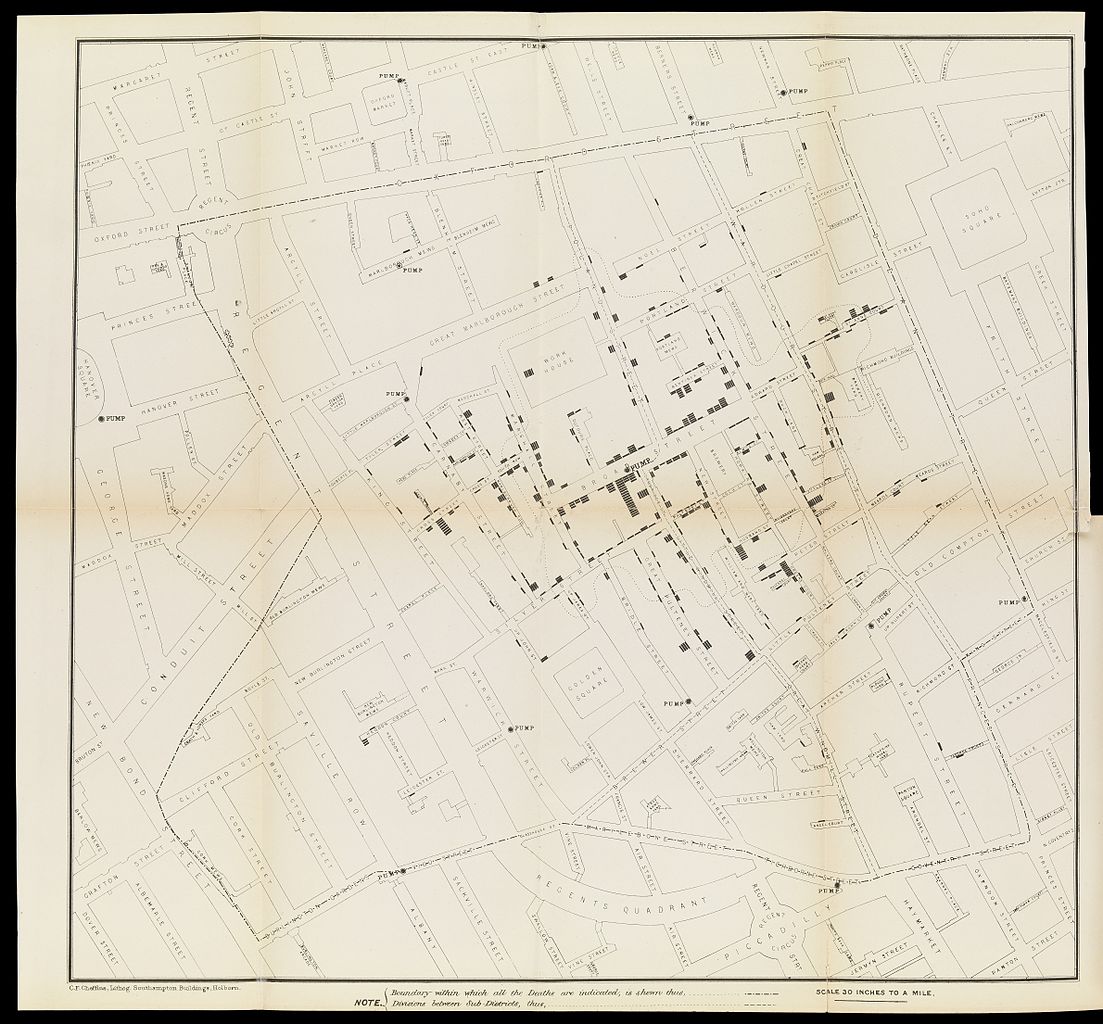
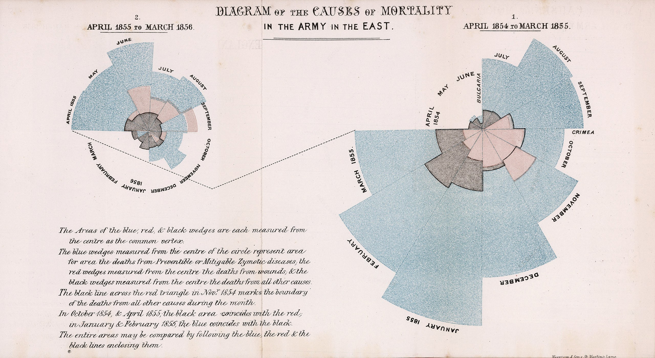
Playfair's charts are most forceful today —
for advancing an argument about the uses of visualization itself.
Consider the process of recreating one of Playfair's charts with D3.js, as we did for this chapter. Unlike Playfair's chart, which needed no actual data in order to be produced, we were required to begin with a dataset. These data were required not merely as a guide, but as the very foundation of the visualization itself. D3 is, after all, a software library designed with data at its core. Its own innovation is not any new mode of graphical display, but instead the ease and efficiency with which a dataset can be visualized, on the web, according to any conceivable form.
More than a practical issue, this structural dependency on the data points to an evolving understanding of the significance of data, and of the role of visualization in making this significance clear. Whereas Playfair was unfazed by the lack of data to support the lines that he engraved, a contemporary visualization designer would be shocked at the suggestion that a data line be drawn with only a mental image of its slope as a guide. Even more difficult to comprehend is the underlying idea that the dataset and the image are altogether distinct. Thus as Playfair continues to be positioned as the source of so many of the visual typologies that we encounter today, we would be well-served by attending to his "assumptions" about his images, and how they diverge—or not—from the images we encounter today.
Consider the wide range of visualization libraries and platforms that make use of Playfair's charts in order to demonstrate their own features. For instance, Arvind Satyanarayan and Jeffrey Heer center the product demo video for Lyra, their drag-and-drop visualization platform, around a recreation of Playfair's 1822 bar chart comparing the price of wheat and worker's wages.Michael Bostock, similarly, demonstrates the flexibility of Protovis, the visualization toolkit he developed before D3, with this example (among several others).Jorge Camoes, an independent database consultant, recreates several of Playfair's charts in Microsoft Excel in order to demonstrate his own spreadsheet bonafides.The list could go on.And while they make very different assumptions about the function of data and its relation to visual display, they express a view of the value of visualization that is inherited from Playfair himself. Indeed, in many ways, Playfair's argument about the value of reducing complexity in the service of a "simple view" has become synonymous with the argument for the value of visualization itself.
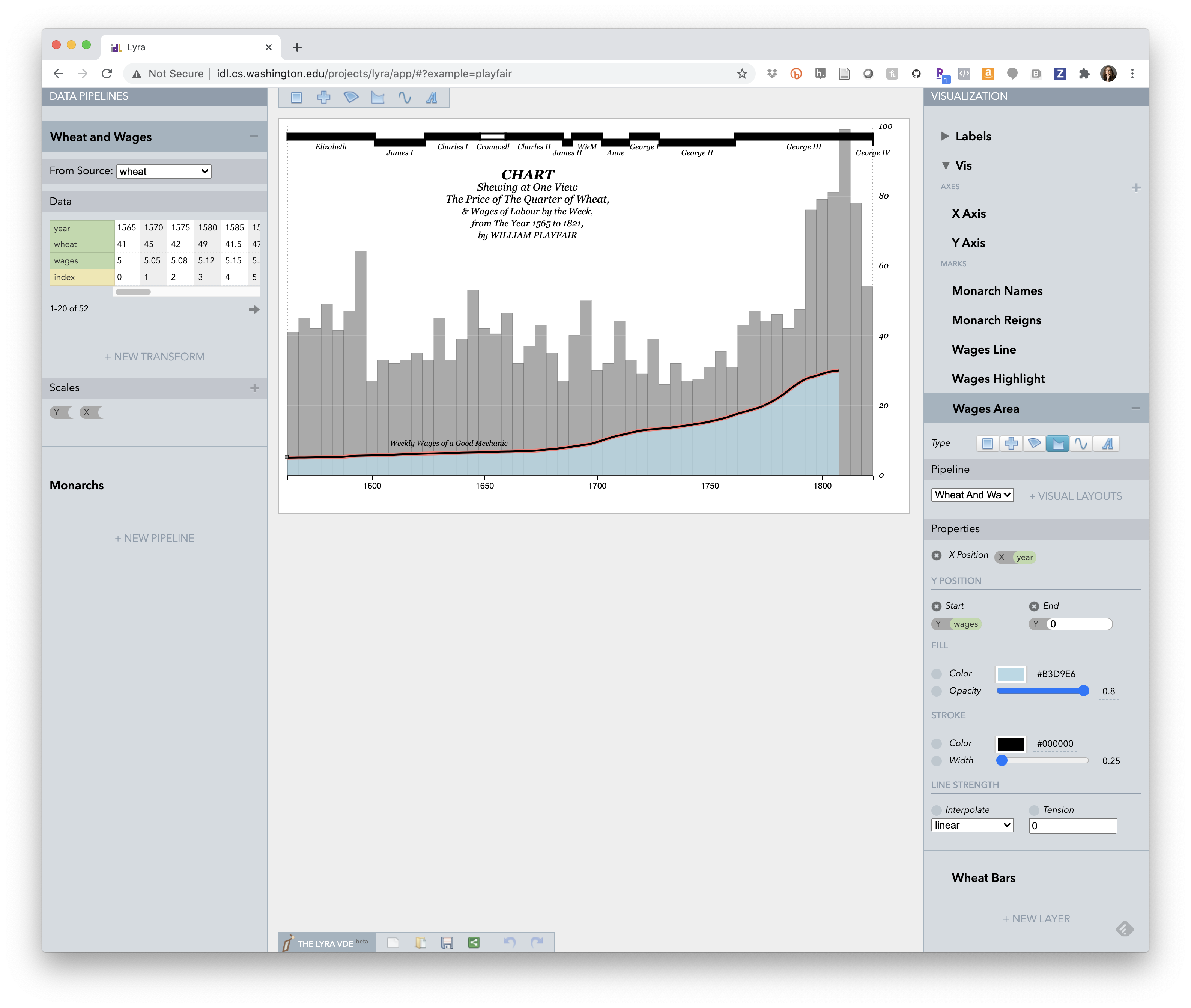
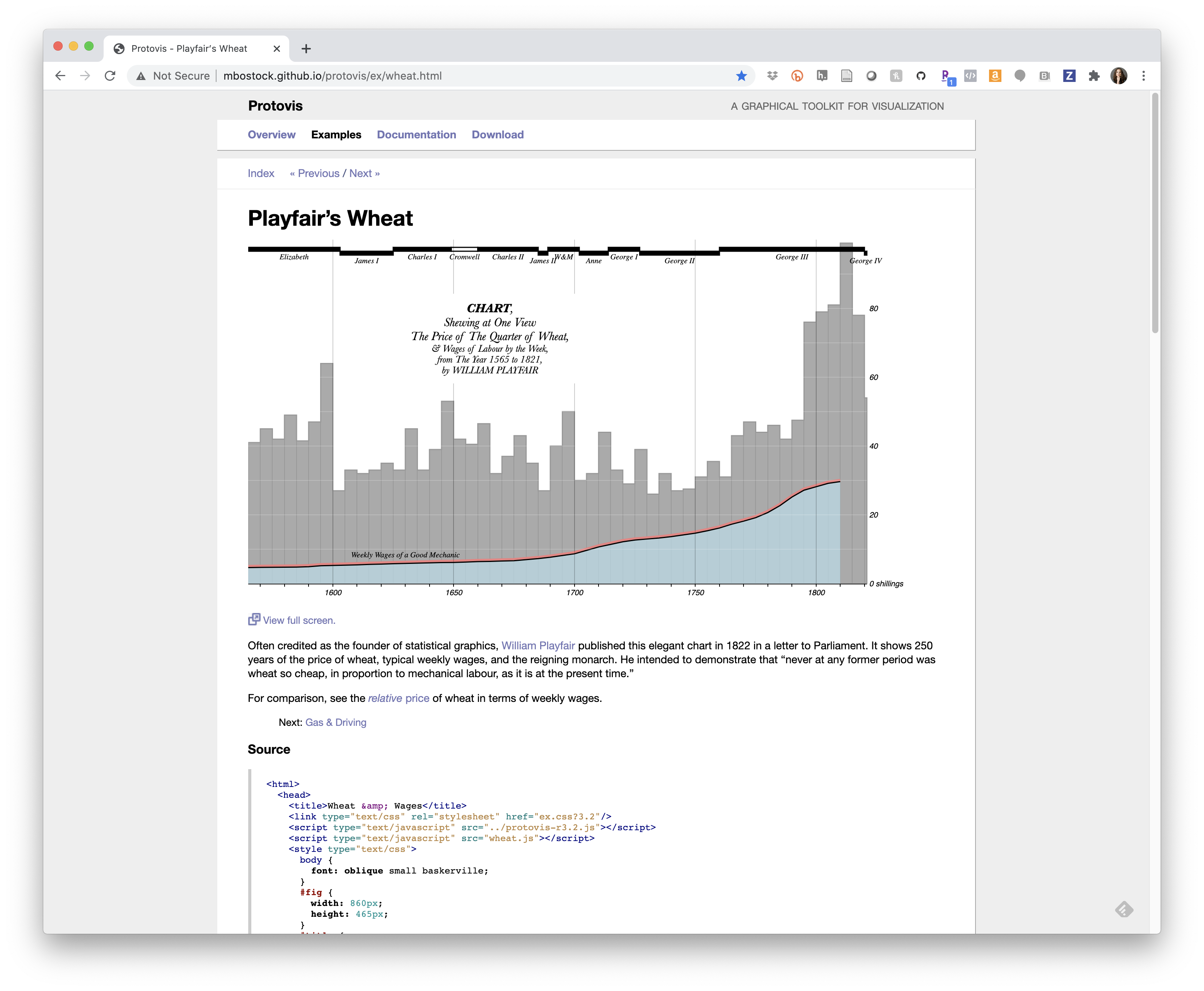
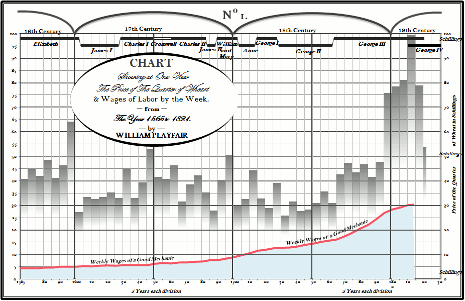
While this argument is not always made explicitly, or even intentionally, it is evident in the wide range of contexts in which Playfair's visual typologies are deployed. On the one hand, this pervasiveness confirms Playfair's own claims about the broad utility of his designs. But on the other hand, it elides the assumptions embedded in those designs: that the primary goal of visualization is to reduce complexity, and to produce a simple, more comprehensible view.
What do these visualizations of incredibly varied data, each of which look roughly the same, tell us about the assumptions embedded in their form? To be sure, there are specific trends that can be discerned from each dataset—in the case of deaths from Covid-19, the waves of infection, and the comparative response between the US and the UK; in the case of comparative income levels, the increasingly tenacious grip of global neoliberalism; and in the case ofwomen representatives in government, how much more work is to be done.But these are all general trends. How are we to be prompted to think about, for example, the uncertainty around how "death" from Covid-19 has been defined; how the average income level erases the widening gap rich and poor; or, in the case of political representation, how gradual change is often accelerated by specific events. These are each crucial questions to ask about their respective dataset, but their answers are not conveyed—or nor are the questions even prompted—by the simple view presented through Playfair's form.
Every visualization carries certain assumptions—what we've called an argument in this chapter—about the knowledge that it conveys. This has to do not only with the value of that knowledge, or its intended recipient, but also about its source. As we will see throughout this site, this argument is by no means the same for each image, interaction, or other instance of data visualization that we encounter in the world. Thus while contemporary visualization researchers increasingly assert, as does Ben Shneiderman, that "the purpose of visualization is insight, not pictures," we must continually ask ourselves about the nature of this insight—the basis for its knowledge claims, the utility it serves, and for whom its utility applies—lest we fall back into the passive mode of knowledge reception that characterized Playfair's intention for his charts.
Playfair clearly longed to be recognized for his graphical innovations. In 1787, one year after the initial publication of theCommercial and Political Atlas. he authored an account—almost certainly fictitious—of a dialogue between Benjamin Franklin and Joseph II, Holy Roman Emperor. The men's conversation was far-ranging, most likely conceived so as to ventriloquize support for Playfair's various but ultimately uniformly unsuccessful schemes. Published with the dialogue was a set of letters—their veracity similarly difficult to discern—one which included an endorsement, on the part of Franklin, of Playfair's visual method of display: "I have begun to practice the mode here," writes Playfair in the voice of Franklin, "and it throws light on the state of our accounts, as if by inspiration, one minute giving a much clearer idea of the matter, than whole days and weeks without this simple invention."
The reality, of course, was that Playfair's "simple invention" would go unrecognized for over a century—first eclipsed by another individual, William Stanley Jevons, who, in the 1860s, introduced a set of impeccable time-series charts that were almost certainly inspired by (but not credited to) Playfair; and then by invention itself, as the advent of digital computing (and the concomitant development of hardware and software for graphical display) allowed data visualization to become a field of study in its own right.
The fact that Playfair's charts now hold a highly visible position in the field of data visualization would have thus given him great pleasure. That his charts are not only widely recognized for their historical contributions to the development of the field, but also often recreated with contemporary technologies, attests to the enduring if uncertain "value" of the charts that he explicitly envisioned in his Atlas.That his charts are so often recreated today also speaks to Playfair's status—now if not then—as a master of his craft, as the majority of those who seek to recreate Playfair online are evidently (if not explicitly) operating under the art world model of emulating masterworks, hoping to lend evidence to their own mastery of their chosen techniques and/or tools.
And yet errors like the one that Playfair inscribed into his chart of "Exports & Imports to and from all of North America," which led us to arrive at this chapter's claims, are far more difficult to detect today. Common among the array of visualization tools currently in use is that each allows for easy revision. Errors in scale can be adjusted. Clashing colors can be swapped out. And data lines are generated automatically, interpolated from the data themselves. The finished product bears no trace of the process of its production—of the many revisions, the myriad design tweaks, and the edits to the code. We must therefore continue to attend to conditions of their making, and to the conceptual, political, and procedural arguments embedded in their design. For what is not revealed on the surface of any particular visualization is contained within its depths.
Image Courtesy of Google Books.
Digitized by Harvard University.
FOOTNOTES
- Edward Tufte, The Visual Display of Quantitative Information (Cheshire, CT: Graphics Press, 2001), p. 32.
- In their preface to the modern edition of Playfair’s Commercial and Political Atlas (1786), for instance, Howard Wainer and Ian Spence describe that text as the “Bible” of contemporary visualization design (New York: Cambridge University Press, 2005), p. vi. In related work, Wainer traces a direct line from Playfair to Jacques Bertin, author of The Semiology of Graphics, the most significant study of visualization of the twentieth century (Bertin 1983, vii). Bertin himself selects an 1805 chart of Playfair’s as one of only two historical images he reproduces in his foundational text. Also see Michael Friendly, “The Golden Age of Statistical Graphics,” Statistical Science 23.4 (2008): 502-535; and more recently, Sandra Rendgen, History of Information Graphics (Koln, Germany: Taschen, 2019).
- Howard Wainer and Ian Spence, “Introduction” in William Playfair, The Commercial and Political Atlas and Statistical Breviary, eds. Howard Wainer and Ian Spence (New York: Cambridge Univ. Press, 2005), p. 9
- Responsible for numerous failed money-making schemes throughout his life, Playfair, in 1816, attempted blackmail. Claiming ownership of a set of papers that would cast doubt on the lineage of the twin inheritors of the Douglas estate—a seven-year debate, known as the Douglas Cause, that earned dubious distinction as the longest and most expensive legal battle in Scottish history—Playfair attempted to extort funds from Lord Douglas himself, one of the wealthiest men in Scotland. For more on this episode in Playfair’s life, see Wainer and Spence 8-9.
- My account of Neele and Playfair’s distribution of tasks derives from Wainer and Spence.
- My account of copperplate engraving derives from Wainer and Spence, as well as Roger Gaskell,“Printing House and Engraving Shop: A Mysterious Collaboration” BC 53 (2004): 213-51. Interested readers may also consult “From Paper to Copper: The Engraver’s Process,” a demonstration by Andrew Stein Raftery, Associate Professor of Printmaking at the Rhode Island School of Design, viewable online at:https://www.youtube.com/watch?v=fQvghHs15hA
- William Playfair, The Commercial and Political Atlas, 3rd ed. (London: 1801), p. viii.
- Quoted in Wainer and Spence, p. 14.
- Playfair, pp. ix-x. attr
- Wainer and Spence find evidence of similar extrapolation in the chart of trade with the Channel Islands. It depicts seven reversals of the balance of trade, whereas the data table records only three. See p. 21.
- Playfair, p. 29.
- Playfair, p. iv.
- Playfair, p. iv.
- Playfair, p. xiv.
- See: http://idl.cs.washington.edu/projects/lyra/
- https://mbostock.github.io/protovis/ex/wheat.html
- https://excelcharts.com/excel-charts-meet-william-playfair/
- Another notable recreation of Playfair is Doug McCune’s design of a custom app to generate Playfair-esque charts using contemporary import-export data.
- Data on deaths from Covid-19 courtesy of TK.
- Data on income courtesy of TK.
- Data on women in the US Congress courtesy of TK. Data on women MPs courtesy of Sam Joiner, The Times of London.
- Need LCP cite, (1787, 232).
- Michael Friendly and Daniel Denis’s comprehensive website, Milestones in the history of thematic cartography, statistical graphics, and data visualization, viewable at http://www.datavis.ca/milestones/ serves as the benchmark reference for this history. See their entry, “1950-1974: Re-birth of data visualization,” for an extended treatment of the impact of digital computing on the proliferation of theories of data visualization and their associated techniques.