Every Datapoint a Person
The Brooks / Diagram of a Slave Ship
Before there are data, there are people. People who offer up their lives as data -- or whose lives become data without consent.
It was a long and circuitous—and often painful—path that led Olaudah Equiano," the famed author and abolitionist, to London in January 1777. According to his autobiography, The Interesting Narrative of the Life of Olaudah Equiano, or Gustavus Vassa, the African (1789), Equiano was born in the Igbo area of the Kingdom of Benin, in what is now southeastern Nigeria. Kidnapped from his birthplace at the age of 11 and carried to the Atlantic coast, Equiano was then forced aboard a slave ship. There he encountered "a multitude of black people of every description chained together," the captives packed in quarters "so crowded that each had scarcely room to turn himself."Equiano sailed to Barbados and then to Virginia, where he was sold into slavery. He would remain enslaved for almost twenty years.
By the time that Equiano settled in London, he had been free for over a decade; in 1766, Equiano had purchased himself, and therefore his freedom, with earnings from his personal trading business. But his experience of enslavement was never far from his mind. Thus in the late 1780s, as the British antislavery movement began to coalesce, Equiano became increasingly involved in its activities. Through these activities, he became acquainted with Thomas Clarkson, a leading British abolitionist and key member of the London Committee of the Society for Effecting the Abolition of the Slave Trade (SEASE). Thus in early 1789, when Clarkson received a copy of an image created by the Plymouth Committee of SEASE entitled, "Plan of an African Slave Ship's Lower Deck with Negroes in the Proportion of Only One to a Ton," he knew who he should approach for its first endorsement.
In Committed to Memory: The Art of the Slave Ship Icon, art historian Cheryl Finley imagines how Equiano might have felt as he encountered the image for the first time:
One can picture how his eyes might have followed the contours of the darkly shaded figures, counting each one, possibly imagining the face of someone he once knew. Fine black lines representing the wall that divided groups of figures by age and sex might have caused him to pause and think about which space he had occupied or the people who had lived and died next to him. The combination of rows and rows of black figures separated and surrounded by fine black lines schematically mapped the space of the hold, marking a route to untold horror.
The route that Finley evokes, the infamous Middle Passage, was what Equiano, one year later, writing in his autobiography, would describe as "a scene of horror almost inconceivable." The route was the same that fellow Black British antislavery activist, Quobna Ottobah Cugoano, in his own treatise, Thoughts and Sentiments on the Evil and Wicked Traffic of the Slavery and Commerce of the Human Species, published in 1787, recalled such a trauma that he refused to describe it at all.But in the image that Clarkson received from the Plymouth Committee, and that he shared with Equiano, he believed he'd found the key to conveying this horror to his white compatriots. The image would create an "instantaneous impression" in "all who saw it" and compel them to join the abolitionist cause.
The "instantaneous impression" that Clarkson associated with the image, was--like all carefully engineered viewing experiences--the result of countless hours of research and design. It also represented the culmination of over a century of thinking about data and its visual display. Indeed, the idea that evidence could be compiled as data and analyzed in terms of its larger significance, its findings then distilled into clear and compact visual form, took shape over the course of the eighteenth century, guided by (then) new theories about how knowledge is produced and perceived.
Most historians of data visualization agree about this chronology, as well as about the philosophical reorientation that was required for the earliest European exemplars of data visualization to begin to envision their influential designs.But they have not yet admitted how this philosophical reorientation was the same that enabled the rise of global capitalism—itself undergirded by the practice of slavery that was depicted in the Plymouth Committee's "Plan." Thus in the "instantaneous impression" produced by the image, not one but two salient features of data visualization come into view: the first, of course, is the power of visualization to distill complex information such that insights can easily and efficiently emerge; and the second, equally present, but far less remarked upon, is how the abstraction that is required into to generate insight from complex information always comes at the expense of the particularities—and the context—that the data purports to represent.
Setting the "Plan of an African Slave Ship's Lower Deck…" at the center of the story we tell about the emergence of modern data visualization serves as a powerful reminder that the history of data and its visual display is intertwined with the history of both capitalism and slavery. It also reminds us that the context of any particular visualization always matters—and that context carries with it both social and political force. More basically, and more profoundly, the "Plan" reminds us that before there are data there are people—people who offer up their lives to be counted as data, or have their lives counted without their consent. Thus every design process must be accompanied by a consideration of the ethical issues engaged—both by those who design visualizations and those who perceive them as well. In short, the "Plan" epitomizes the necessary trade-offs and inherent contradictions involved in visualizing data, those which often result in profound human cost. Placing the "Plan" at the center of the story that we tell about the emergence of modern data visualization thus reminds us of the power—for good and for harm—that is involved in a technique that produces new knowledge at the same time that it seeks to put that knowledge on view.
Like the history of data visualization itself, there is no clear starting point for the development of the "Plan of an African Slave Ship," nor is there even a definitive version. It is generally agreed upon that the idea to create the "Plan" originated with another white British abolitionist William Elford, the chairman of the Plymouth Committee of SEASE and a veritable polymath. A banker by trade, Elford was also an acclaimed painter whose landscapes had shown at the Royal Academy of Arts, as well as an amateur scientist whose experiments had earned him a Fellowship of the Royal Society, the highest scientific honor of the time. Supplementing these skill was domain expertise: Elford had family ties to the Royal Navy, and as a result, had early access to a report being prepared by one of its naval captains, Captain Parrey. Commissioned by British Parliament, Parrey had been tasked with investigating the ships docked in Liverpool that were involved in the transatlantic slave trade. His research was both quantitative and qualitative; in addition to taking precise measurements of the ships and scrutinizing muster logs—lists of crew members aboard any particular ship—Parrey also interviewed the captains and sailors of the ships themselves, learning otherwise undisclosed details about the perils faced by crew members aboard these ships.
Finley speculates that among the "most useful" artifacts included in Parrey's report were the hand-drawn diagrams of the ships created by the captains themselves, which indicated the "cargo area and the space allotted for the different types of goods to be stowed."Intended to maximize the efficiency of packing cargo on board—since, of course, the principal objective of these ships was financial profit—the diagrams became inspiration to Elford, who recognized in the simple sketches a visual representation of the violence that accompanies the reduction of richly lived lives to commodity goods.
Elford's "Plan" divides the ship's hold into six distinct areas.
The largest area, in the bow of the ship, and which occupies the entire right half of the diagram, is labeled the "Men's room," and depicts 120 male bodies in four rows of 30.
In the middle is a narrow column labeled "Boy's room" and depicts smaller male figures in six rows of 12.
To the left is the larger "Women's room," depicting figures the same size as the men, but with breasts, in four rows of 21 figures representing 84 women total.
And at the stern, in the center, the "Girls room," the figures shorter and squatter than the boys, arranged in three rows of ten. These "scaled inequalities," as Hortense Spillers describes the layout, represented COMPLETE.
Certain visual features help the plan achieve its impact. Most immediate is how the 297 figures, what Marcus Wood describes as a "mass of black human flesh," are set against the clean lines that indicate the bounds of the ship. The labels of each area, engraved in neat script, underscore the reduction in complexity that is intended by the diagram. Wood describes the design of the Plan in terms of an "awful rigor," underscoring how the "formality" of the figures "appears to deny [their] flesh and blood presence." But for Elford, this abstraction was perhaps part of the point.
It is unknown as to whether Elford was familiar with an earlier, more literal depiction of a slave ship, the Marie Séraphique, which dates to around 1770. This image, commissioned by the owner of the ship, presents a view of the hold—and the captives within it—as one of four cross-sections of each of the ship's levels. This image, which also includes a watercolor of the ship arriving into Loango as well as tables that depict the numbers of captives—312 souls--alongside information about the other, nonhuman cargo aboard, is shocking in its attempt at realism. The captives here are each individually drawn, depicted lying on their sides. Most are naked, but several are clothed. The men are shackled—some their arms and legs shackled to each other; others shackled to two-by-two. One woman nurses a child.
Regardless of whether Elford saw this particular image, he clearly considered what was given visual form and what was not. In contrast to the chart of the Marie Séraphique, the two areas of the hold labeled "store room" are here left blank, even as they were assuredly packed with all of the materials required to sustain the captives and crew throughout the voyage.In Elford's "Plan," however, the white space of the store rooms emphasizes its rhetorical point: to call attention to the fact that it is people who are packed as cargo on the ship.
And yet, in order to make this profound point, another form of reduction must take place: from bodies to numbers, to richly lived lives that are represented only by their incarceration on the ship. The "Plan" represents the precise deployment of what Wood describes as a "semiotic shock tactic." And yet for all of the power that holds, it withholds much more. This has to do with the violence of the slave trade that remains unimaginable for those who did not experience it. As indicated by both Equiano and Cugoano's remarks, the lived experience of the horror of the middle passage, and the condition of slavery that it set in motion, can never be communicated to those who did not experience it—and even if it could be, as Saidiya Hartman and others have argued, it should not be. Thus the turn to abstraction in the original image of the "Plan" could signify a deliberate choice, on the part of Elford, to use abstraction to signify that no amount of description could ever accurately represent the truth of the experience that the diagram seeks to depict.
Independent of the Parrey report on which Elford based his "Plan," William Clarkston also pursued his own research—again, both qualitative and quantitative--into the pernicious nature of the slave trade. Like Parrey, Clarkston compiled data from the available records. He visited merchant halls in order to examine the muster rolls stored there, computing mortality rates among the sailors and gathering 20,000 of their names. He then sought out individuals—primarily sailors who had been mistreated or maimed—who could speak from direct experience about the conditions aboard slave ships.More than anyone else involved in the abolitionist effort at the time, Clarkston understood the value of evidence—and data in particular—in order to advance his claims.
The evidence-backed revisions that Clarkson made to the original "Plan" secured what historian Marcus Wood describes as its "graphic authority."Drawing from the conventions of naval architecture, which were by that time strongly established, Clarkson created a series of cross-sections that showed each deck from above and from the side—cross-sections that, like the Plymouth Committee's "Plan," included human figures intended to indicate how the captives were confined. The result was a set of schematics that carried with them the connotations of accuracy and precision that were associated with the naval diagrams of the time, and yet also enlisted what Ian Baucom characterizes as a "sympathetic grammar" intended to draw those who viewed the chart to the antislavery cause.
Clarkson's revised chart, entitled "Description of a Slave Ship," was—like the original "Plan,"--accompanied by explanatory text. In addition to the text, Clarkson also included a set of tables intended to reinforce the factual nature of the evidence visualized above. The tables included measurements of the actual ship, along with a scale that indicated how they corresponded to the image; as well as several small tables that presented information about the number of captives that had actually been held on the ship, as well as a comparison between the number of actual captives and those pictured on the diagram, making clear that while the image is informed by data, it is not a direct representation of those numbers and lives.
Finley makes the case that the diagram was intended to be viewed in relation to the text, pointing to how each figure is labeled with a number that corresponds to a place in the text. "Each is incomplete without the other," she explains. "Once having moved from the visuals to the text, these two aspects of the broadside virtually require the individual reader to move back and forth between these two elements."
At this juncture one point becomes important to underscore: these "readers," like the figures themselves, had a definitive race: they were white readers whose own lives were far removed from the actual experience of being enslaved. Indeed, Clarkson had a very clear audience in mind with his design of the "Description": the Members of Parliament--which included one of the London Committee's own members, William Wilberforce--who were scheduled to vote on a motion to abolish the slave trade in several weeks' time. Wilberforce believed, and even said as much, that if the MPs "could actually see one thousandth part of the evils of that practice which they have, for so many years, under one pretense or another, been prevailed on to suffer to be continued," that they would quickly come around to the abolitionist cause.Thus the "Description" can be viewed, according to Finley, as a "necessary weapon"--one which restages the violence of the slave trade in its attempt to give that violence visual form.
The viewers intended to be affected by this image were white abolitionists, and the response that was intended was one of imaginative, sympathetic response. Clarkson himself frames the value of the image in these terms, recalling how "No one saw it but he was impressed. It spoke to him in a language, which was at once intelligible and irresistible. It brought forth tears of sympathy in behalf of the sufferers, and it fixed their sufferings in his heart."Here, Ian Baucom argues, Clarkson mobilizes the ideas of the Scottish Enlightment as he enlists the "facts" of the slave trade in the interest of engaging the "otherwise disinterested spectator in the sufferings of an actually unseen other."But for this transformation to take place, the viewer would be required to enlist their own imagination in imagining the suffering of others. As Finley explains, "The image is a starting point for the viewer - a point of reference while the text enables the reader to elaborate on the image in her mind."
But there is a second set of people less explicitly, but no less clearly engaged by the "Description": those whose lives the abolitionists intended to represent. The sociologist Simone Browne emphasizes this point in her own analysis of the "Description," underscoring how the original "vantage point was meant to be that of the predominantly white and male abolitionists and lawmakers." Browne connects the "Description" to Donna Haraway's critique of visualization as manufacturing a "view from nowhere," a view that is "always unmarked, and therefore already markedly white and male, and one that claims a power to 'represent while escaping representation.'" Browne continues: "What this visual representation of the slave ship points to is the primacy given in these abolitionist texts to white gazes and vantage points to the trauma of slavery, where the tiny black figures are made to seem androgynous, interchangeable, and replicable." Gordon Wood elaborates this point: "This image supports an abolitionist cultural agenda which dictated that slaves were to be visualized in a manner which emphasized their total passivity and prioritized their status as helpless victims." Bernier also lends her support to this interpretation: "Working not to humanize but to propagandize black subjects bought and sold into slavery, the iconographic emphasis across these broadsides betrays a white British commitment to exposing slavery's atrocities by imagining black women, men, and children not as individualized subjects but as unindividualized objects defined solely by their incarceration on board a slave ship whose physical dimensions alone were considered sufficient to offer visual confirmation of the atrocities of the trade."
The sole evidence of the agency of the enslaved are, as some have observed, the shackles that bind the arms of the men. The shackles point to the potetial for insurrection—a point underscored in the accompanying text. And yet even in their inclusion they also exclude: only the men are shackeled, even as women just as often contributed to planning the insurrections on the ships. And with respect to Spillers's "scaled inequalities," Clarkson is not immune. Whether as a commentary on the "objectified status of the black female body and the history of rape and sexual abuse to which black female slaves were subjected by their white male captors," or because of his own racist perceptions about the sexuality of Black women, Clarkson depicts the women on the ship in exaggerated sexual form.
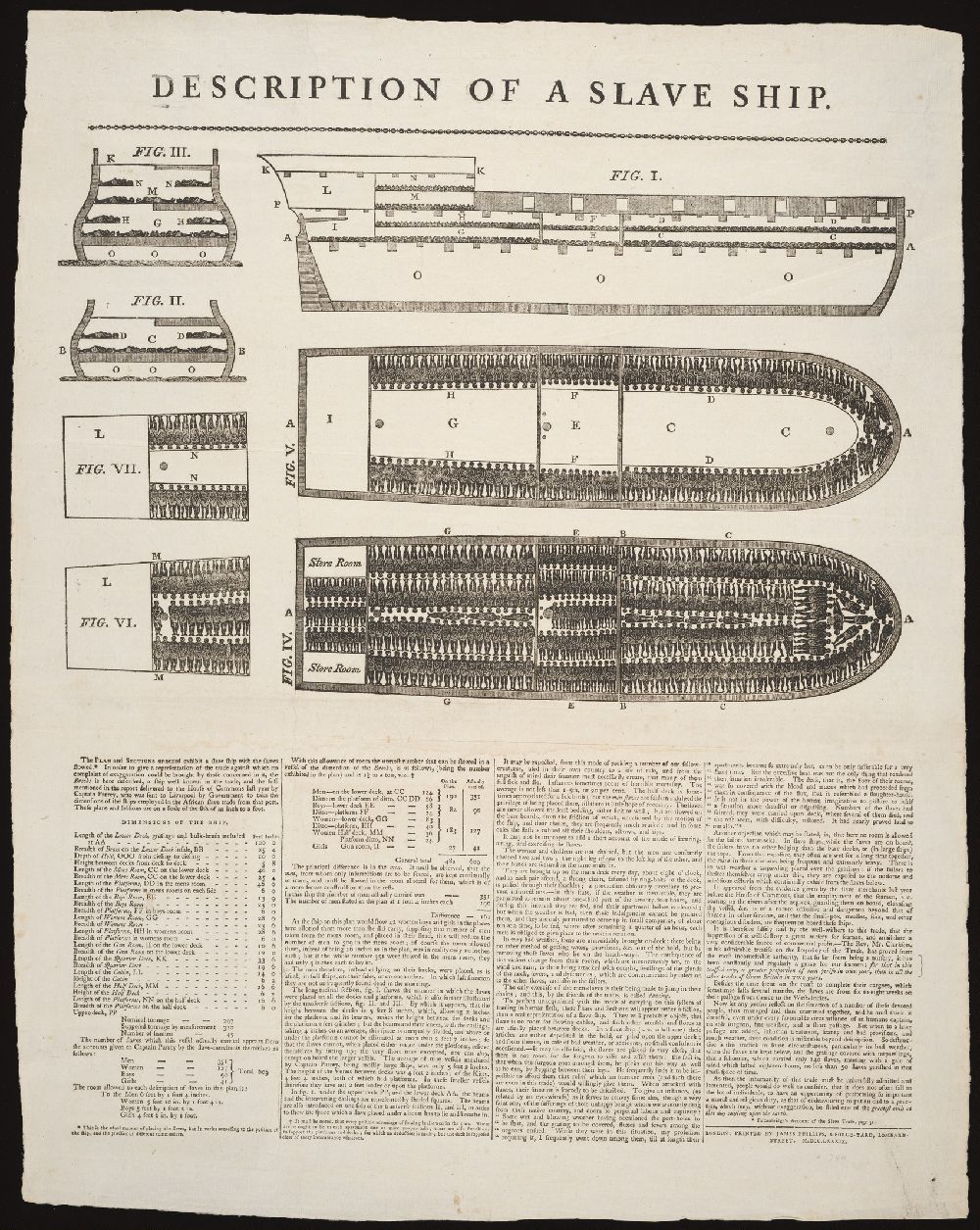
The idea that quantitative information can be abstracted into pure numbers, so as to be given visual form, is often considered the conceptual precondition that paved the way for the technique of data visualization to emerge. In The Visual Display of Quantitative Information, Edward Tufte makes the case that QUOTE. But what has gone unmentioned in discussions of the history of data visualization is how that same conceptual precondition—of the abstraction of complex information into more tractable numerical form—was what led to the rise of modern capitalism. As Ian Baucom, following Mary Poovey, explains, "what distinguishes European modernity's knowledge projects (scientific, governmental, and aesthetic) from classical Aristotelian models of epistemology—which had bred abstractions from abstractions (universals from a priori truths)—is that for European modernity abstraction predicates itself on observed particulars, assemblages of fact from which abstract reason can never entirely detach itself, and whose relation to the abstracting impulse's systematic or universal truth claims, Europe's modern philosophical, social, and political discourses continuously oblige themselves to theorize."
This "will to abstraction, the will to derive systematic knowledges, general theories, or any number of the other 'versions of abstraction: universals, generalizations, aggregates' from observed particulars," as Ian Baucom, quoting Mary Poovey, explains, … COMPLETE THIS. // CONNECT TO RISE OF ABSTRACT PROPERTY, WORK IN QUOTE: Indeed, to the extent that the case of the Zong was to help define the struggle between slave traders and abolitionists in the late eighteenth century, the way in which that struggle was waged suggests that it was not only a struggle between competing theories of right (the slaves' right to human dignity and the slavers' right to trade), but one between competing theories of knowledge, a struggle between an empirical and a contractual, an evidentiary and a credible epistemology. As such, this struggle both extends and replays what scholars in recent years have taken to be the central epistemological drama of the long eighteenth century, the drama—emerging from the social rivalry of the old landed and the new moneyed classes—in which, as mobile property displaced ''real' property, and the imaginary value of stocks, bonds, bills-of-exchange, and insured property of all kinds increasingly trumped the ''real' value of land, bullion, and other tangibles, the concepts of what was knowable, credible, valuable, and real were themselves transformed. 16
For Baucom and Poovey, as for many others, the Ur example of the "will to abstraction" that sustains modern capitalism is slavery. Understood in Baucom's terms, slavery becomes the abstraction of human lives into their monetary value. This process is no more apparent than in the legers of slave ships which abstract the value of their human captives into the monetary value of each when sold. And while the creation of the Brooks diagram was intended to push back against this violent abstraction, it nevertheless engages in its own process of abstraction. As Baucom explains, "The print seeks simultaneously, dialectically, to turn the empire's disinterested modern science of wealth sentimentally against itself by fashioning a visible abstraction (an image of what we cannot see) designed not merely to account for the trade but to ‘give the spectator an idea of the sufferings of the Africans in the Middle Passage, and this so familiarly, that he might instantly pronounce upon the miseries experienced there.'"
There is one additional aspect of this process of generalizing from observed particulars that this "visible abstraction" helps to expose, and that is how the translation from observed particulars to "theories, aggregates, universals, ideas, or any other type of abstraction is not reason but fiction or the imagination." Clarkson's desire that the diagram will "give the spectator an idea of the sufferings of the Africans in the Middle Passage" draws upon the viewer's imagination, and their sympathy, and not any rational response. In her analysis of Clarkson's diagram, she underscores this point: "Despite its graphic flourishes and details, this plan was not a realistic representation of the space available or the conditions characteristic of a slave ship hold. Instead it was an abstraction. As with the Plymouth plan, the schematic drawings, easy to grasp and hold in the memory, were elaborated by the descriptive text."
Clarkson himself understood as much, writing: "To persons unacquainted with the mode of carrying on this system of trading in human flesh, these Plans and Sections will appear rather a fiction, than a real representation of a slave-ship." But as Finley observes, "Clarkson's distinction between a fictional versus a "real representation" introduces aesthetic and political debates regarding the imaging and imagining of the slave ship that remain in place across the nineteenth, twentieth, and twenty-first centuries by shedding light upon the formal and thematic inspiration for a vast majority of contemporary African American and black diasporic artists. A recognition of the enduring significance of white dominant emphases upon a literalized and figurative and therefore seemingly authentic or "real representation" over and above abstracted and experimental representations typically dismissed only as a visual fabrication speaks to a white racist terrain characterized by invisibilized black histories, narratives, and memories." In a sense, the bodies represented in the diagram are not abstracted into monetary currency but instead a moral currency—the currency of the white-led abolitionist movement. Thus alongside questions about the ethics of abstracting lives into data come questions about the ethics of who is doing the abstracting, and for whom it is intended to be perceived.
Far from the margins of the history of data visualization, it's possible to tell a story of the origins of data visualization that places Clarkson and his thinking at its core. This history passes through many of the images already familiar to scholars of historical data visualization, but it places these images in the context of the questions that must accompany them. These questions have to do with the source of the data that is included, as well as what is deliberately excluded or, alternately, impossible to capture in quantitative form. They also have to do with the intended audience for the visualization, as well as the intentions of those who design it. With these questions in mind, we might turn to another visualization designed by Thomas Clarkson, which is also often included in histories of data visualization.
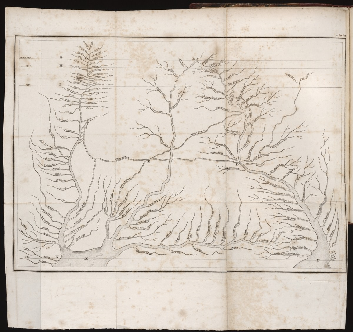
This image, a so-called stream chart that Clarkson included in his 1808 volume, The History of the Rise, Progress, and Accomplishment of the Abolition of the Slave Trade by the British Parliament, presents the history of abolition in the form of a watery network. Each of the "springs and rivulets" are labeled with the name of a significant abolitionist. They are also visualized according to time, with horizontal lines indicating efforts that took place before 1650, 1700, 1740, and 1787, respectively. As the viewer follows the streams from top to bottom, in the direct of time, the tributaries converge into "two great political rivers, representing the abolitionist movement in England and America."
On the surface, the metaphor of abolition as a watery network, with many tributaries that feed a larger river, seems like an apt representation of a social movement which drew strength from countless individuals and collectives over an extended period of time. This conception must have been known to Clarkson, given his work with the London Committee, which he once described as [BODY QUOTE]. And yet, in adapting the model of the hydrographic map to the abolitionist movement, Clarkson rewrites the history of abolition through what Marcus Wood characterizes as "the new, lean, scientific conventions of late-eighteenth-century hydrography. Each abolitionist is a clean new river with a clear European name," with "Africa off the map" altogether. Wood's critique calls attention to how the colonizing purpose of hydrography and the abolitionist diagram are the same: both overtake the territory that is pictured—and the people who live there—with the British imperial mission. Here, it is not the discovery of new land, but the discovery of the horrors of slavery, that were of course already known to those who experienced its direct effects. Here, as in the slave ship daigram, the question of audience comes to the fore: this chart was not designed for those who were enslaved, but for a British viewership that sought to valorize its own role in the fight to end slavery.
Even as the stream chart shares the colonizing impulse as the slave ship diagram, as well as its graphical authority, it bears far less correlation to the facts. "In many ways there is no rhyme or reason to the figures he selects," Wood explains, "his attempt to create a self-sufficient cultural history for the cause requires a coherent descriptive model which is capable of overriding the heterogeneity of the names and writings he has furnished. Clarkson's map imposes order on chaos by providing an abolition tree of Jesse. The fruitful loins belonging to no single abolitionist but to a mysterious sea, into which, in a strange reversal of the generative metaphor, all the tributaries pour."
And yet, Clarkson was anchoring his diagram in some stable ground: namely, this history of data visualization to that point. In Cartographies of Time, Daniel Rosenberg and Anthony Grafton position Clarkson's diagram as an adaptation of the ideas expressed by the German chronologer, Friedrich Strass, who had published his own widely circulated "Strom der Zeiten" (Stream of Time) in 1803. Strass "believed that a graphic representation of history held manifold advantages over a textual one: it revealed order, scale, and synchronism simply and without the trouble of memorization and calculation," Rosenberg and Grafton explain. Translated into multiple languages, including English, and widely circulated, Clarkson almost certainly saw the chart. Even if he didn't, Clarkson clearly understood how, according to the chart's English translator, William Bell, the metaphor of the stream "gives greater liveliness to the ideas, and impresses events more forcibly on the mind, than the stiff regularity of the straight line."
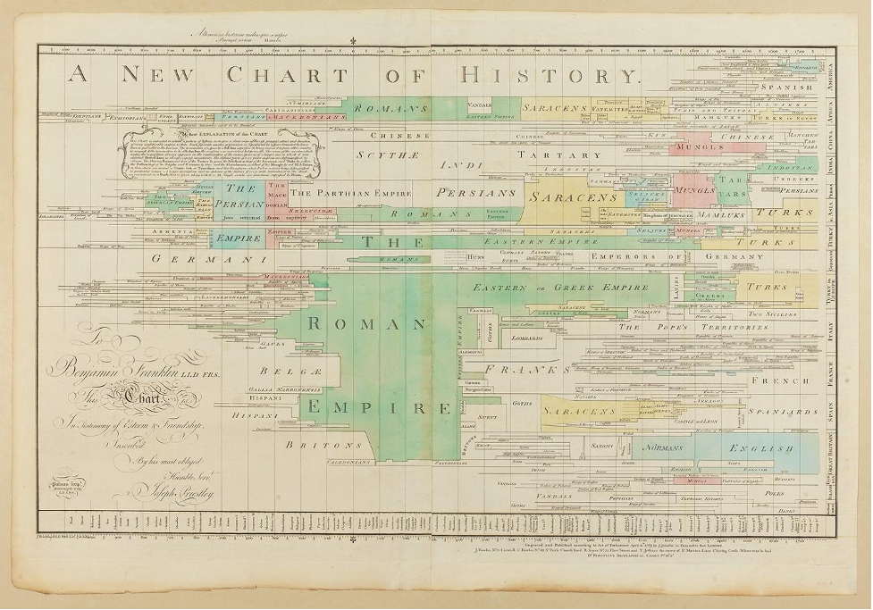
Many scholars, including Grafton and Rosenberg, have made the case that chronological charts "cleared the way for statistical graphics" by introducing the idea of consistent scale. William Playfair, the subject of the next chapter of this book, wrote in his 1801 Statistical Breviary that:
The study of chronology has been much facilitated by making space represent time, and a line of proportional length and in a suitable position, the life of a man, by means of which the men of past ages appear as it were before us in their proper time and place.
In the first edition of his Commerical and Political Atlas, Playfair cites the work of Joseph Priestley, the author of several famed chronological charts, "as a direct predecessor to his own line graphs and bar charts.
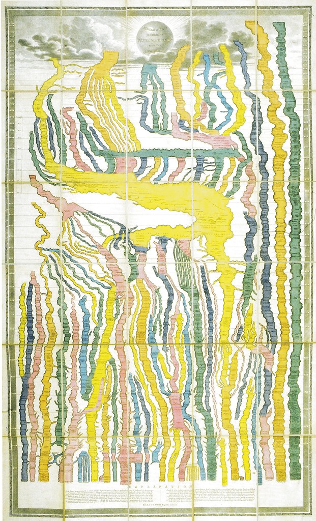
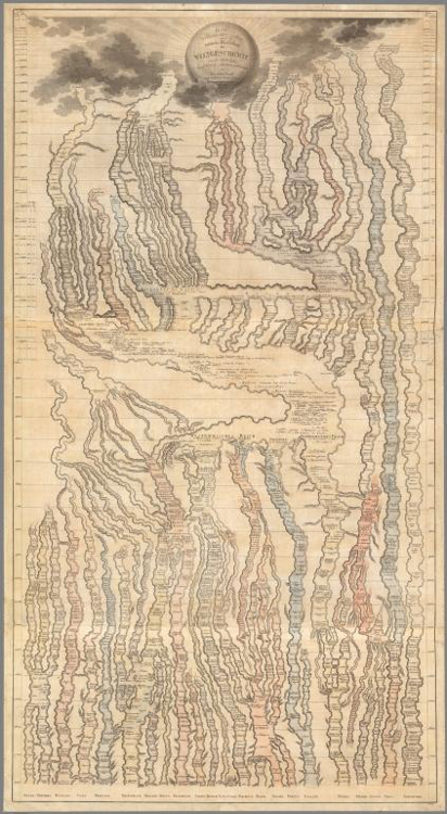
But there is a second feature of chronological charts that connect to later data visualizations, which is the goal of presenting a large amount of information in a single view. Clarkson himself invokes this language as he explains his intention to bring the history of abolition "before the reader, that he may comprehend the whole of it in a single view." This goal is one echoed by Playfair, in his Commercial and Political Atlas, and resonates up to the present.
And yet, placing Clarkson and his abolitionist map at the center of the history of data visualization prompts us to ask—always—what this single view contains and what it omits, for whom this view will benefit, and for whom this view will harm. In the case of the abolitionist stream chart, the names of the bRitish abolitinoists perform an erasure of those on whose behalf they were working, as well as any Black abolitionists who might have contributed to the cause. Some of these names may be recoverable, but others are forever lost to time. Thus Clarkson's image also carries with it a lesson about what remains outside of data, or its visual representation: the kinship bonds, colelctives, etc etc., that remain outside of western power strutures, outside of the western gaxe, and therefore otusideof western history—but not outside of all knowledge altogether. Clarkson's image thus accentuates the boundedness of the totalizing western view. Concluding line TK.
It is not only in the abstract but in the visible and concrete that the slave ship diagram carries through the history of data visualization, and into the present. Consider, for example, how the inventors of the ISOTYPE icon system, Otto and Marie Neurath, incorporated their own isotype icons into a reproduction of the diagram in their pamphlet on the history of global trade. (They also held a ca. 1800 version of the diagram, created by the German printmaker Jacob Xaver Schmunzer, in their personal archive). Their icons, like those on the slave ship, were intended to serve as abstract representations of observed particular—in their case, of the rich complexity of the world's population. What's more, they similarly sought to enlist their icons in a political cause.
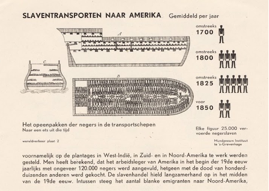
The Neuraths explicitly aligned themselves with the Brooks—and with people and politics—at the same time that they rejected visualization strategies that, they felt, lacked commensurate communicative richness. Christopher Burke, the typeface designer and historian, believes that the Neuraths probably deliberately chose to exclude Playfair from their collection. Trained as a political economist, Otto Neurath was almost certainly familiar with Playfair's work. Less speculative is Marie Neurath's blanket critique of time-series charts, quoted by Burke: "Curves are subject to much stronger demands for precision than pictorial representation. And so it is all the more embarrassing when they do not fulfill these demands. A method of statistics that works with countable elements, as pictorial statistics does, hardly gives any occasion for error. Its advantages are not only educational but also logical." Marie Neurath was more correct than she could have known, as will be discussed in the next chapter. [ MAYBE START NEXT CHAPTER W/ THIS ??? ]
It seems more than coincidental that Edward Tufte would critique ISOTYPE on the way to establishing his own lineage of the history of data visualization, the one which places Playfair at its center. For Tufte, as for Playfair and for those who followed in his wake, the idea of a neutral, objective representational form seemed possible, and desirable. And yet, as the current political moment has shown, data and its visual display is always political. With this in mind, we must work to develop visual typologies that reattach—rather than sever—the data to the people it represents.
Consider a recent visualization, of the people killed by guns in the US. [DESCRIBE; SHOW].
https://www.theguardian.com/us-news/ng-interactive/2021/may/27/us-mass-shootings-database
Of course not all data is about people, nor are questions about ethics TKTK equally relevant at any particular time. One of the only rules of a visualization practice that seeks to attend to the specificity of the data is to never say never in design. But another fundamental rule of this enlightened practice is to always consider the possibility from the beginning; to interrogate our own positionalities, the people we've involved in our projects, as we well as the project's potential for impact or harm.
Taking the lessons of the Brooks, as well as these questions to mind, might we visualize additional populations working to combat gun violence, or other social harms? How might we honor the people behind the data, and insist on connecting numbers back to their richly lived lives?
ENDING VIS HERE, BLACK DATA, COVIDBLACK, SOMETHING HERE???
FOOTNOTES
- Equiano 55, 58.
- Equiano 58; more on Cugoano refusal, p. 15.
- Equiano 58; more on Cugoano refusal, p. 15.
- Clarkson, history of abolition, need ##.
- Ref here about retaining anglo-western focus.
- Finley 34.
- Wood 28.
- Cite Finley here too.
- In an example of mixed methods research avant le letter, Clarkson also published the transcripts of his interviews with these men at roughly the same time as he released his revised version of the Plymouth Committee's "Plan." For more on the interviews, see Riedeker 319-324.
- Wood 28
- Finley 67.
- Quoted in Baucom 218.
- Finley 99.
- Quoted in Baucom 267,
- Baucom 267-8.
- Finley 40.
- Browne 49.
- Browne 49.
- Wood 17.
- Bernier 998.
- Finley 59.
- Baucom 223.
- Baucom 274.
- Baucom 274.
- Finley 62.
- Cartographies of time.
- Wood 5.
- Wood 4.
- CoT 143.
- Cartographies of time.
- CoT 136.
- Quoted in CoT 136
- CoT 136.
- From Hyrogliphics… p. 189.
- Isoytpe design and contexts, 10.
- Qutoed in Isotype, Design and Cotext, 11.
- Ref DF