Between Data and Truth
W.E.B. Du Bois’s “Data Portraits”
October 4th, 1899, was the first day of the fall term at Atlanta University (now Clark Atlanta University), where W.E.B. Du Bois had been teaching for the past two years—and a long two years they had been. After relocating from Philadelphia to Atlanta in January 1897, Du Bois and his family were first required to contend with the overt racism of their everyday lives in the New South; and then, on May 24th, 1899, the most profound of personal tragedies when the Du Bois's two-year-old son, Burghardt, died after a brief illness.But any small comfort that might have brought about by the start of the school year and the return to a teaching routine would soon evanesce as Du Bois found himself pulled into an unexpected new project, one that had the potential to put his research to date on a major international stage.
On that very same day in October, Du Bois’s own college classmate, the lawyer and newspaper editor Thomas J. Calloway began the letter campaign that would result in a commitment from the federal government to fund an “Exhibit of American Negroes” at the 1900Exposition Universelle in Paris, which was scheduled to open the following spring. With time running short, Calloway turned to Du Bois and one other man, Daniel A.P. Murray, the Assistant Librarian of Congress, to design and curate the show. While Murray tasked himself with assembling a set of books and pamphlets by Black writers to put on display, Du Bois saw his purview in more conceptual terms: to present “the history and present condition of a large group of human beings”—namely, the United States's Black citizens—"in as systematic and compact a form as possible."This “systematic and compact form” was, of course, data visualization—a technique that he'd studied during his time in Germany, and which he'd perfected in his groundbreaking study,The Philadelphia Negro, published just one year earlier.

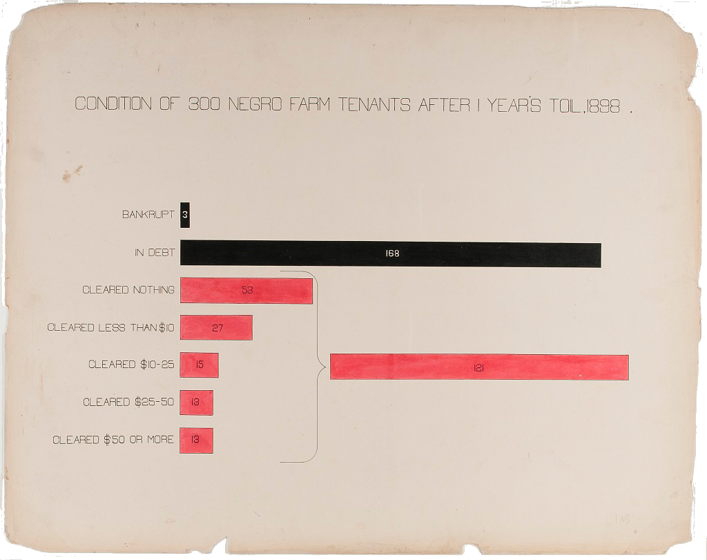
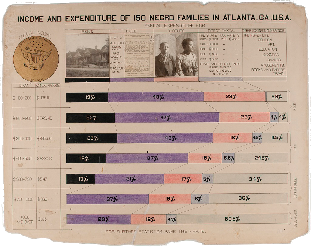
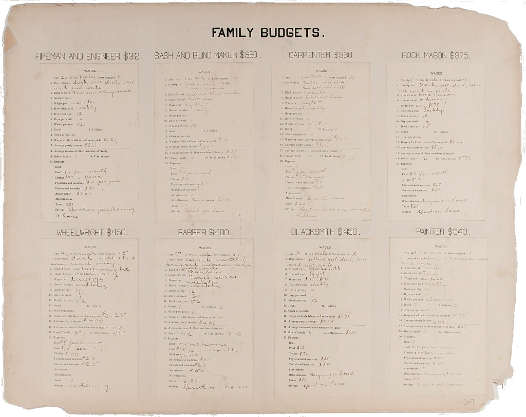
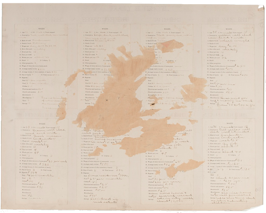
For the Paris Exposition, as the event is more commonly known, Du Bois worked with a team of Atlanta University students to create 63 poster-sized statistical charts. Like William Playfair and most visualization practitioners ever since, Du Bois appreciated the ability of the charts to convey trends and patterns “at a glance.” In this case, Du Bois sought to highlight the growth and progress of Black Americans in the years since emancipation. But Du Bois understood that data could not convey the full picture of this progress—nor could it convey the full extent of the obstacles that the nation’s Black citizens were required to overcome. Thus he supplemented the charts with over 500 photographs that documented “typical” Black Americans at home, at school, and at work; as well as with three large manuscript volumes that compiled the complete Black Codes of Georgia—the legislation that, as Whitney Battle-Baptiste and Britt Rusert explain, “stretch[ed] from the slave codes of the colonial and antebellum period to the segregationist policies and laws of the present,” and which attempted to control and constrain all aspects of Black life. Conceived at a time when Du Bois found himself increasingly affected, both personally and intellectually, by the racism and violence of white supremacy, the range of materials assembled for the Paris Exposition at once attest to his deep-seated belief in the transformative power of data and, at the same time, his growing awareness of the limits of what data—and, by extension, data visualization—could do.
The 63 charts created for the Paris Exhibition were grouped into two sets. The first set,The Georgia Negro: A Sociological Study, focused on statistics that had been compiled by Du Bois and his students that related to the Black population of that state. The second set was more national in scope. Entitled A Series of Statistical Charts Illustrating the Condition of the Descendants of Former Slaves Now in Residence in the United States of America, this set drew from several data sources, including the US Census, in order to put the Black population of the United States in national and international perspectives. Throughout both series of charts, Du Bois underscores the vitality of the nation’s Black citizens, as well the educational and economic progress they had made in the decades since Emancipation.
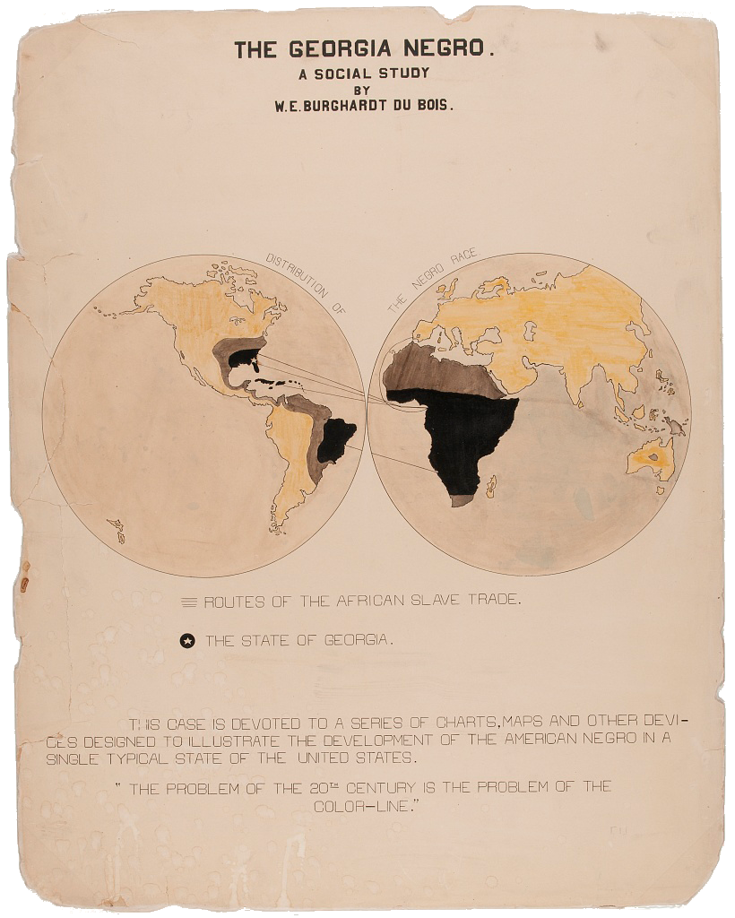
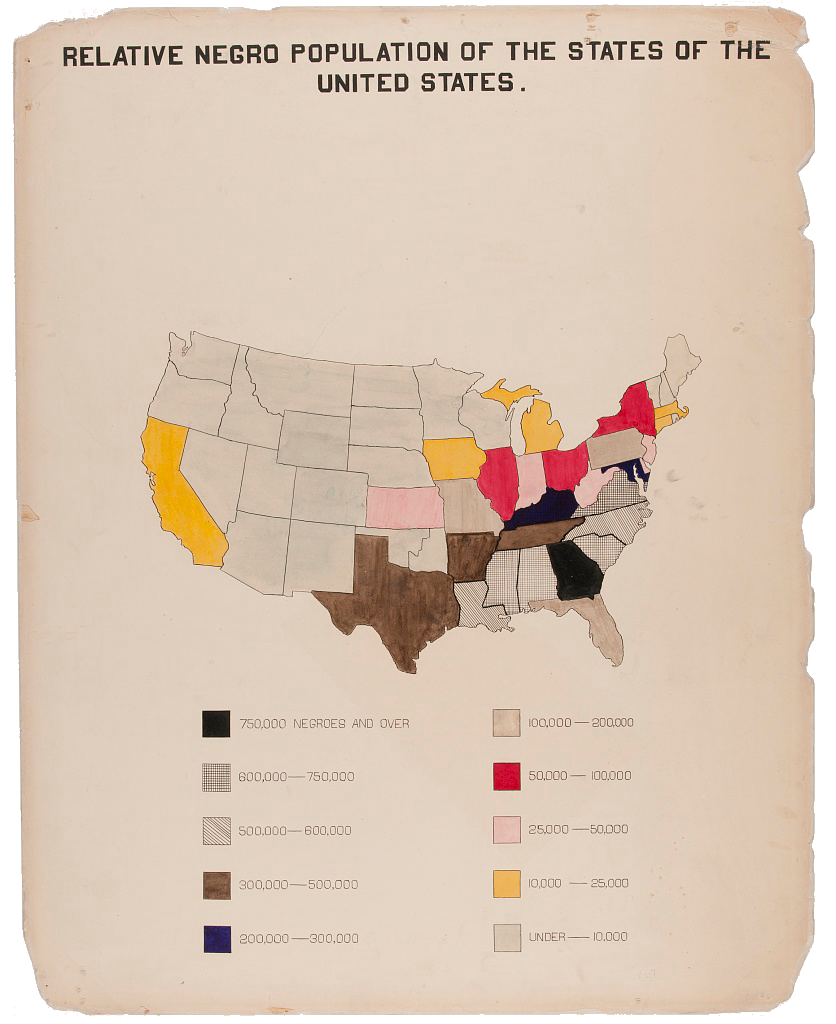
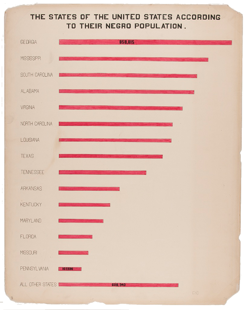
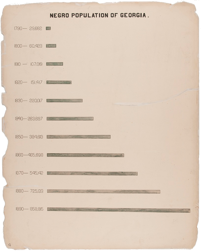
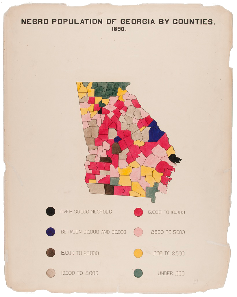
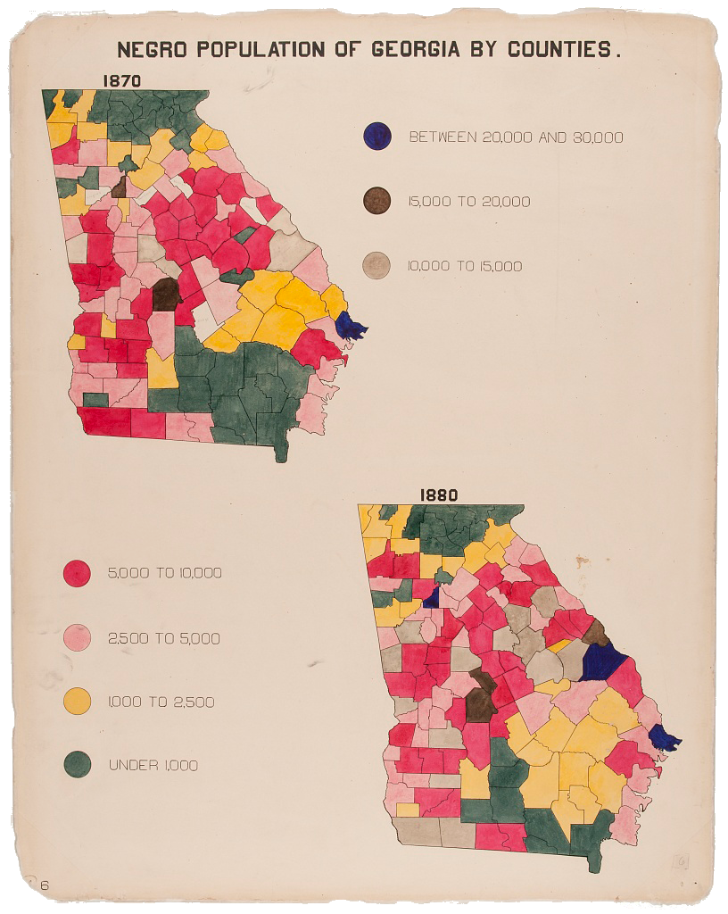
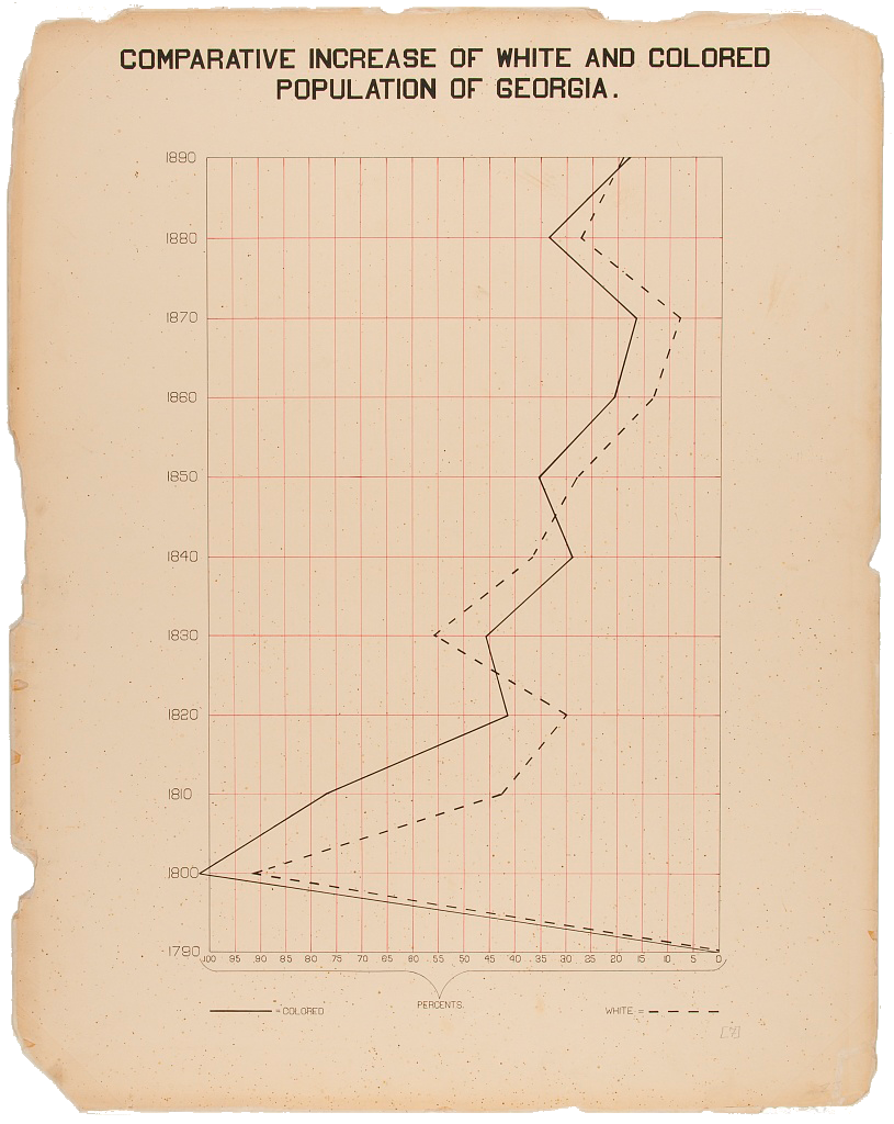
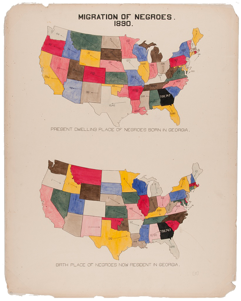
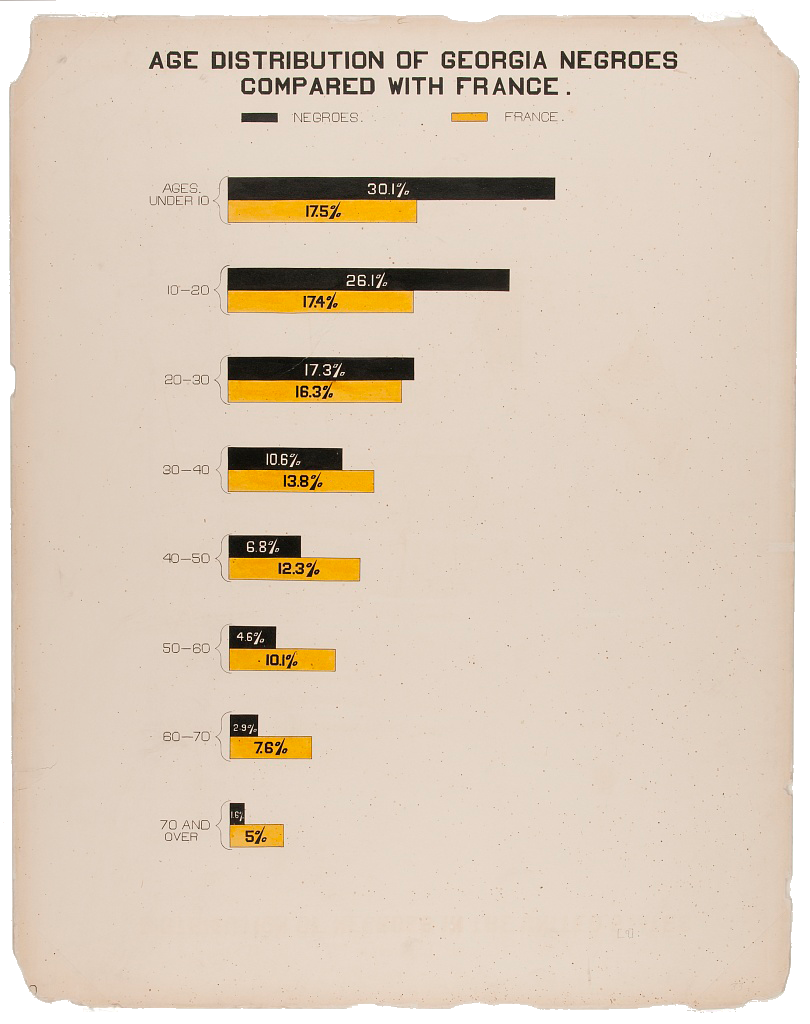
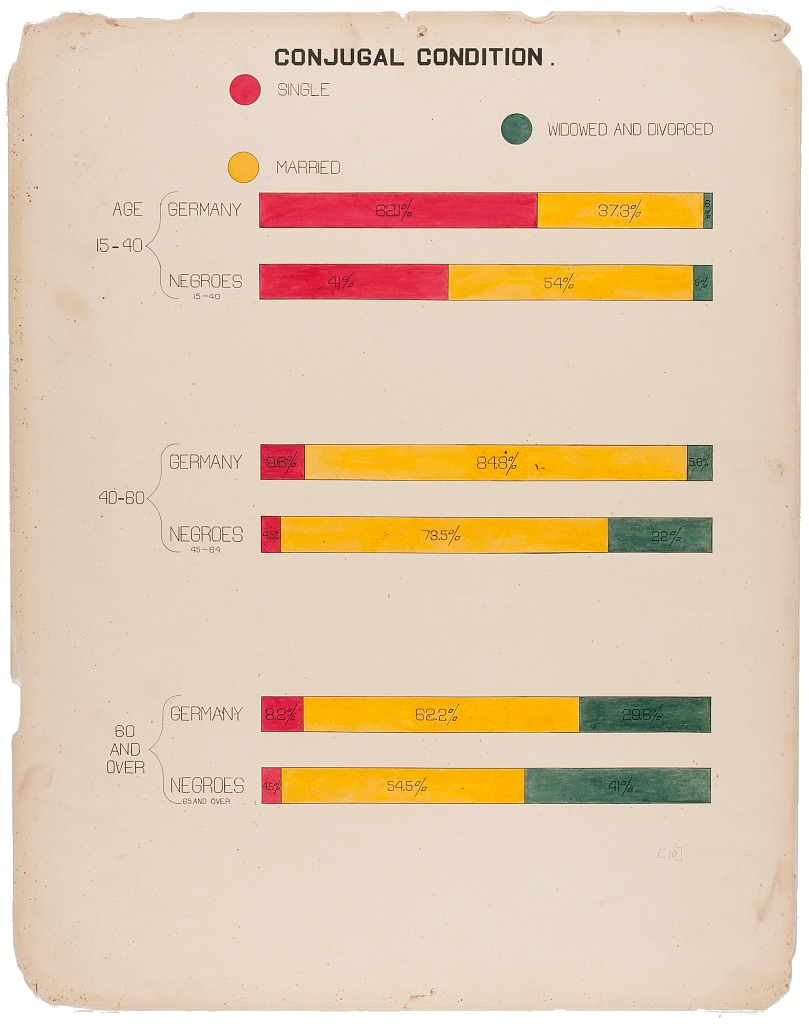
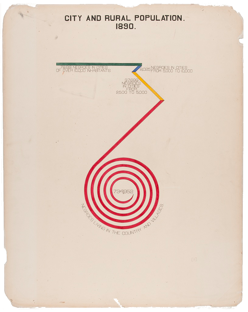
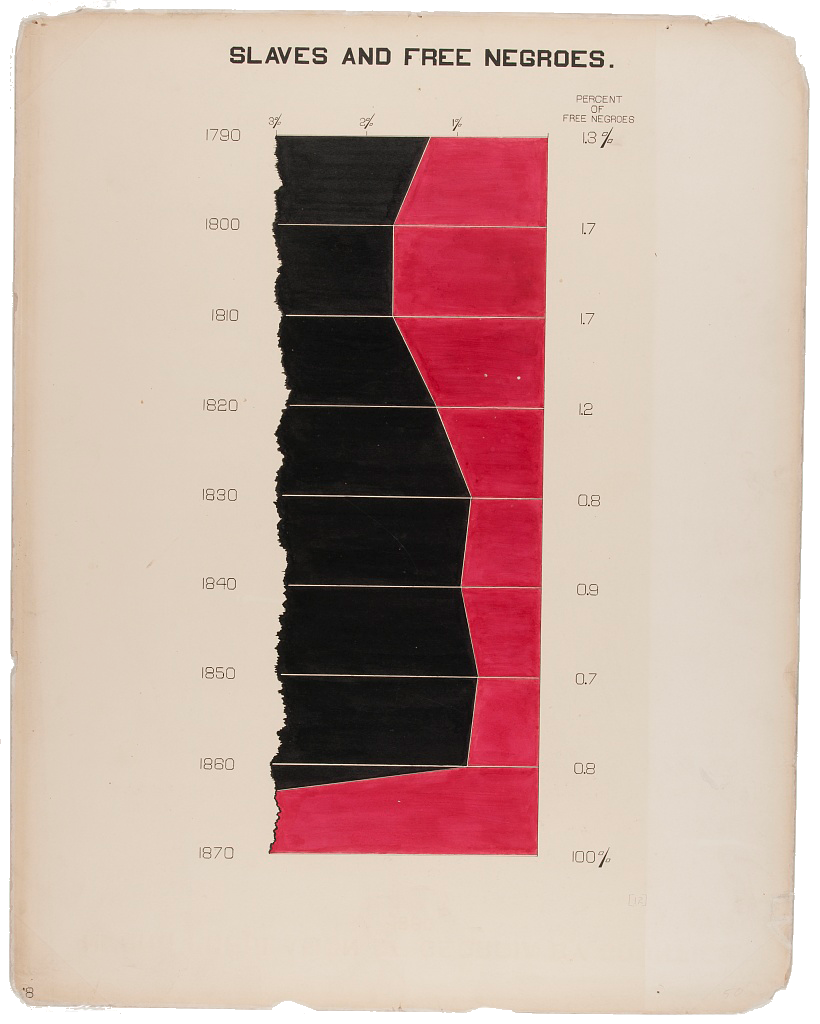
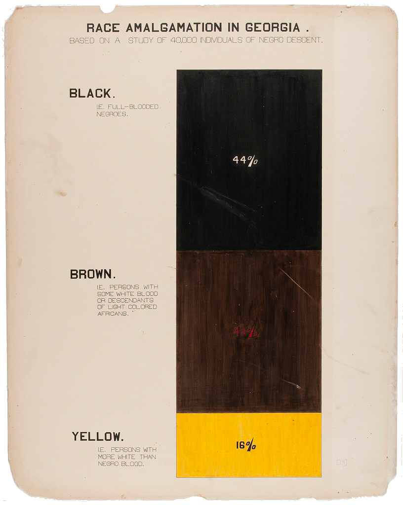

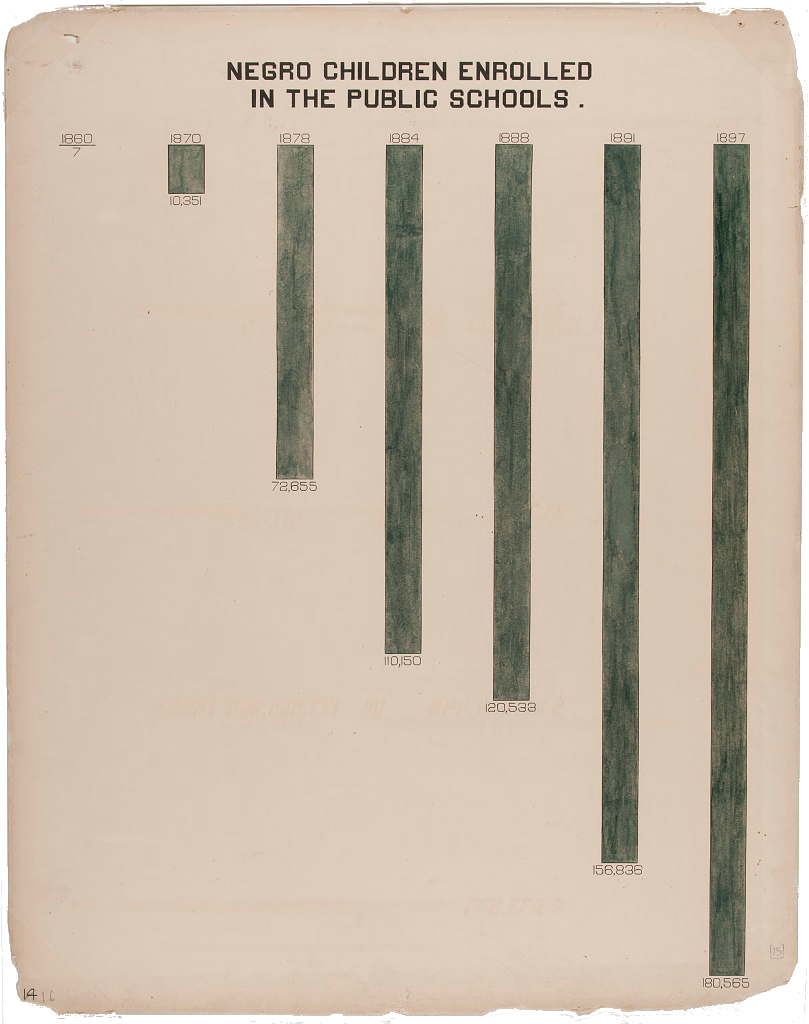
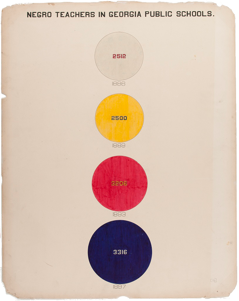
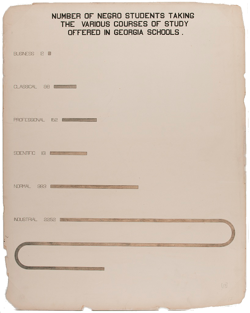
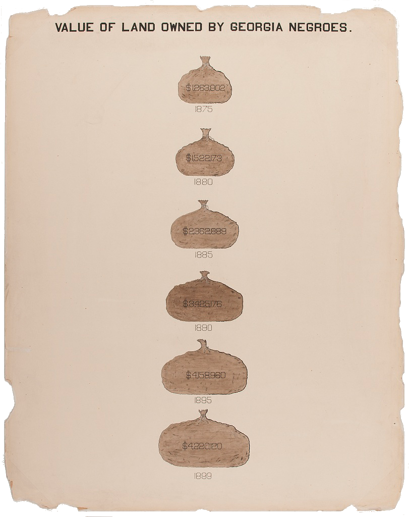
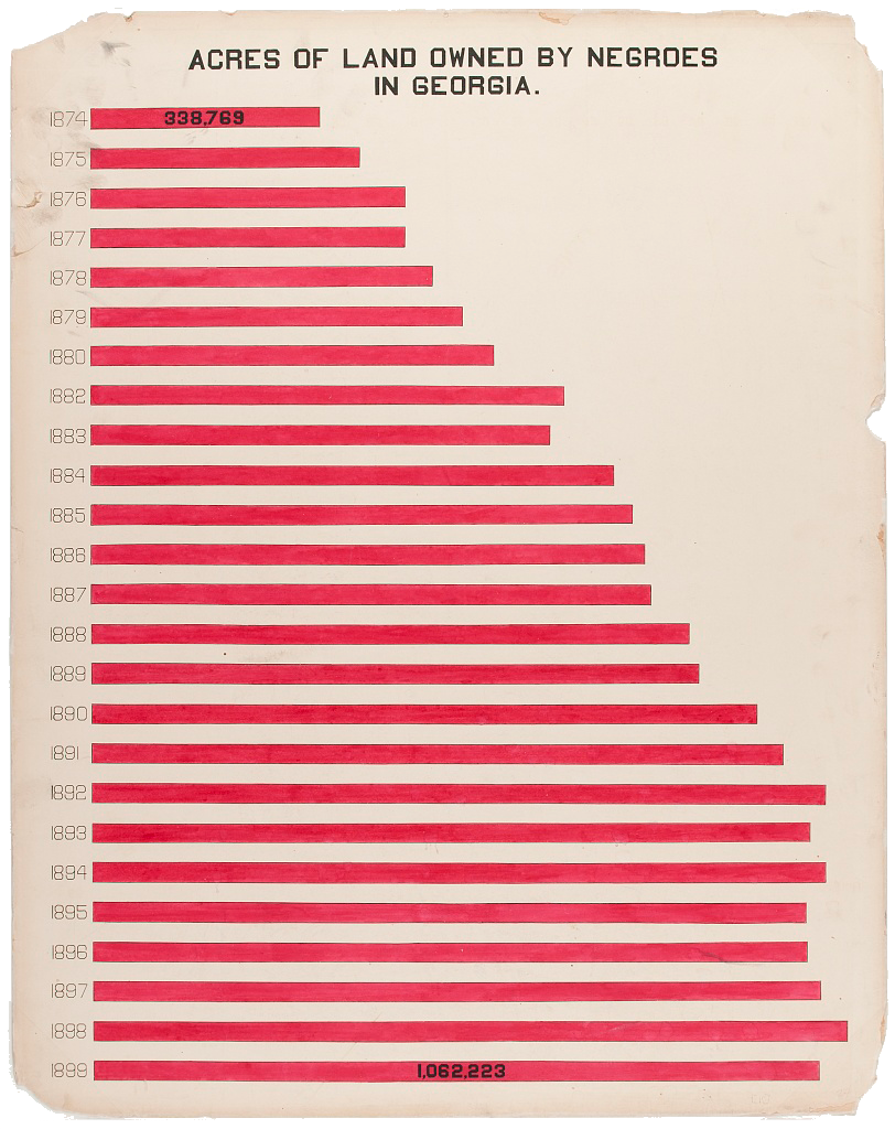
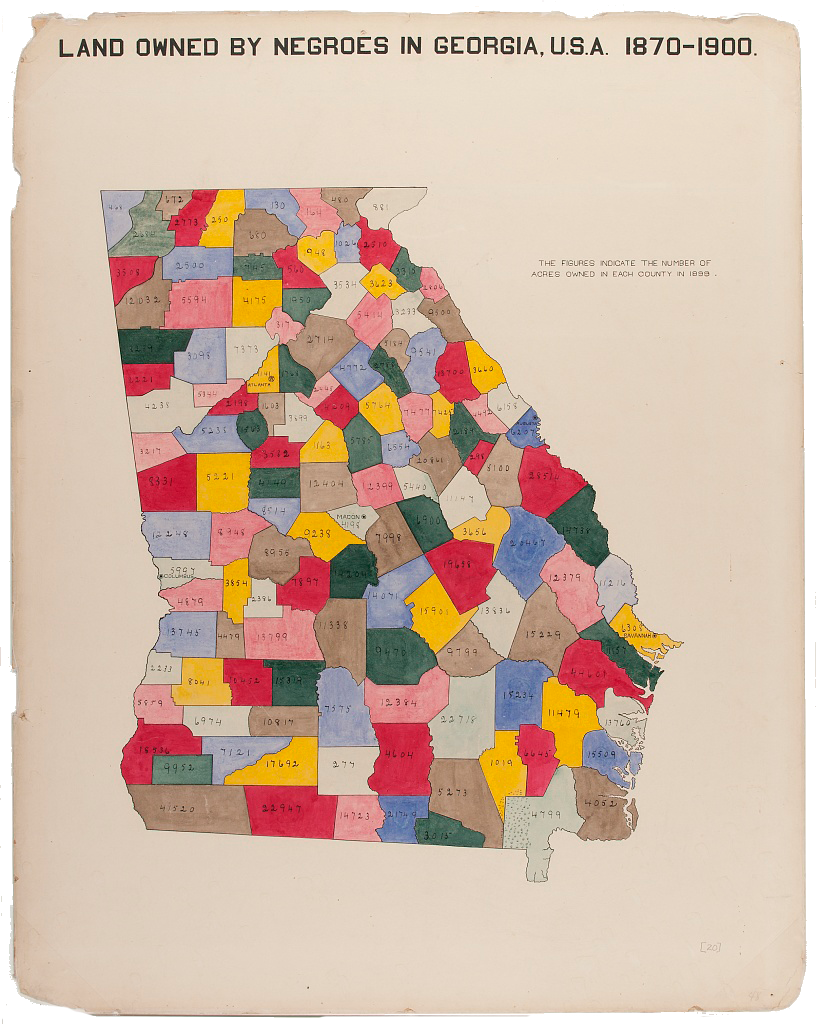
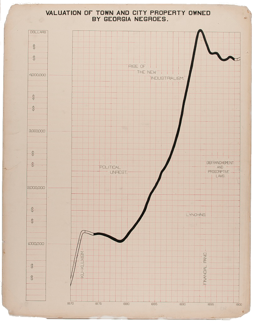
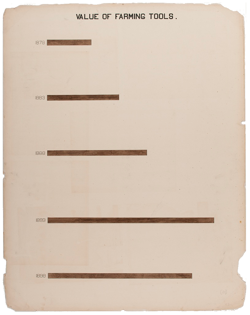
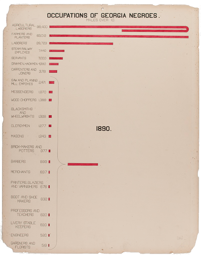
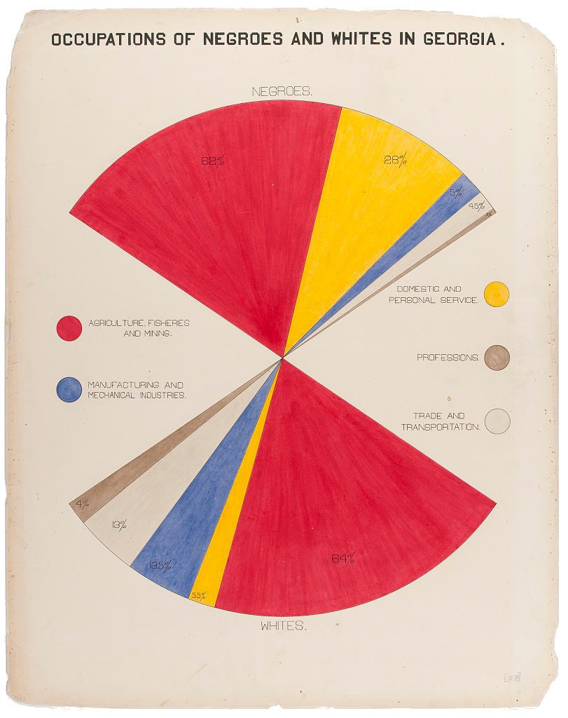
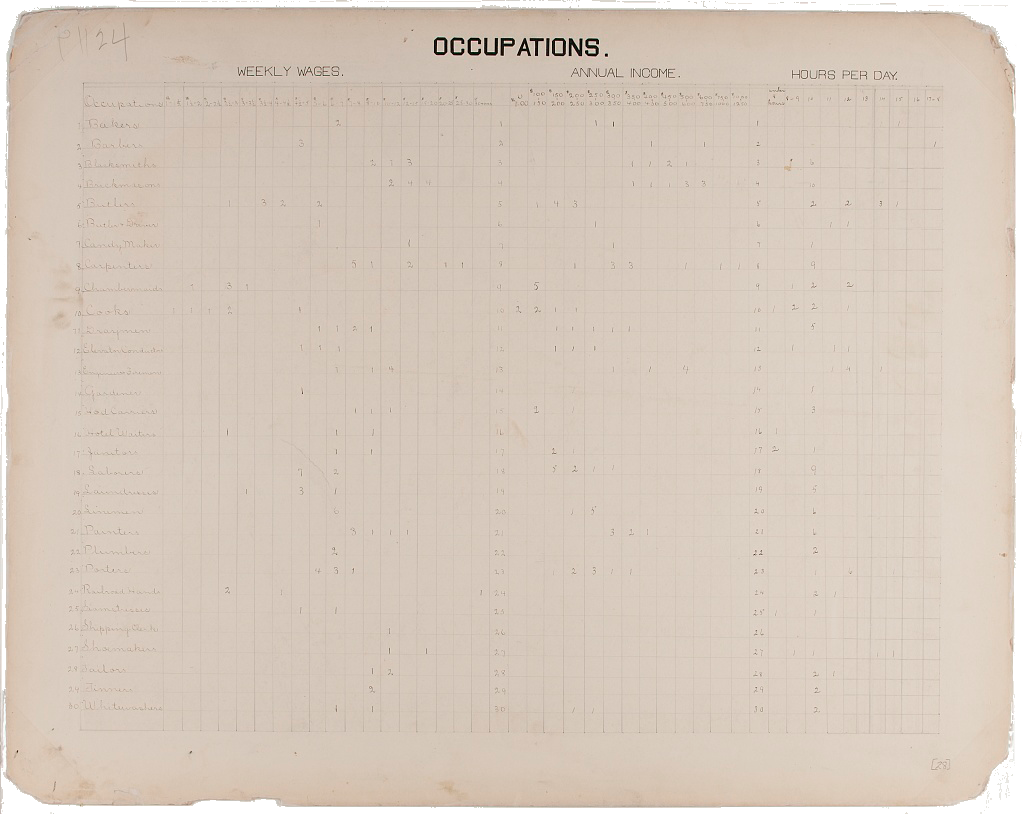
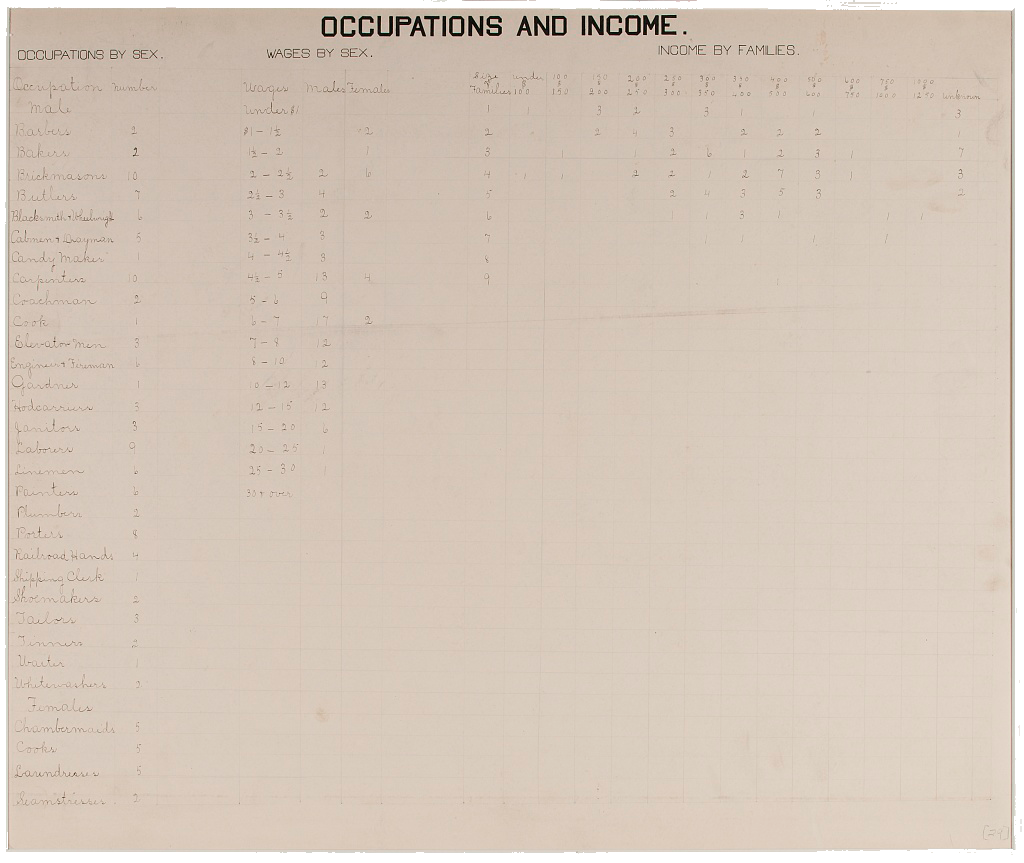
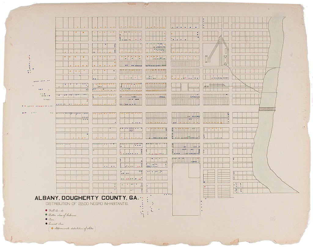
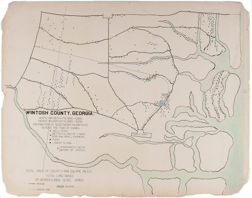
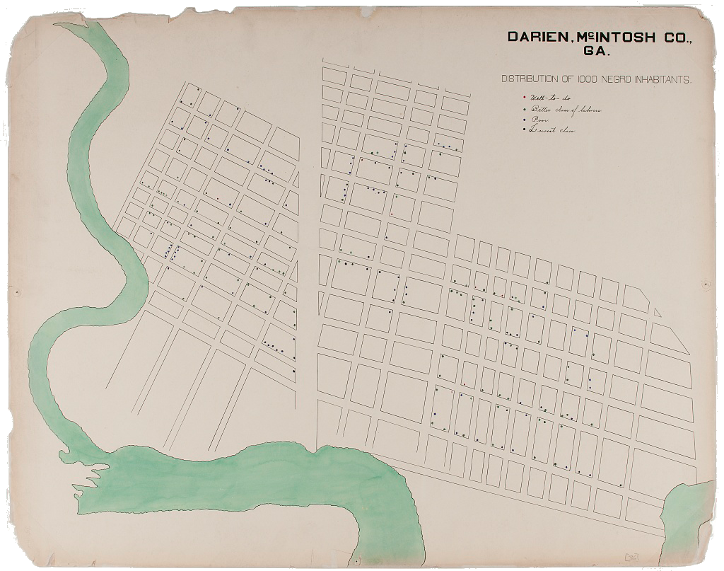

The Georgia Negro: A Social Study
Image courtesy of the Library of Congress,
Prints & Photographs Division,
LC-DIG-ppmsca-33863.
These words would reappear several years later inThe Souls of Black Folk (19n03), where they would become “perhaps Du Bois’s most famous indictment of the centrality of race and racism to modern American sociopolitical life,” as architectural historian Mabel O. Wilson explains.But Du Bois mounts the same case through his charts. Both through his choices about what data to visualize, and about how to visualize them, Du Bois advances a clear argument about the nation’s Black citizens: not only about the progress that the nation’s Black citizens had made up to that date, but also about the extent of the challenges that remained to be addressed.
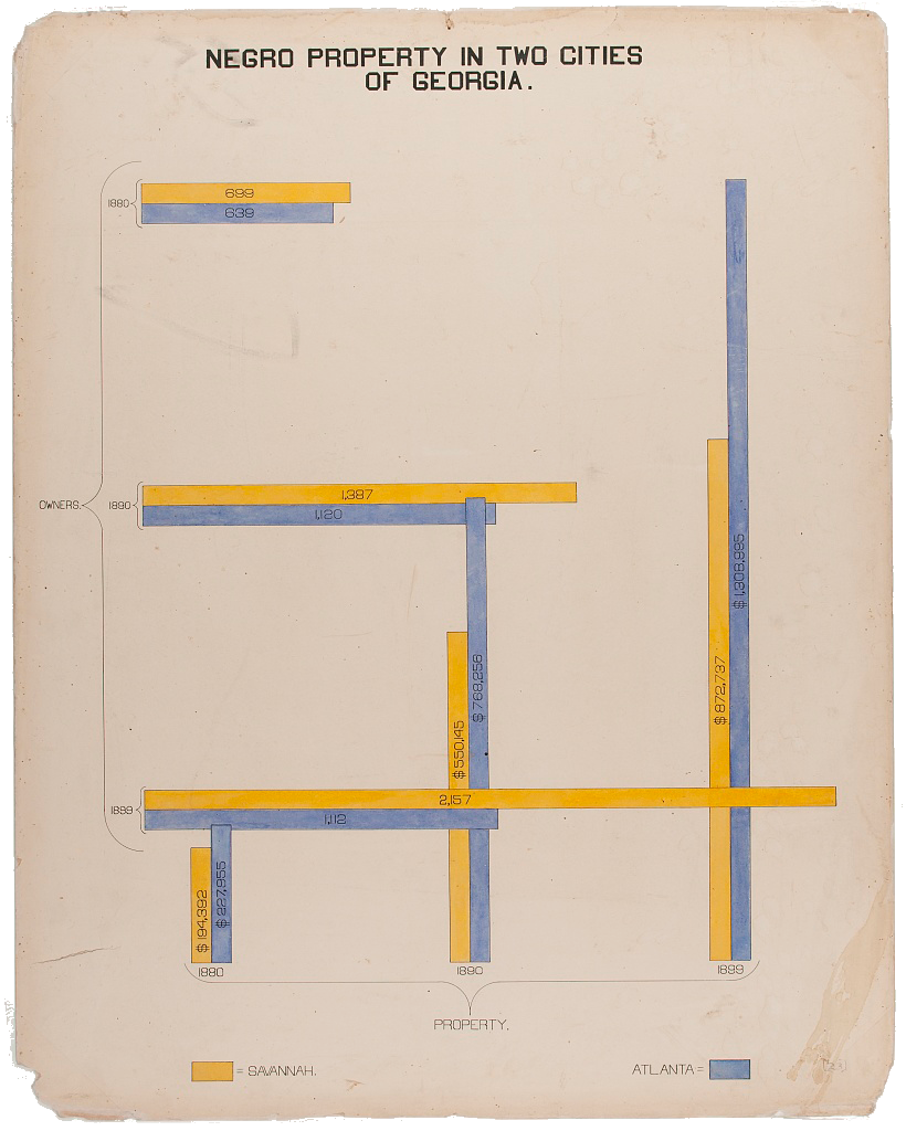
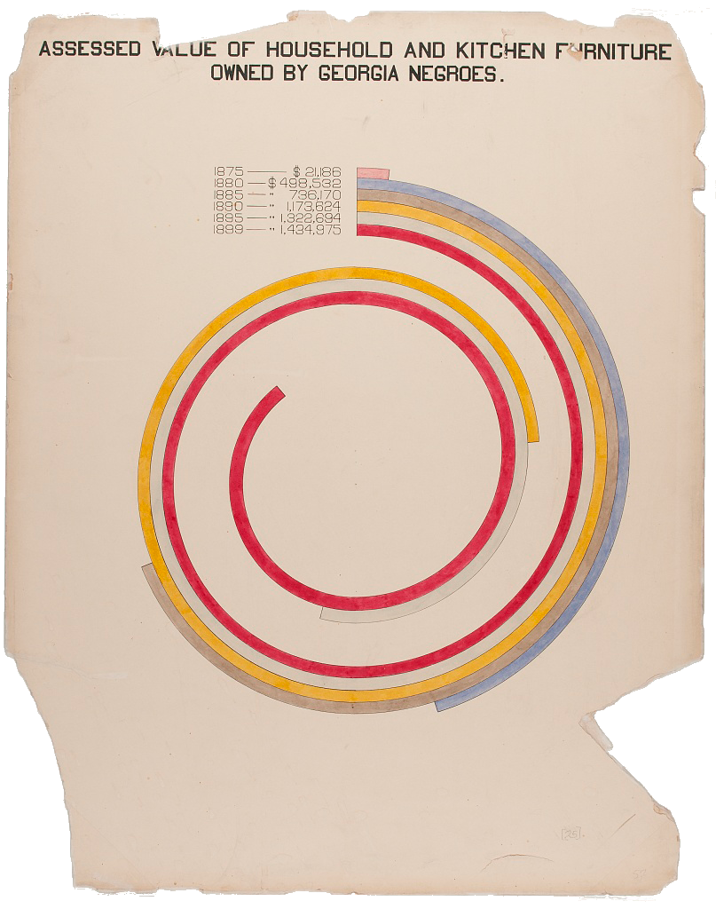
While the first several charts in the series make use of familiar visual forms—maps, bar charts, and line graphs—in order to introduce the exhibition’s international viewership to the state of Georgia and its significance as an object of study, the visual style shifts to altogether new terrain once the focus on Georgia’s Black residents has been established. In his comparative representation of the places where Georgia’s Black citizens reside, for example, Du Bois brings together aspects of the bar chart and the line chart along with a new form of spiral graph in order to give animacy to the presence of Black people in each of type of locale. In a later chart, which documents the decrease in illiteracy rates in the years between 1860 and 1900, Du Bois makes use of what graphic designer Silas Munro describes as a “lattice-like arrangement,” in which an otherwise standard bar is folded at a right angle in order to further accentuate the decreasing rate of illiteracy. Du Bois elaborates upon this technique in a later chart, which compares the numbers of Black property owners, and the value of their properties, in two Georgia cities. Another unique chart in this series, which plots the “assessed value of household and kitchen furniture” owned by Black Georgians, takes the standard bar chart and bends it into a spiral, concentrating the viewer’s focus on the cumulative value of the population’s material possessions in addition to its growth in time.

Above: The introductory image of The Georgia Negro: A Social Study, the first set of charts included in the Paris Exposition. Image courtesy of the Library of Congress, Prints & Photographs Division, LC-DIG-ppmsca-33863.
As the series unfolds, so too does its argument about the progress of the state’s Black citizens, and it does so in a way in which the data presented is aligned with its method of display. The charts’ custom visual design speaks to an overarching desire, on the part of Du Bois, to attend to the specificity of the data and its significance for his larger goal.
Du Bois continues this line of argument, and his graphical innovation, in the second series of charts. Focused on the “condition of the descendants of former African slaves now resident in the United States of America,” as the introductory chart of this series explains, these charts document the upward progress of Black Americans in a national and international context. They also make use of comparisons to other populations, both within the United States and abroad, in order to challenge racist assumptions about Black Americans’ social, intellectual, and economic lives. As with the first series of charts, this series begins with several charts focused on population, before moving on to explore themes related to employment, education, and economics, as well as social, cultural, and religious life.
An unnamed interlocutor in this series is the US Federal Government, which for each of the three previous national censuses, had created a “statistical atlas” that visualized the data that had been collected. The most recent atlas, based on the results of the 1890 Census, had been published only two years earlier, in 1898. Most famous today for its visual depiction of the closing of the American frontier, in its own time the atlas was motivated by a more academic goal: “popularizing and extending the study of statistics.”
The 409 maps and diagrams began, as Du Bois’s did, by introducing viewers to the population of the United States. Through by-then standard bar charts, pie charts, and line graphs, as well as its own creative use of pattern and visual form, the Atlas included, for example, a prototypal bump chart that ranked each state according to its population; a map that illustrated the spatial distribution of the nation’s male population; and another that illustrated the spatial distribution of the nation’s Black population. (Another chart used area charts in small multiples in order compare certain state’s Black and white populations). And while race was certainly of concern in the census; indeed, race remains one of the lighting rod issues of the census, even today—it was not the Statistical Atlas’s main concern. Indeed, after a series of charts early in the atlas that visualized the nation’s Black population, the focus of the atlas shifts, turning first to the nation’s immigrant population before expanding outward to consider other features altogether: the population’s age and gender breakdown, its religion, the occupations of its inhabitants, and more.
Du Bois was clearly influenced by the Atlas. Several of the diagrams created for the Paris Exposition precisely mirror the form of those created for the Atlas. Du Bois’s graduated area chart of “The Amalgamation of White and Black elements of the Population in the United States,” for example, takes the same visual form as the chart in the Atlas depicting “Growth of the Elements of the Population: 1790-1890.” Similarly, the combined area and bar chart form that Du Bois ¸ employs for his chart of “Conjugal Condition of American Negroes according to Age Periods” is the very same as the chart in the Atlas depicting “Conjugal Condition of the Population by Age and Sex, in proportion to the total number of each group.” The notable difference within each pair is, of course, Du Bois’s focus on the Black population alone. And for Du Bois, this focus was the point: the nation’s Black population was itself diverse, and it was thriving. By adopting the visual typologies of the Statistical Atlas in order to make his claims, Du Bois underscores his textual argument about the “small nation of people” within the larger United States by creating a national statistical atlas of their own.
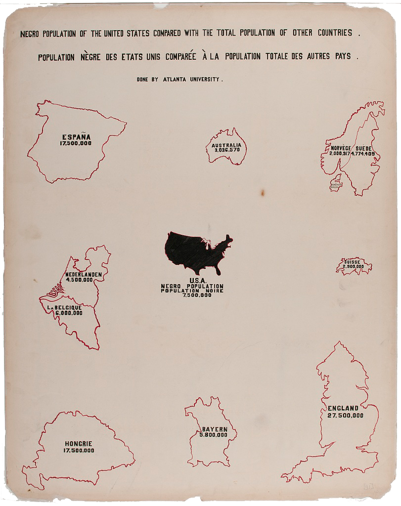
Today, Du Bois’s charts are often shared as single images, embedded in a tweet or blog post, or—as in the case of Du Bois’s Data Portraits, the 2018 volume that compiled the charts in print for the first time—bound as a dazzling, full-color book. But in their own time, the charts were intended to be viewed as part of a carefully curated exhibition experience. Visitors entered a small reading room, about 20 feet by 20 feet square, its walls painted and ornamented by decorative crown molding, and lined with artifacts from floor to ceiling. The books assembled by Daniel Murray, of the Library of Congress, filled three shelves of under-counter bookcases. On the counters lay more books and some of the charts, arranged in a stack for easy perusal. A bronze statue of Frederick Douglass was installed on one of the side walls, on a pedestal that could swing out from the wall for a 360° view. Filling the entire height of the back wall were framed artifacts, arranged in three rows: farming tools and other objects from Black agricultural and industrial schools, installed in swing-out vitrines; the most significant of the charts, installed in ornate wooden frames; and alongside them, photographs: over 500 portraits of the nation’s Black citizens, pictured at school, at home, and at work—in other words, in the activities that defined their everyday lives.
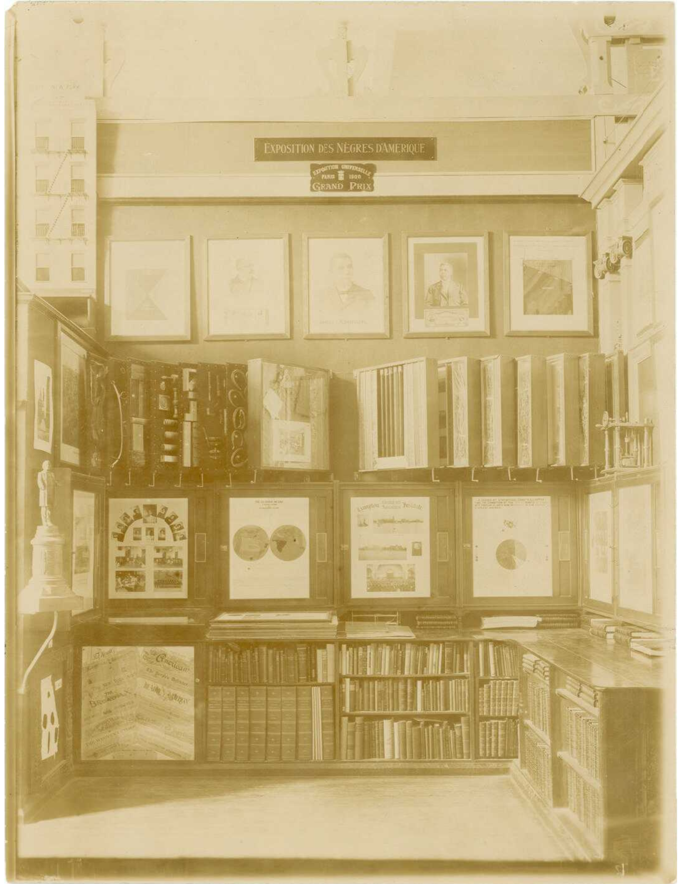
In a reflection on the Paris Exhibition, published several months after its opening, Du Bois explains that he included the photographs to challenge “conventional American ideas,” although he does not specify what particular ideas he intends to challenge. Presumably, these ideas included racist assumptions about what Black citizens looked like, what social and professional roles they occupied, and what they could achieve. In her in-depth analysis of the photographs, art historian Shawn Michelle Smith connects them to Du Bois’s idea of double consciousness, “the sense of always looking at one’s self through the eyes of another,” as articulated most famously in The Souls of Black Folk. With the photos, which not only featured black citizens but were also created by them, Du Bois sought to present to a predominantly white international audience a view of how Black American saw themselves.
Considered alongside the photographs, it becomes possible to understand the charts as pushing back against this double consciousness through an additional visual form. In their discussion of the charts, Battle-Baptiste and Rusert elaborate this line of thinking, emphasizing how Du Bois understood double consciousness as a “kind of ‘second sight’ that might be transformed from a curse into a “gift” that offered a unique and superior perspective on turn-of-the-century race relations, sociability, and even existence itself.” In direct comparison to the Statistical Atlas, the charts certainly express a “superior perspective” on the race relations of the time. They also express a more general desire, one shared with the photographs, to put the vitality and talents of Black America on public display.
But Du Bois’s decision to pair the photographs with the charts also points to his awareness of the limits of what each medium could achieve on its own. While the photographs could document the richness of individual lives, they could not picture each one of the nation’s Black citizens. Conversely, while the charts could present powerful evidence of generalized trends, they could not expose the individual people behind the data or the unique stories that accompanied each one of their lives. Considered as a complementary pair, the charts and the photographs recall another visual technology of that era: the stereoscope. The stereoscope was a device designed to resolve left- and right-eye views of the same image into a single view of additional depth. Similarly, Du Bois understood the charts and the photographs as two parts of a larger whole. While each was legible on its own, the best and most complete picture was gained by viewing them together.
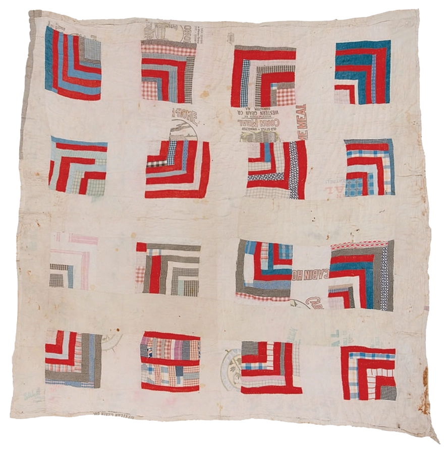
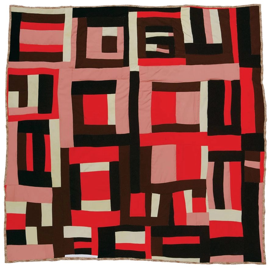
Left: "Housetop," by Rachel Carey George, ca. 1935.
Right: "Housetop" variation, design by Mary Lee Bendolph. 1998, quilted by Essie Bendolph Pettaway, 2001. Photos courtesy of Tinwood Media.
Permissions pending.
The idea of the charts and the photographs as stereoscopic pairs is more than a visual gimmick; it serves as an outward reflection of the methodological soul-searching in which Du Bois was, in the months leading up to the Paris Exhibition, deeply engaged. When Du Bois first arrived in Atlanta, he was heavily invested in advancing a quantitative approach to sociological work. As he recalls in his 1940 autobiography, Dusk of Dawn, “I was going to study the facts, any and all facts, concerning the American Negro and his plight, and by measurement and comparison and research, work up to any valid generalization which I could.” Here we see the strength of Du Bois’s belief in the power of “facts”—the more facts the better—when they could be aggregated and analyzed in the service of generalized claims.
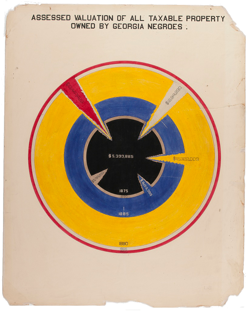
But after only a year in the Deep South—and just a few months before he began to assemble the materials for Paris Exposition—Du Bois experienced what can only be described as an intellectual epiphany, one brought about not by any new sociological research but instead by his own first-hand evidence of how white supremacy overdetermined any and all of the work he might do. In Dusk of Dawn, Du Bois narrates this transformation in almost metaphysical terms: “At the very time when my studies were most successful, there cut across this plan which I had as a scientist, a red ray which could not be ignored.”
This “red ray” was no abstraction. It had a specific and horrific source: the lynching of a man named Sam Hose, which had taken place just outside of Atlanta, on April 23, 1899. Du Bois had first intended to approach the incident as he approached any inquiry: through a social-scientific lens. He recalls how drafted a “careful and reasoned statement concerning the evident facts” of the case, which he sought to publish in the Atlanta Constitution, the leading newspaper of the South. But while walking from the Atlanta University campus to the newspaper office—he planned to deliver the statement in person—Du Bois learned of a gruesome new turn of events. He turned around and went home, his statement never to see the light of day.
While Du Bois’s desire to publish a statement on the “facts” of the case was extinguished at that point, he continued to contemplate—deeply—the larger function of his sociological work. As he narrates in Dusk of Dawn:
“Two considerations thereafter broke in upon my work and eventually disrupted it: first, one could not be a calm, cool, and detached scientist while Negroes were lynched, murdered, and starved; and secondly, there was no such definite demand for scientific work of the sort that I was doing. I regarded it as axiomatic that the world wanted to learn the truth and if the truth was sought with even approximate accuracy and painstaking devotion, the world would gladly support the effort.”W.E.B. Du Bois,Dusk of Dawn, pp. 67-8.
From these lines, it becomes clear that Du Bois emerged from the incident with a greater awareness of the limits of his “scientific,” data-driven approach, as well as of the larger stakes of any future work he might do. The violence brought about by centuries of white supremacy, Du Bois then realized, demanded a different scholarly charge: not an emphasis on any particular methodology, but instead a broader attempt to describe “the truth.” Thus when Du Bois turned to the Paris Exhibition in several months’ time, it was this “truth”—the experience and effects of living within, and continually resisting, a racist regime—that Du Bois sought, through the charts and the photographs together, to put on public display.
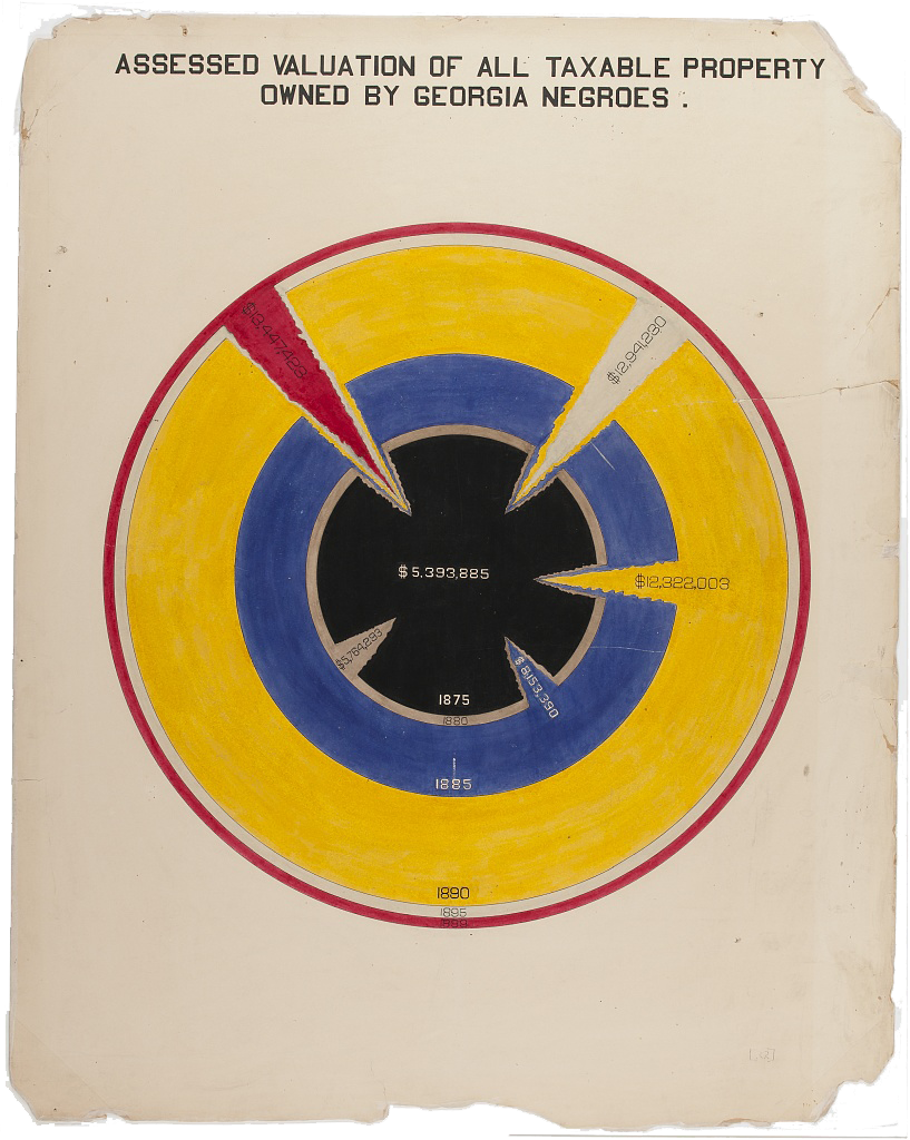
Above: Plate 22, “Assessed Valuation of All Taxable Property Owned by Georgia Negroes,” which depicts (among other things) a red ray cutting through the history of Black property ownership. Image courtesy of the Library of Congress, Prints & Photographs Division, LC-DIG-ppmsca-33884.
If one major purpose of the Paris Exposition was to illustrate the accomplishments—and, therefore, the requisite tenacity—of Black Americans as a group, a second equally major purpose was to illustrate the accomplishments of a much smaller group: the students of Atlanta University. These students were pictured in several of photographs included in the exhibition, along with students from other Black universities and industrial schools; but their talents and potential were most visible in the second series of charts, which were credited not to Du Bois but to “Negro students under the direction of Atlanta University.”
Through his explicit acknowledgement of his students’ contributions, as well as the contents of the charts themselves, Du Bois sought to demonstrate the capability of his Atlanta University students. To wit: the introductory chart of the second series, which announces itself as a study of the Black citizens of the United States, is illustrated not by any visualization of the population as a whole, but instead by a pie chart that displays the occupations of the 330 individuals who had graduated from Atlanta University to that date. Additional statistics printed at the bottom of the chart provide additional information about the University, including the number of current faculty members (20) and students (250), as well as buildings on campus (5) and books in the library (11,000). A final number closes the chart: the amount of funding required to seed an endowment for this level of intellectual inquiry ($500,000). In this way, the chart reads as an advertisement for the past successes of the University and a plea for its future support.
While the subsequent charts in the series deliver on the promise to treat the Black population of the United States as a whole, they continue to underscore the value of Atlanta University, both for its students and for the nation. Unlike the first set of charts, which do not include credit lines except on the introductory image, each chart in this series contains a credit line just below its title: “Done by Atlanta University.” The credit line serves the dual purpose of acknowledging their labor and accentuating their skill.
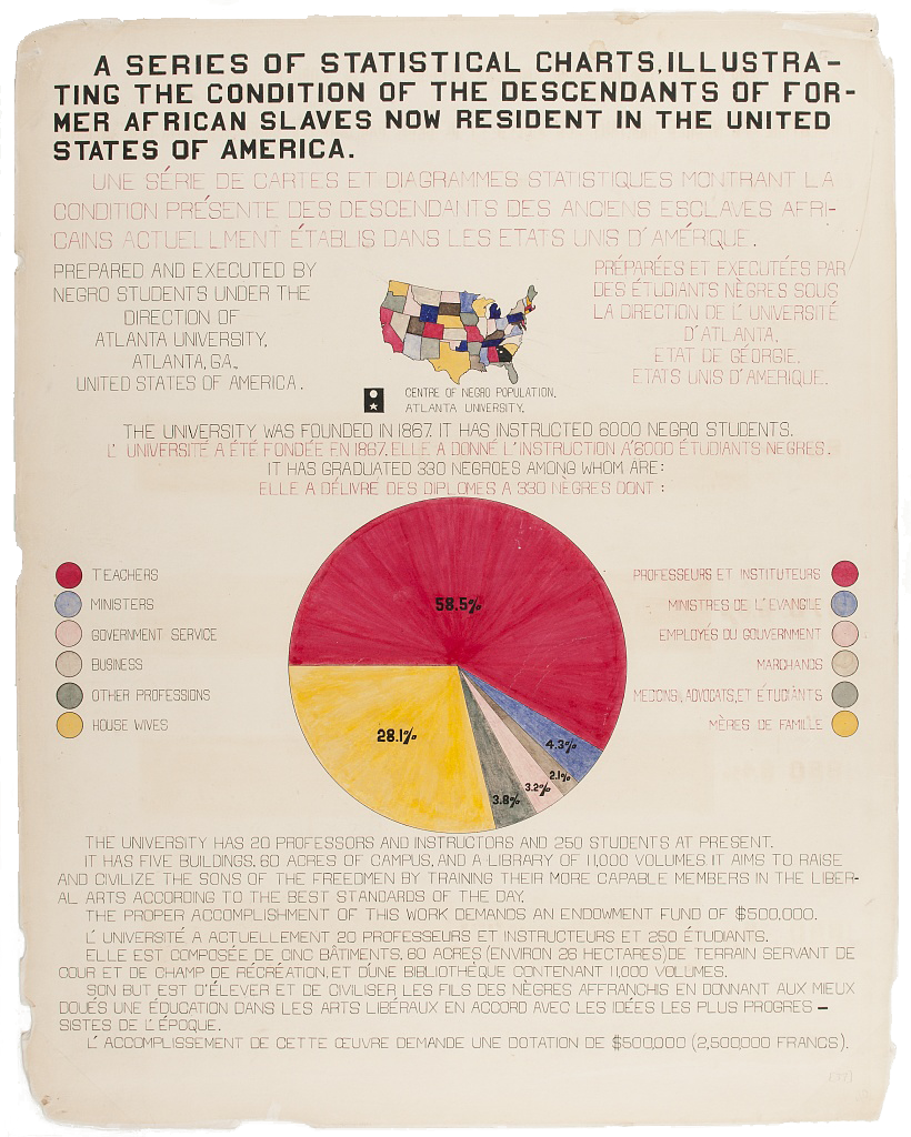
As to who, more specifically, Du Bois intended to credit, it remains difficult to discern. The Atlanta University Bulletinfor May 1900, which included an article on the exposition, emphasizes how the work “was done entirely by Negroes—Dr. Du Bois and his assistants, most of whom are Atlanta University graduates.”Du Bois himself provides only slightly more clarity, recalling in his third and final autobiographical text, written late in life, “I got a couple of my best students and put a series of facts into charts,” resulting in the “most interesting set of drawings” that were displayed in Paris.And while Du Bois goes on to describe the contents of the charts as well as how “the details of finishing these fifty or more charts, in colors, with accuracy, was terribly difficult with little money, limited time, and not too much encouragement,” he does not name any of the students who might have helped to ease this challenging task.
[ SOMETHING INTERESTING WITH ALL OF THE SINGLE CREDIT LINES? ]
Newspaper reportage of the Paris Exposition does name one former student, William Andrew Rogers, as responsible for having “executed” the charts. The 1899-1900 Atlanta University College Bulletin confirms this role, listing Rogers’s occupation as “Work on Paris Exhibit.” (Rogers had graduated the previous year.) But “based on the volume of the designs, each piece’s complexity and detail, and the compressed project timeline,” as graphic designer Silas Munro confirms, “it seems implausible that Rogers and Du Bois worked alone to complete the project.” The fact that the first set of charts are more sophisticated in their visual design, and more professional in their execution, suggests that Rogers and Du Bois might have worked on the first series together, while enlisting additional students in the design and execution of the second set of charts.
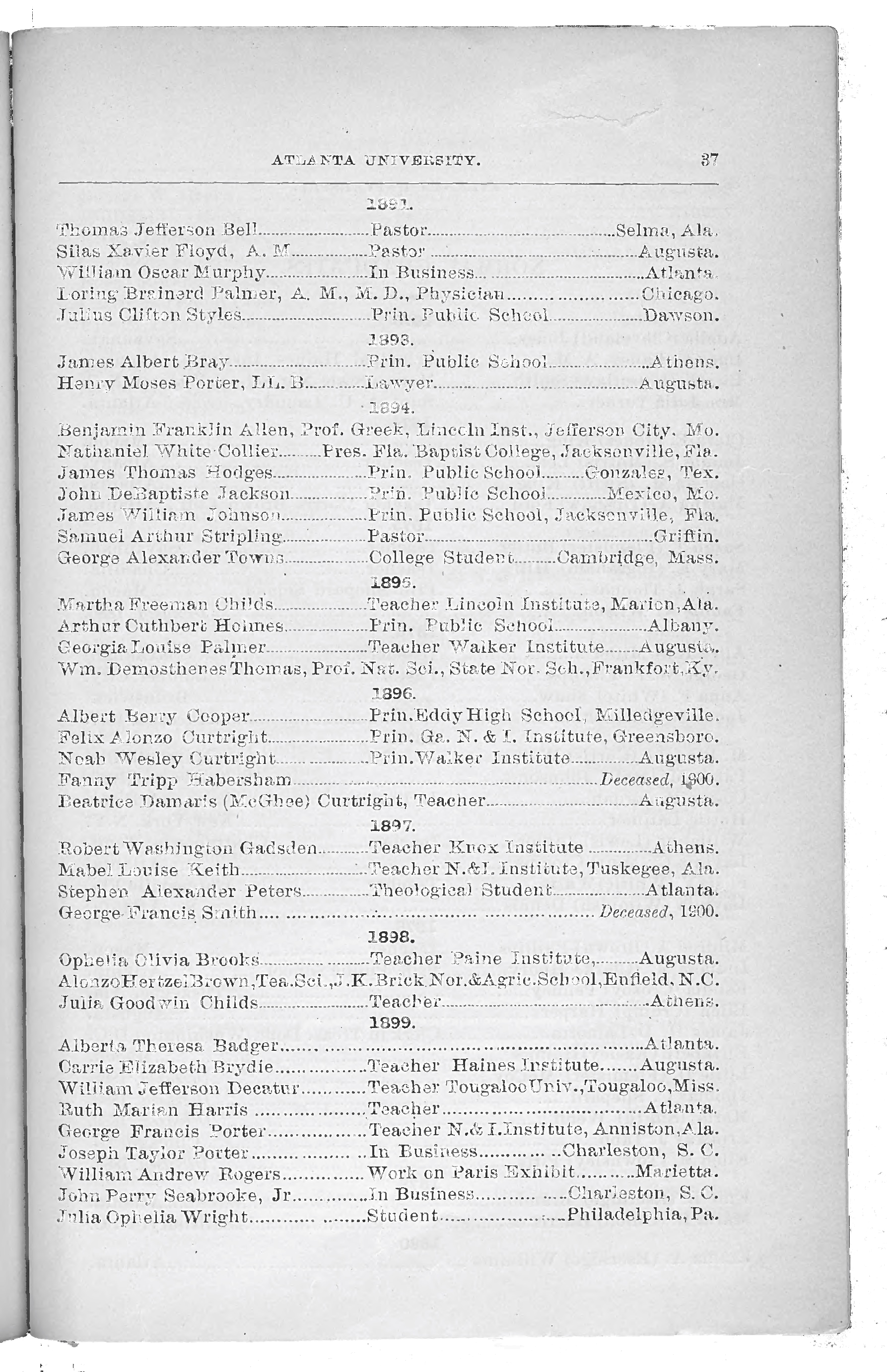
If this were true, it would not have been the first time that Du Bois enlisted his students in a collaborative research project. Among the defining intellectual contributions of the early years of Atlanta University were the Atlanta University Studies, annual data-driven reports on specific areas of Black life that were presented each spring at a large public conference. In fact, Du Bois was recruited to the University in large part to assume direction of the studies, which had begun only two years earlier. To complete this work, Du Bois drew from “two tiers of volunteer researchers,” as sociologist Aldon Morris explains, recent graduates of HBCUs across the nation, and his own graduate and undergraduate students. Their work together became the basis for what Morris names the Du Bois-Atlanta School of Sociology, the first “scientific, or data-driven, sociology program in the United States.
Among the innovations of the Du Bois-Atlanta school was its required coursework. Long before any elite university offered training in data collection or analysis methods, Du Bois instructed his students in a full year of such methods, culminating in a term of applied research on “the social and economic conditions of the American Negro.” While there is minimal evidence as to the specific research tasks these students performed, it is generally acknowledged that this coursework was the mechanism by which Du Bois prepared his students for the role they would play after graduation, as satellite field sites for the data collection required to produce the annual reports.
As for the charts created for the Paris Exposition, several of the charts made clear use of data collected for the Atlanta University Studies. The data on Atlanta University graduates that was collected for the 1900 report, for example, is the same that is visualized in the second series’s opening chart. Thus while the specific contributions of individual students remain conscribed to the past, we might take the data they together created as an invitation to visualize the larger network of the Du Bois-Atlanta School of Sociology: the names of Atlanta University students and alumni who contributed, in ways large and small, to the program that enabled the creation of the charts. This visualization, while necessarily imperfect and imprecise, nonetheless helps bear witness to the deep infrastructure and broad scope required to produce the Paris Exposition charts.
The charts that Du Bois and his students together created for the Paris Exposition demonstrate how data visualization can serve as witness and as testimony: documenting the existing conditions—and even the accomplishments—of a group that would otherwise go overlooked. They also show how visualization can be used to make arguments, either on their own through choices about what data to visualize and how to visualize it; or through comparison to other datasets or to other data visualizations. At the same time, the arguments mounted through visualizations of data cannot stand on their own; they must be accompanied by additional forms of information and methods of presentation, as well as the broader context in which they are intended to intervene. Du Bois understood these things as well, as evidenced through his decision to display the charts alongside the photographs at the Paris Exposition, as well as through his writing throughout his life about the uses and limits of data.
Du Bois’s nuanced consideration of both the uses and the limits of data, in the context of his larger goal of bearing witness to “the truth,” helps to explain why his charts have become flashpoints in current conversations about data in relation to racial justice. The topics explored through Du Bois’s charts, such as income level and occupational spread, continue to bear witness to the deep roots of racism and oppression, as the data journalist and visualization designer Mona Chalabi discovered when she created Du Bois’s charts with contemporary data. The methods of data collection employed by Du Bois, focused as they were on the data that others did not see as important—or, alternately, intentionally sought to ignore—similarly continue to inspire artists and activists alike to turn their critical eye to the racism that overdetermines which data are collected and which are not, as the artist and educator Mimi Onuoha explores in her multimedia installation, “In Absentia.”
As scholars and activists turn, once again, to questions of how data can be enlisted as “protest,” “accountability,” and “collective action,” as the group Data for Black Lives aims to do, Du Bois again emerges as a key antecedent—as much for how he understood how data and data visualization is complicit in holding up the structures of white supremacy is it can be used to dismantle them. The challenge as Du Bois understood it, and as these artists, activists, scholars, and organizers, also understand in the present, is how to hold these two competing realities in their hands at the same time: how data has been used as a tool of oppression, and at the same time how it can be wielded back.
FOOTNOTES
- As indicated in the Catalogue of the Officers and Students of Atlanta University, 1899-1900, available online at: http://digitalcommons.auctr.edu/aucatalogs/31.
- The medical cause was diphtheria, although Du Bois and his wife always felt that the root cause of Burghardt’s death was racism. None of Atlanta’s “two or three” Black doctors had been available to make an emergency house call, and not a single one of the city’s many white doctors would allow themselves to cross racial lines to tend to Burghardt, even with the knowledge of the severity of his illness. For more on this incident and Du Bois’s early years in Atlanta, see David Levering Lewis, W.E.B. Du Bois: A Biography (New York: Henry Holt, 2009): 152-176.
- W.E.B. Du Bois, “The American Negro in Paris,”The American Monthly Review of Reviews 22.5 (November 1900), p. 576.
- On The Philadelphia Negro as the antecedent to the Paris Exposition charts, see Alexander Weheliye, “Diagrammatics as Physiognomy: W.E.B. Du Bois’s Graphic Modernities,” CR: The New Centennial Review 15.2 (2015): 23-58.
- Du Bois, “The American Negro in Paris,” p. 576.
- Du Bois, “The American Negro in Paris,” p. 577; Whitney Battle-Baptiste and Britt Rusert, “Introduction,” in W.E.B. Du Bois’s Data Portraits: Visualizing Black America, eds. Whitney Battle-Baptiste and Britt Rusert (New York: Princeton Architectural Press, 2018), p. 19. For a sustained meditation on the legacy of the Black Codes and their relation to contemporary digital life, see the special issue of The Black Scholar on “Black Code,” edited by Jessica Marie Johnson and Mark Anthony Neal, and in particular, the introduction, “Wild Seed in the Machine,” The Black Scholar 47.3 (2017): 1-2.
- The visualization designer Jason Forrest believes that there is evidence of an additional chart, bringing the total to 64. See “Discovering an Unknown Chart from W.E.B. Du Bois’s ‘The Exhibition of American Negroes’,” Nightingale: The Journal of the Data Visualization Society, January 1, 2019.
- Mabel O. Wilson, “The Cartography of W.E.B. Du Bois’s Color Line,” in Battle-Baptiste and Rusert, p. 39.
- See Battle-Baptiste and Rusert.
- Du Bois, “The American Negro in Paris,” p. 577.
- W.E.B. Du Bois, The Souls of Black Folk (New York: Library of America, 1903), p. 8; quoted in Shawn Michelle Smith, Photography on the Color Line: W.E.B. Du Bois, Race, and Visual Culture (Durham: Duke Univ. Press, 2004) p. 25. For more on the photographs, see the Library of Congress, A Small Nation of People: W.E.B. Du Bois and African American Portraits of Progress (New York: Amistad-HarperCollins, 2003).
- Historian of photography Deborah Willis identifies one of these photographers as the prominent Black portraitist Thomas Askew. Others remain unknown. See “The Sociologist’s Eye: W.E.B. Du Bois and the Paris Exposition,” in A Small Nation of People, pp. 51-78.
- Battle-Baptiste and Rusert, p. 15.
- W.E.B. Du Bois, Dusk of Dawn: An Essay Toward an Autobiography of a Race Concept, ed. Irene Diggs (New Brunswick NJ: Transaction, 1984), p. 51.
- Du Bois, Dusk of Dawn p. 67.
- Du Bois, Dusk of Dawn p. 67.
- In keeping with the approach of Saidiya Hartman as outlined in p. 67. Scenes of Subjection: Terror, Slavery, and Self-Making in Nineteenth-Century America (New York: Oxford Univ. Press, 1997), I elect not to restage the violence of this horrific act. To read Du Bois’s account, see Dusk of Dawn p. 67.
- “The Georgia Negro Exhibit for the Paris Exposition,” The Bulletin of Atlanta University, May 1900, p. 2.
- W.E.B. Du Bois, A Soliloquy on viewing my life from the last decade of its first century, ca. 1961. W.E.B. Du Bois Papers (MS 312). Special Collections and University Archives, University of Massachusetts Amherst Libraries. p. 18.
- “Atlanta University Exhibit At Paris,”’The Atlanta Journal, February 22, 1900. Archives Research Center, Robert W. Woodruff Library, Atlanta University Center, Box 23, folder 6; “Catalogue of the Officers and Students of Atlanta University, 1899-1900,” Atlanta University Bulletin (Catalogs) 31. Archives Research Center, Robert W. Woodruff Library, Atlanta University Center.
- “Atlanta University Exhibit At Paris,”’The Atlanta Journal, February 22, 1900. Archives Research Center, Robert W. Woodruff Library, Atlanta University Center, Box 23, folder 6; “Catalogue of the Officers and Students of Atlanta University, 1899-1900,” Atlanta University Bulletin (Catalogs) 31. Archives Research Center, Robert W. Woodruff Library, Atlanta University Center.
- Aldon Morris, The Scholar Denied: W.E.B. Du Bois and the Birth of Modern Sociology (Oakland: Univ. of California Press, 2015), p. 71.
- “Catalogue of the Officers and Students of Atlanta University, 1899-1900,” p. 14.
- In the report published in advance of the 1900 Atlanta Conference, on the life trajectories and achievements of college-educated Black citizens, Du Bois describes his “general method” of distributing surveys to “about fifty” “experienced correspondents throughout the South,” drawing from a network of “graduates of Atlanta, Fisk, and other institutions.” See The College-Bred Negro, ed. W.E.B. Du Bois (Atlanta: Atlanta Univ. Press, 1900), p. 10.
- Mona Chalabi, “W.E.B. Du Bois: Retracing his attempt to challenge racism with data,” The Guardian, February 14, 2017, https://www.theguardian.com/world/2017/feb/14/web-du-bois-racism-data-paris-african-americans-jobs
- Documentation of the installation is available on the artist’s website, Mimi Onuoha, “In Absentia” (2019), https://mimionuoha.com/in-absentia, accessed February 21, 2021.
- This mission is stated on the landing page of the group’s website. See “Data for Black Lives,” https://d4bl.org/, accessed February 21, 2021. The scholar Ruha Benjamin has also cited Du Bois as a key antecedent for her work. See, for example, Race After Technology: Abolitionist Tools for the New Jim Code (New York: Polity, 2020).
- For additional examples of how data can be wielded back against inequality and oppression, see Lauren F. Klein and Miriam Posner, “Data,” in Keywords for American Cultural Studies, 3rd ed., eds. Bruce Burgett and Glenn Hendler (New York: New York University Press, 2000) : 82-5; and Catherine D’Ignazio and Lauren F. Klein, Data Feminism (MIT Press, 2020).