The Work of Knowledge
Elizabeth Palmer Peabody's Chronological Grids
Indeed, Peabody was an educator to her core. She came from a family of teachers. Her mother and two sisters all taught grade-school at various times. And in the 1850s, when she set out from her home in Boston to ride the rails, it was with an explicitly educational aim: to promote the pair of history textbooks she had recently written,The Polish-American System of Chronology(1850) andA Chronological History of the United States (1856). She traveled as far north as Rochester, NY; as far west as Louisville, KY; and as far south as Richmond, VA, in order to evangelize about her new pedagogical method. The Polish-American System, she came to call it, was a method with data visualization at its center.
Peabody designed her charts to be abstract rather than intuitive;
to promote sustained reflection rather than immediate insight.
Along with boxes of her textbooks, Peabody traveled with a fabric roll the size of a living room rug, which contained a floor-sized version of one of the chronological charts described in the book. Peabody identified the charts—in their vibrant, full-color detail—as key components of her visual pedagogy. As she describes in the "Advertisement" that begins the Polish-American Systemthe charts were "intended to do for the science of history what maps do for that of geography; and they will make [it] easy to lay the foundations of historical knowledge in the minds of the young."Like Playfair, Willard, and other early proponents of data visualization, Peabody understood the value of visual communication. But she did not intend, as did Playfair, to produce a clarifying "picture of the past."Rather, Peabody designed her charts to be abstract rather than intuitive; to promote sustained reflection rather than immediate insight. And she did so with a clear goal in mind: to provoke a unique imaginative response in each viewer. Aligning the insight-prompting power of inductive reasoning with her own ideas about the generative potential of aesthetic judgment, Peabody placed her charts within a proto-participatory learning environment that was intended both to produce new knowledge about the past and to help envision new pathways for the future.
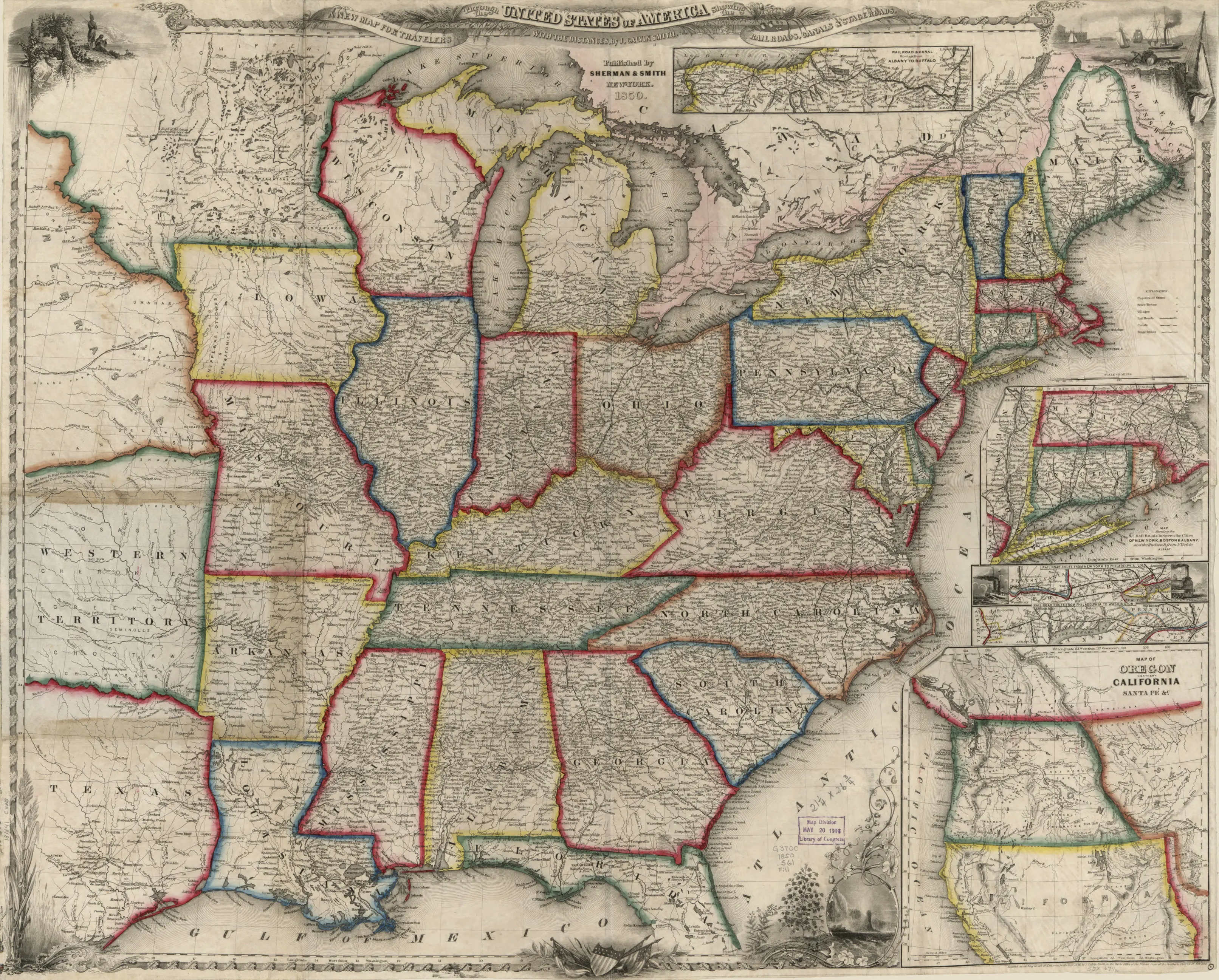
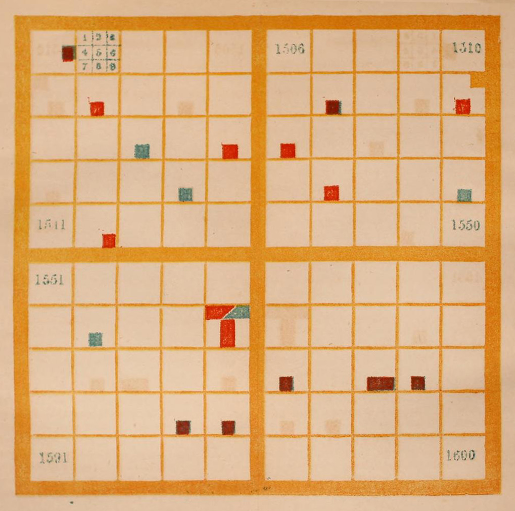
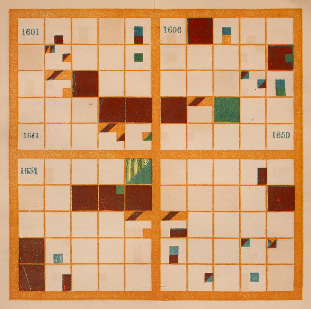
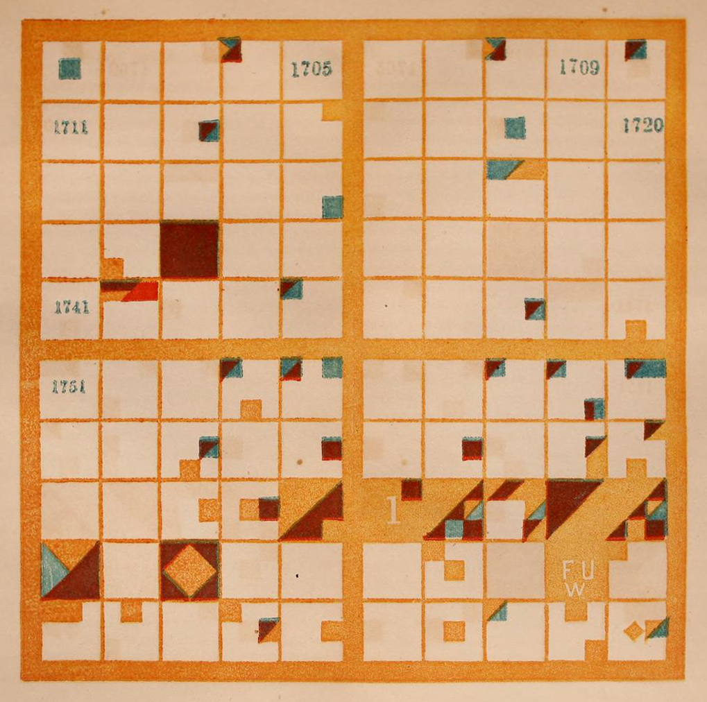
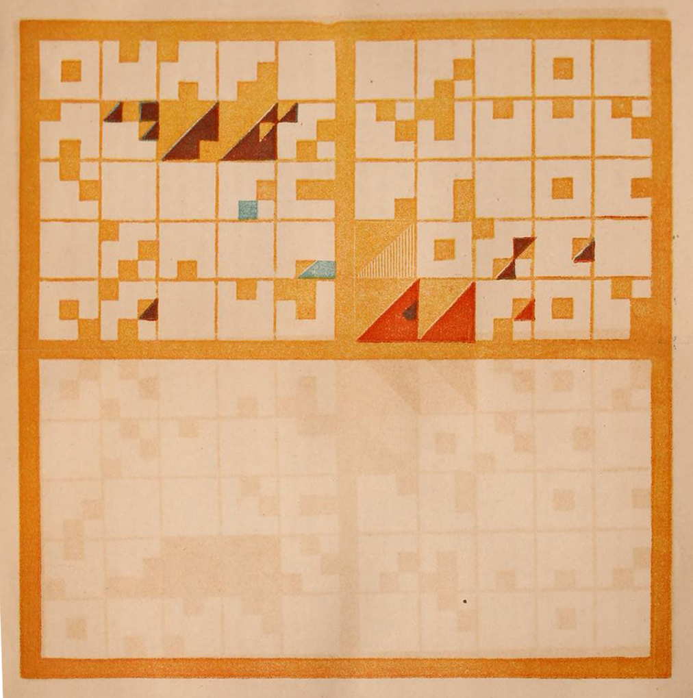
Peabody's method of visualizing events of historical significance was inspired by a system developed in Poland in the 1820s, and popularized in subsequent decades by the military general (and erstwhile math teacher) Jósef Bem.Bem's system employed a grid overlaid with shapes and colors to visually represent events in time. In Cartographies of Time: A History of the Timeline, Daniel Rosenberg and Anthony Grafton describe how the system "swept across Europe and North America" in the middle decades of the nineteenth century.But Peabody first encountered the system by chance: through a traveling lecturer who briefly boarded with her family on West Street. The boarder, a man named Joseph Podbielski, had come from Poland with copies of Bem's charts, which he intended to promote on a lecture tour of the United States. While he soon departed the family's residence, Peabody remained "captivated" by the charts, according to one of her biographers, Bruce Ronda.She went on to devote several years to a study of the Polish System, culminating with the development of her own modified version: the Polish-American System that prompted her own national tour.
On this point, Peabody makes special note that she employs "a somewhat different, and, as it seems to me, a more expressive distribution of colors."
Peabody's version of Bem's system borrows the idea of a numbered grid, with each year in a century marked out in its own box.
She also borrows the idea of subdividing each box, so that each of the nine interior squares corresponds to a particular type of historical event.
In the Polish-American System, as in Bem's, the top left corner is the space for wars, battles, and sieges; in the top middle is the space for conquests and unions; in the top right is the space for losses and divisions, and so on.
- Battles, Sieges, Beginning of War
- Conquests, Annexations, Unions
- Losses and Disasters
- Falls of States
- Foundations of States and Revolutions
- Treaties and Sundries
- Births
- Deeds
- Deaths, of Remarkable Individuals
The events are also color-coded, indicating the various countries involved in a particular event. On this point, Peabody makes special note that she employs "a somewhat different, and, as it seems to me, a more expressive distribution of colors."
Shapes that take up the entire box indicate an event of such magnitude or complexity that the other events in that same year hardly matter.
1607 marks the establishment of Jamestown.
England
Events inform each other. Here we see Pilgrims settling Plymouth in 1920.
2. Conquests, Annexations, Unions
England Holland
It also marks the first slaves in being brought to Jamestown, Virginia (20 brought on a Dutch ship).
6. Treaties and Sundries
England Holland
Peabody also uses diagonals to show an event being shared by 2 countries (or more).
England Americas Holland
Here we see the Jamestown Massacre.
1. Battles, Sieges, Beginning of War
England Americas
Assault on Powhatan Settlements.
2. Conquests, Annexations, Unions
England Americas
"Indians are conquered."
3. Losses and Disasters
Americas
And the death of Pocahontas.
9. Deaths, of Remarkable Individuals
Holland
In The Polish-American System of Chronology, Peabody covers a tremendous expanse of time: the period between 2500 BCE and 1849 CE (what was then the present). But Peabody also saw the need for a textbook that focused exclusively on the United States, and that went into more detail than she could cover in a textbook on world history. And so, shortly after the release of thePolish-American System, she began working on the book that would be published, in 1856, asA Chronological History of the United States. This textbook contained the four full-color plates displayed above; one for each of the centuries since the first European colonizers set foot on Native American land. As Peabody envisioned it, the basic exercise was to read a chapter of the textbook, which contained a narrative account of the events of a single century, and then match each item in the list of events that concluded the chapter with its visual representation on the corresponding chart.
For example, by cross-referencing the table of events of the seventeenth century, pictured just below, to its corresponding chart, it is possible to identify, for example, thefounding of Jamestown in 1607;that is the large red square in the first row on the right—red to signal England's involvement, and its full-square shading to indicate its heightened significance. One can also identify, in the last square on the right, one row from the top,the settlement of Plymouth in 1620.The square is nearly entirely red—again, because of England's involvement and because of its heightened significance—save for a small teal square in the middle-right position. Teal corresponds to action by the Dutch; indeed, this registers thefirst enslaved Africans arriving in Virginia in that same year.On the side of abolition but by no means its most radical proponent, the square's ratio of red to teal reflects Peabody's awareness of—if not an urgency about—the need to end slavery in the United States.
Chronology—or, the study of events in time—is not, of course, the same as historiography—the study of how history is written. But in Peabody's mind, the one led to the other: "If you have the dates here [on the charts] represented perfectly by heart," as she explains in the introduction to students included in theChronological History, "events are so connected in the narrative of history."In keeping with the leading pedagogical theories of the day, which emphasized mental recall, students were expected to commit the charts to memory.But Peabody's approach diverged from the rote memorization that characterized most mid-nineteenth-century classrooms in that her ultimate aim was for each student's mental picture of past events to prompt a richer--and, crucially, and individually-constructed--narrative of history. For Peabody, the power of this personal narrative of history was immense: it could show "the origin and consequences of national action"; and for the US in particular—the world's first representative democracy—it could instruct "every one what to do and what to leave undone, in his own inevitable action," as a necessary participant in their own governance.
Far from an antiquated line of thinking, Peabody's belief in the catalyzing effects of chronology remains deeply embedded in US culture today. As a prominent example, one might consider the efforts of New York Times journalist Nikole Hannah-Jones to replace 1776 with 1619—contra Peabody, the year the first enslaved Africans actually arrived in Virginia—as the starting point for the history of the United States. The goal of this revised origin point, as Hannah-Jones explains in the visual feature that introduces the 1619 Project, is to "reframe the country's history by placing the consequences of slavery and the contributions of black Americans at the very center of our national narrative."This recentered narrative would ideally, in turn—in a view endorsed by the Times editorial board—prepare US citizens of all races "for a more just future."
But it is not only the narrative of the nation's founding that can benefit from a recentering of the enduring costs of its legacy of slavery, or of the contributions made by its Black citizens. In her acclaimed recent book, Dear Science and Other Stories, Black studies scholar Katherine McKittrick takes on the project not of history but of science, explaining how an account that centers Black people, Black life, and Blackness more broadly can reveal the "asymmetrically connected knowledge systems" that structure modern scientific inquiry.For McKittrick, an awareness of the range of related yet unequally weighted knowledge-making systems is what enables her own vision of a liberatory Black science to unfold. In addition, it also offers lessons to scholars outside the field of Black studies—including white scholars, such as myself, who cannot claim to know Blackness firsthand—about the "asymmetrically connected knowledge systems" that structure all of our work.

Our ways of knowing—about science, about history, or about any other phenomena in the world—
are overdetermined by the asymmetrically connected (and constructed) systems that shape them.
Indeed, our ways of knowing—about science, about history, or about any other phenomena in the world—are overdetermined by the asymmetrically connected (and constructed) systems that shape them. Data visualization is no exception. This latter point has been made by science and technology studies scholars for decades—perhaps most famously by feminist philosopher Donna Haraway, who uses the example of data visualization in order to formulate her own influential theory of situated knowledges—put plainly, the view that all knowledge is rooted in a particular perspective, and thereby informed by the social, cultural, and political as well as scientific contexts that surround it.Crucially for Haraway, as for McKittrick, our awareness of how knowledge is situated, as Haraway would say; or how knowledge isrelational, as perhaps would McKittrick, does not diminish the validity of what we presently know, nor does it foreclose any future knowledge-making. On the contrary, these more nuanced understandings of the perspectives and places from which knowledge is made are precisely those on which, to quote Haraway, "the possibility of sustained, rational, objective inquiry rests."
With a renewed sense of the stakes of acknowledging the perspectives and places that shape what we know, we might return to Peabody's chronological charts with the observation that few twenty-first-century viewers—or, for that matter, nineteenth-century ones—could have intuited the significance of the events encoded in the charts without first taking the time to learn how the system worked.This lengthy and difficult learning process might be viewed as a liability by visualization researchers and designers who continue to champion the ease and efficiency of visualization; or those who maintain that data visualization is best deployed to amplify already existing thought processes. In support of these arguments, consider the representation of the events encoded in Peabody's chart of the seventeenth century as a timeline, rather than a grid, shown just below. The progression of events over the course of the century, culminating in a series of wars and rebellions in the late 1680s and early 1690s, becomes much more immediately legible.
But for Peabody, her charts' near-total abstraction was precisely the point. She designed her charts to appeal to the senses directly, to provide what she called "outlines to the eye."Her hope was that, by providing the outline of history—and, crucially, only the outline—each viewer could fill in the missing parts of the story themselves.The result would be a proliferation of historical narratives, one originating in the mind of each viewer, and reflecting their own interpretation of the chart. Anticipating claims about both the situated and relational nature of knowledge production, Peabody's visualization system reconfigures the otherwise unidirectional transfer of knowledge between image and viewer. What's more, it affirms each interpretation of each image as knowledge, and therefore, each viewer as that knowledge's source.
Visualizing Time
The Peabody Chart as Bar Graph
Hover over an event
- Battles, Sieges, Beginning of War
- Conquests, Annexations, Unions
- Losses and Disasters
- Falls of States
- Foundations of States and Revolutions
- Treaties and Sundries
- Births
- Deeds
- Deaths, of Remarkable Individuals
Peabody was a lifelong proponent of what might be described today as participatory learning. In the early 1860s, as the nation became increasingly consumed by the Civil War, Peabody found purchase in a personal recommitment to early childhood education. Her kindergarten—the first of its kind in the United States—which she opened with her sister (and Horace Mann's widow), Mary Tyler Mann, served as a proving ground for her innovative pedagogical ideas. With her sister, she also published a series of texts that documented the theories they enacted in the classroom: that physical play mattered as much as formal instruction, and that knowledge was derived not from any external authority but rather, from a focused and sustained analysis of "the self-activity of the mind."
In addition, on her own, Peabody continued to iterate on the teaching and learning materials associated with thePolish-American System. In 1870, she began printing workbooks with sheets of blank charts—"blank centuries," as she called them--so that students could themselves create the visualizations that they would then study.
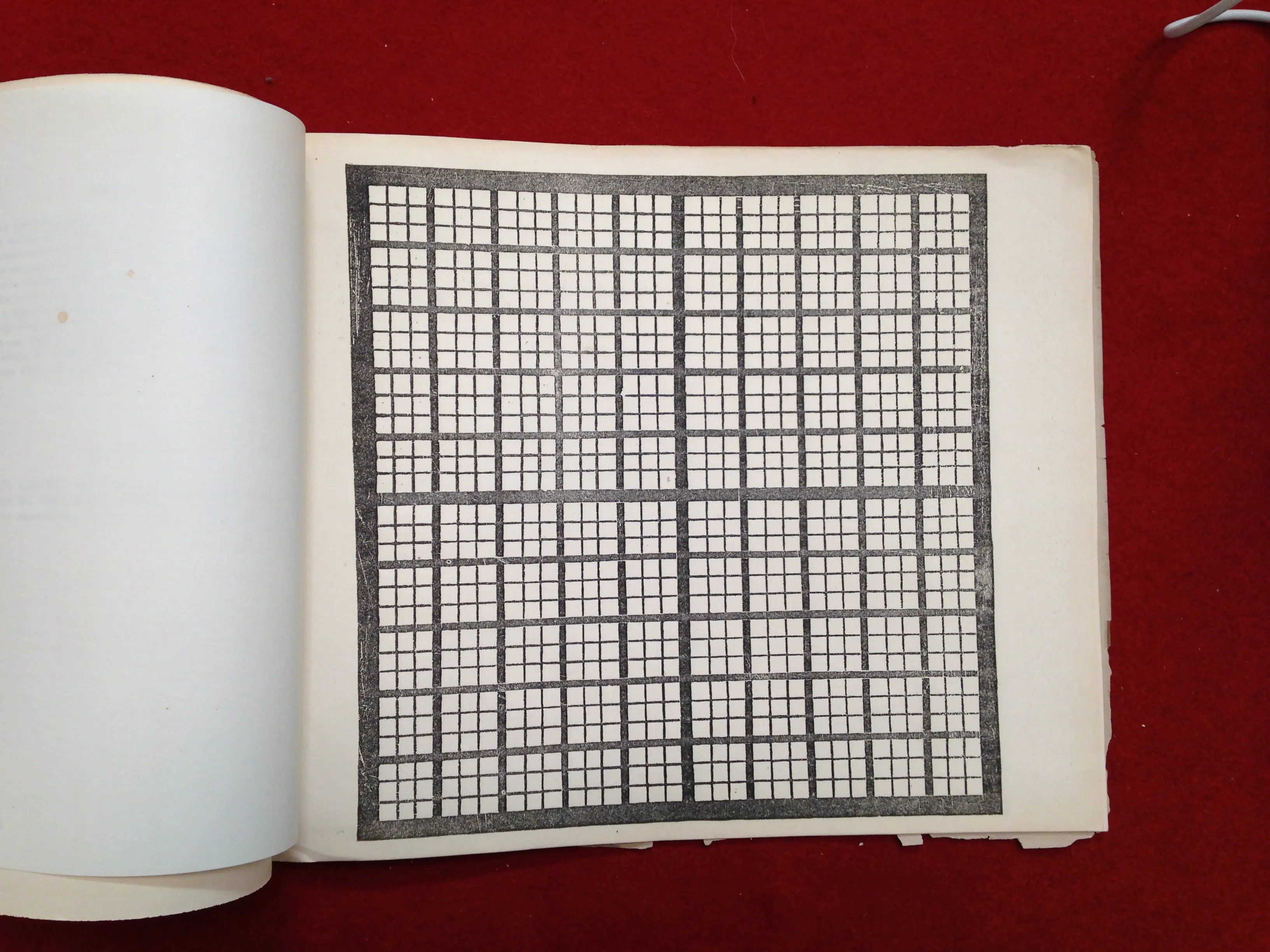
But the exercise of creating a chronological chart from scratch is quite hard, as you--the reader--might have discovered from the interaction above. Not to worry, however! The difficulty level was high for students of the nineteenth century as well. Peabody's nephew, Julian Hawthorne, who served as her first test subject, recalled that she "labored during some years to teach me all the leading dates of human history," but that he nevertheless remained "most inapt and grievous" throughout the process.The evidence in the archive confirms this first-hand account. At the American Antiquarian Society, the Library Company of Philadelphia, Yale's Beinecke Library, and Princeton's Special Collections can be found multiple copies of Peabody's workbooks, many of which I've personally paged through over the course of conducting research for this project. The workbooks all tend to follow a similar pattern: a page or two of grids filled out in earnest; then a series of attempts abandoned halfway; and then a shift in purpose, the grid becoming a canvas for pattern and unbridled play.
It's worth repeating that the difficulty of the Polish-American system is both a liability of the form and also the point. Peabody first developed her method at a time when the nation's future seemed to hang in balance. The second half of the 1840s had brought an increased awareness of the nation's growing sectarianism, as well as its range of social ills--albeit with a (mostly) optimistic view about the potential of its governing structures to address these challenges. But as the 1850s unfolded, the magnitude of these challenges became increasingly more pronounced. Even as her privilege protected her from having to enter the political fray, Peabody recognized that the task of resolving the underlying issue of sectarianism, not to mention the moral obligation of ending slavery, posed a degree of difficulty of the highest order. Peabody understood, moreover, that any successful resolution would require sustained effort and thought.
By prompting her students to create new narratives of the past,
they would also imagine alternative possible futures.
Her goal with the Polish-American Systemwas thus to create a framework, equal parts intellectual and immersive, through which this difficult thinking could take place. "The old world is covered with bad institutions which men have created, very often with positively good intentions, but on false notions, or, at least, without large and profound ideas," she explains in the preface to theChronological History. "Whether the new world shall estimate and sift out these evils, or repeat these mistakes, depends on young Americans, who are now sitting in schoolrooms all over the country, unconscious of their powers and consequent responsibilities," she further explains.Her hope was that the act of creating the chronological charts, rather than simply studying them, would prompt both self-reflection and new ideas. Put another way: Peabody hoped that by prompting her students to create new narratives of the past, they would also imagine alternative possible futures.
The political context that provided Peabody with the motivation to publish her history textbooks is crucial for understanding both her ideas about the uses of visualization, and the form that her visualizations take. But this context is not easily discerned from the visualizations themselves. Without the knowledge of how to decode the charts, let alone a sense of their political stakes, the charts' geometric abstraction prompts a purely aesthetic response.
Other charts from the same era make their politics more explicit, however—for example, Emma Willard's 1846Temple of Time, which depicts past centuries as the pillars that support the titular temple. In the chart, the nineteenth century—then the present—is represented as an unfinished column, not yet stable enough to support the weight of the past. On the ceiling of the temple, Willard catalogues key figures from each prior century, including statesmen, philosophers, discoverers, and poets. On the floor of the temple, she lays out the developments of major nation-states, their paths drawn as rivers subjected—like water levels—to the expansions and contractions of state power over time. Significantly, Willard places the path of the United States front and center. From the perspective of the viewer, this river flows directly towards them, enfolding them in the expanding influence of the United States: the future to come.
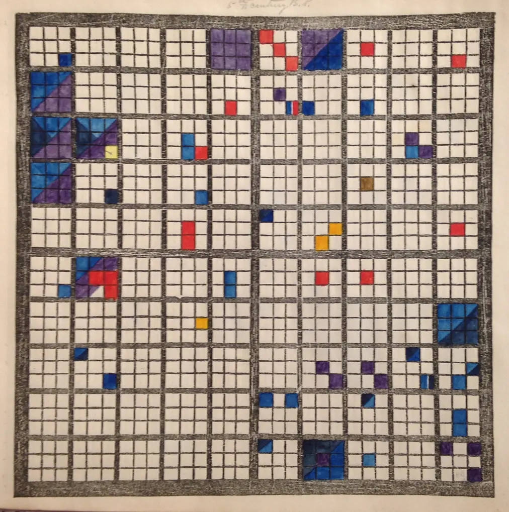
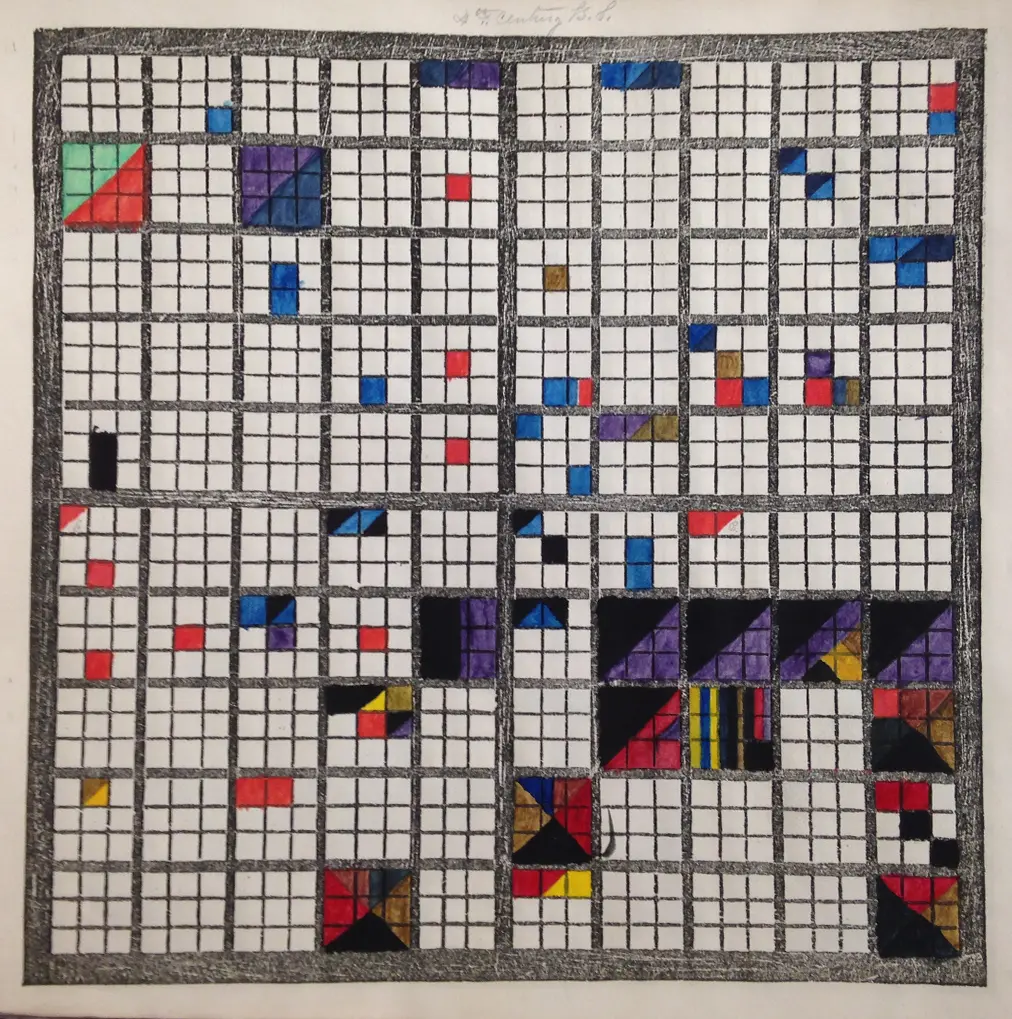
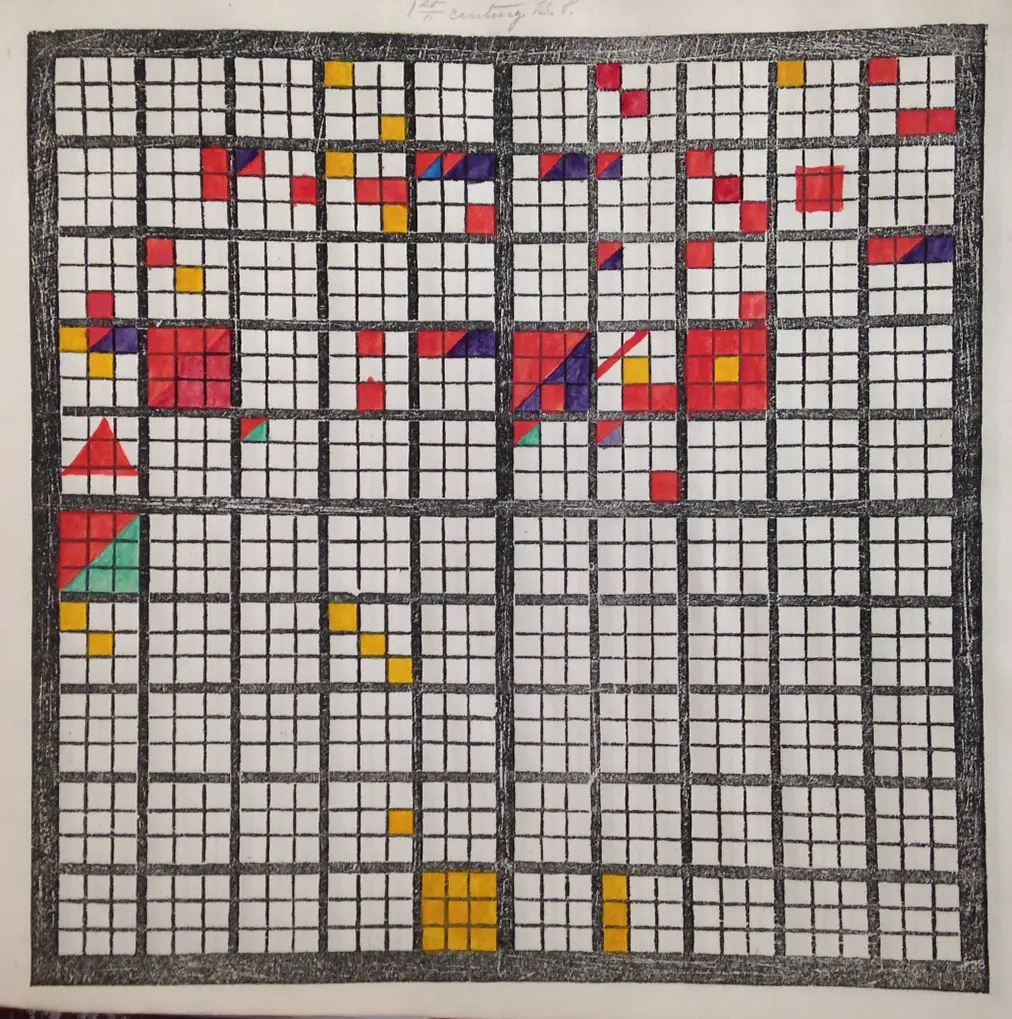
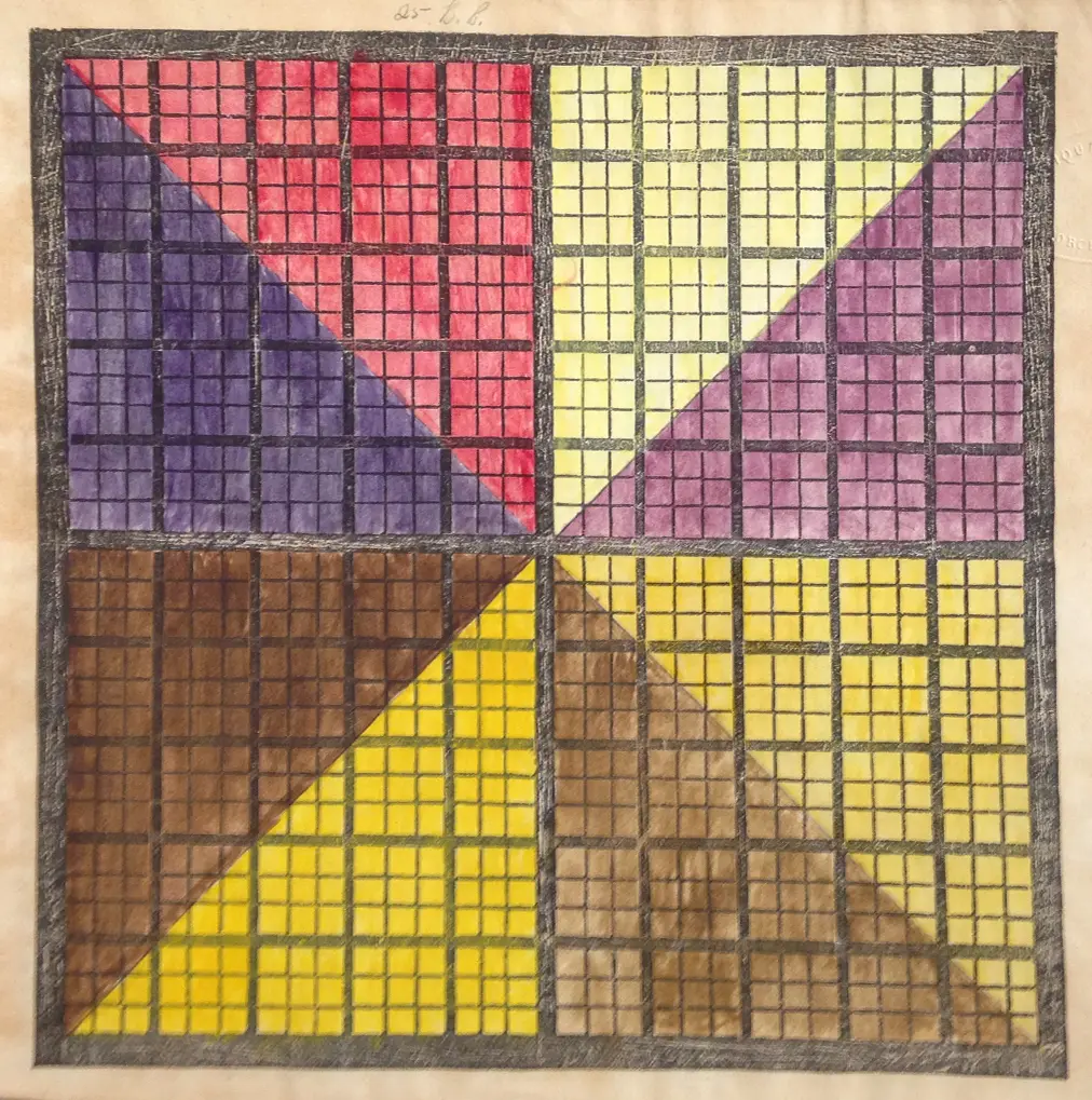
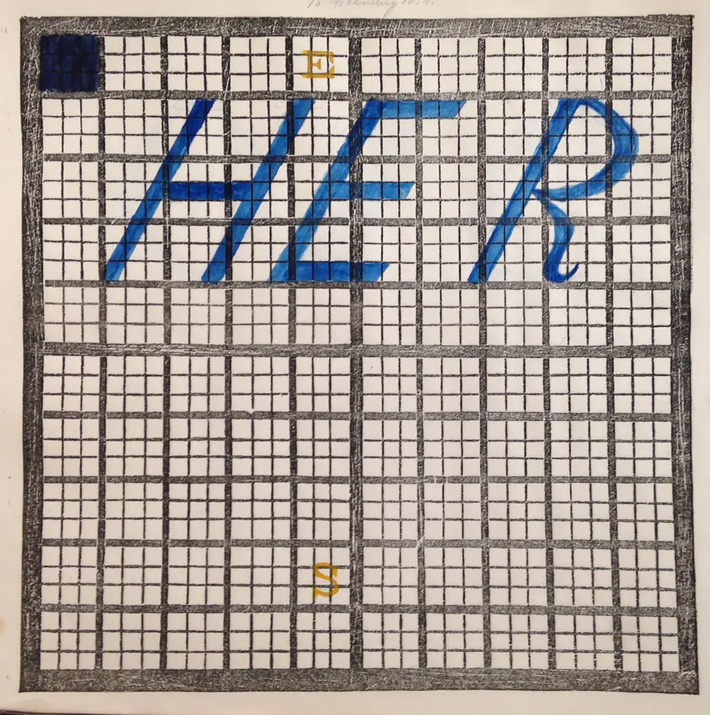

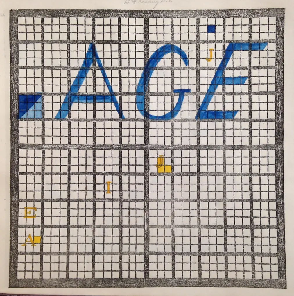
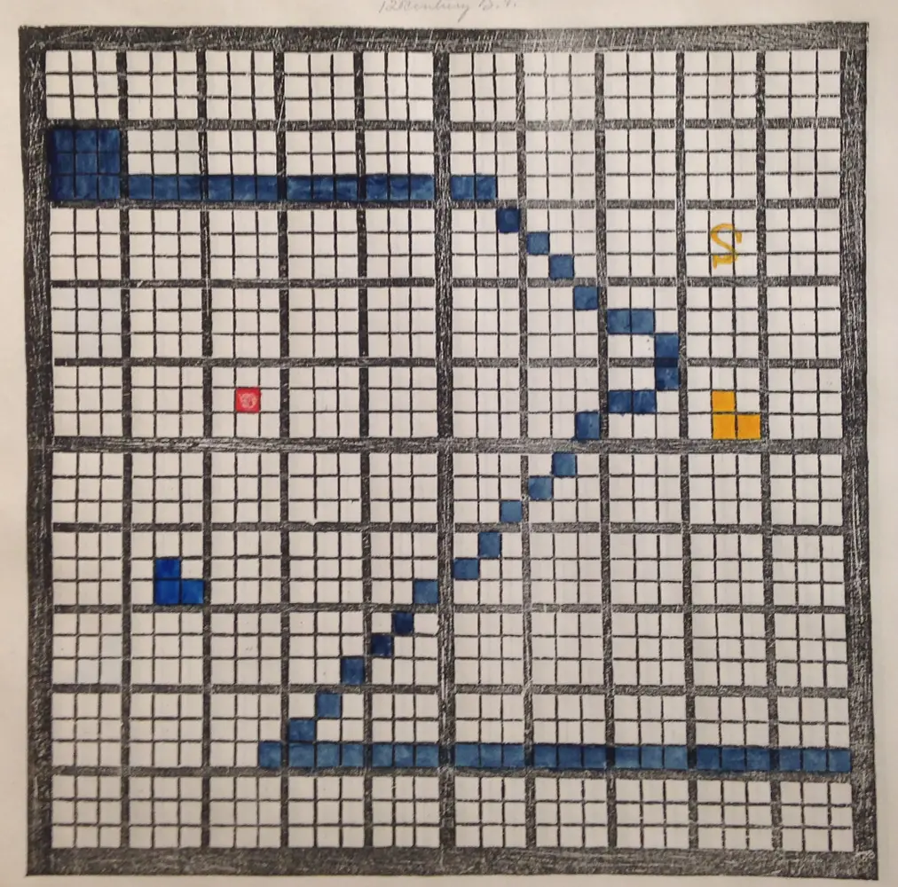
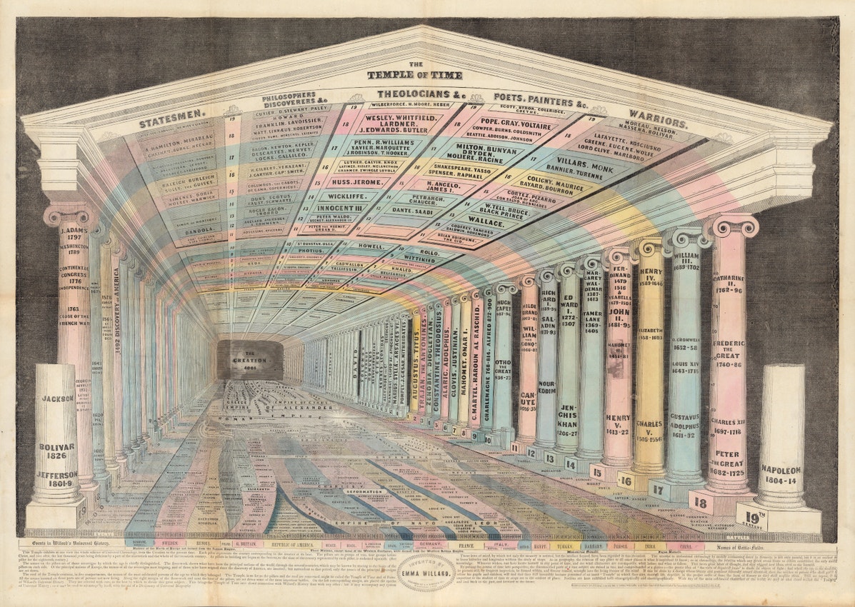
While sharply divergent from Peabody's charts in terms of aesthetics, Peabody nevertheless identified Willard as a major source of inspiration, crediting Willard with creating "the most ingenious chart ever besides [her own] invented."In Chapter 3, I discuss Willard's influences, which included Joseph Priestley's New Chart of History, from 1796, among the most circulated charts of its time; and Playfair'sCommercial and Political Atlas, the subject of Chapter 1. According to historian Susan Schulten, Willard appreciated the efficiency of these charts, but felt that they gave "little sense of thedimension, such as the relative importance of periods or the subjective experience of time."Sure enough, while neither Preistley's timeline nor Playfair's import-export charts provide a sense of the subjective experience of time, they do offer images that are just as interpretable today as they were at the time of their making.
By contrast, the more abstract impression first conveyed by Peabody's chronological grids immediately invites—indeed, requires—additional interpretation. Her configuration of her data not, pacePlayfair, according to the cartesian grid but instead as a visual text, designed to be read from left to right, top to bottom, underscores her interpretive intent. (What might seem to be x-y axes that divide each image into quadrants are instead, as Peabody explains, only intended to serve as visual anchor points in an otherwise unstructured field.) Like the process of interpreting a text, Peabody's charts encourage further contemplation. The charts may serve as the basis for future knowledge, but they do not serve as that knowledge's definitive source. This view of how knowledge should be constructed is conveyed not only in the accompanying textbooks, but through the visually-compelling yet nonetheless unintuitive design of the charts themselves.
With the addition of the workbooks, which enabled the students to create their own charts, Peabody further underscores her belief in a more participatory form of knowledge production. This form of knowledge-making challenges the hierarchy that most commonly structures the relationship between the designer of a visualization and those who view (or interact) with it. According to Peabody's participatory process, it is the student who is authorized to both create and interpret the image, rather than the designer—in this case, Peabody herself—who originally developed its designs. If there is a single message communicated by Peabody's chronological charts, it is that their meaning is not fixed. Rather, they impress upon the viewer a sense of responsibility--first for developing informed interpretations of the images they perceive, and then for designing a course of future action.
There is a final lesson to be learned from Elizabeth Palmer Peabody and her charts, which has to do with the labor—physical as much as intellectual—that is involved in the production of knowledge. An additional aspect of Peabody's pedagogy were the "mural charts" that she created in order to center classroom discussion. These were the charts she traveled with on her national promotional tour, as mentioned at the outset of this chapter, and by all accounts they were dazzling: triangles and squares of crimson, ochre, and forest green, set against a sharp black grid. In her version of a sales pitch, Peabody would "lay [a] chart down on the floor" and invite her would-be textbook adopters to sit around it and contemplate the colors and patterns they perceived.
The pedagogical impact of this embodied interaction was nothing short of transformative. "I have never known a system which placed the events of the history of all nations before the mind with such clearness, so little confusion, and so much permanency," wrote Eliphalet Nott, then president of Union College, who participated in one of Peabody's teaching demonstrations.Anticipating a decidedly twenty-first-century view of the value of immersive education, Peabody staged an encounter with the data that involved the whole body. This was an interaction that, she hoped, would in turn stimulate the imagination to new heights. Indeed, if visualization is to offer "richer understandings [of data] that enable researchers to ask bolder questions," as esteemed visualization researcher Ben Shneiderman believes, then the mural chart seems to represent an early apotheosis.
And yet, because the mural charts were not valued as objects of knowledge in their own time, not a single one has been preserved. Scholars even remain uncertain as to many of their basic features. Peabody's biographer, Bruce Ronda, speculates that they "must have been much larger than even folio size."And while he does not provide any more specificity, Peabody's nephew Julian's recollection of the "huge, colored charts" which "hung on the walls of our sitting room" offers first-hand account of the impression they made.As an additional datapoint, one might consider the "poster-sized timelines" created by Peabody's contemporary, Anne Laura Clarke, who created her timelines with the help of her sister, also named Elizabeth, to accompany a series of lectures on history which she delivered across the country. Clarke's charts were not acquired by an archive but instead kept in her sister's attic, where they remain today.
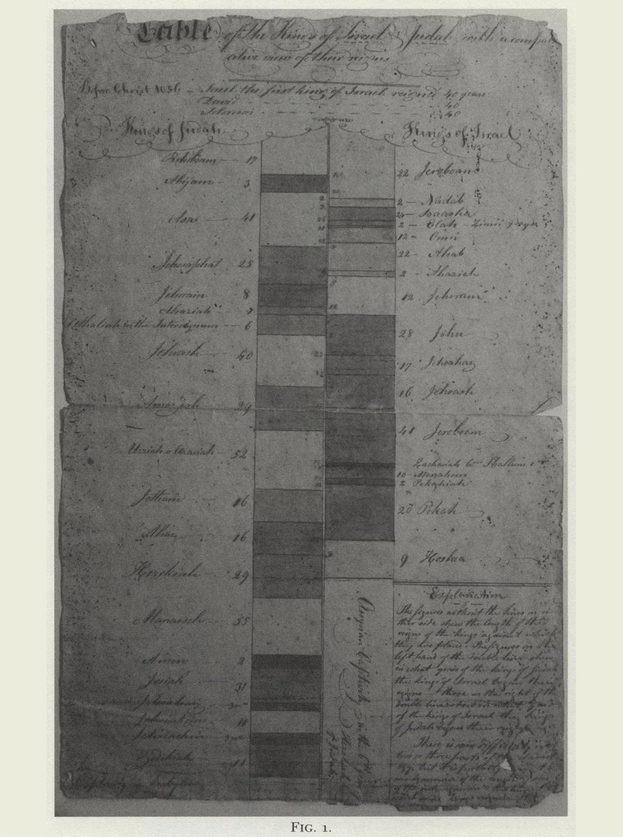
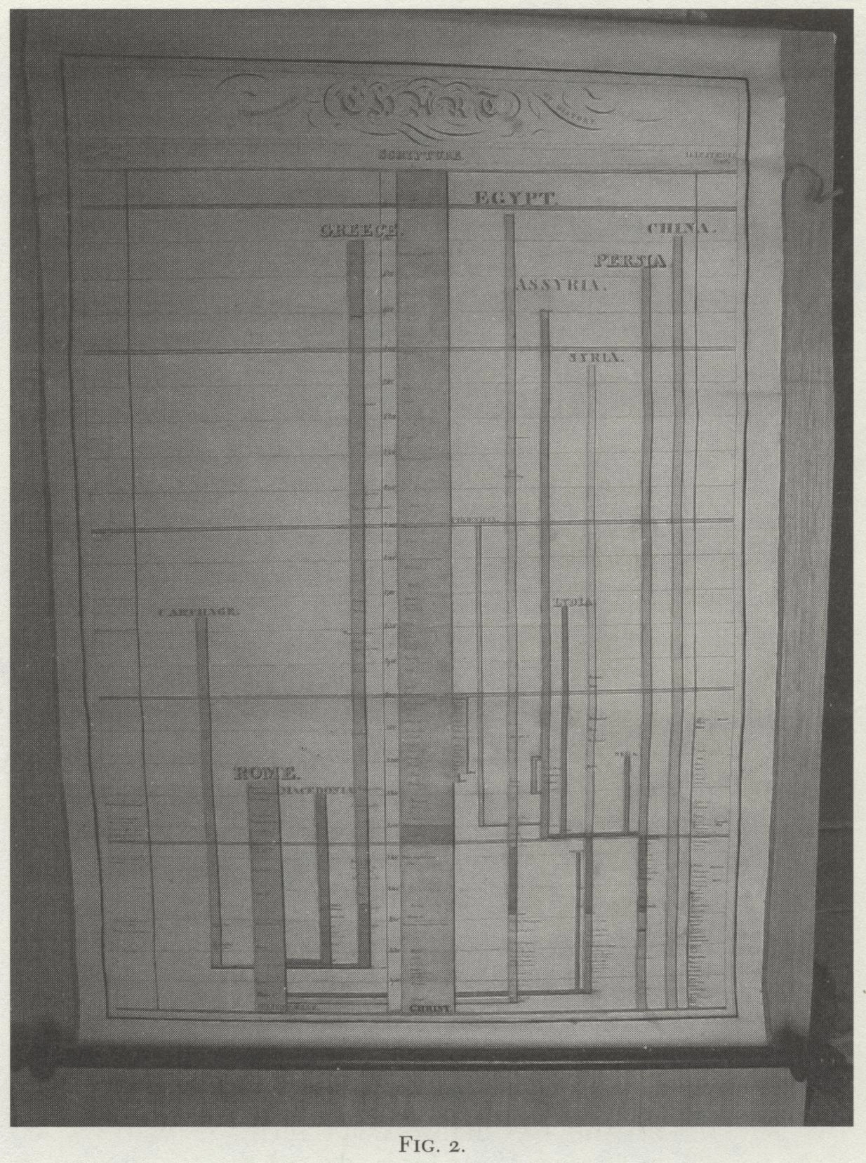
Left: One of the timelines created by Anne Laura Clarke, as explored by Granville Ganter in his essay on Clarke's traveling lectures.
Right: Another timeline as it was first encountered by Ganter. Photos by Granville Ganter. Courtesy of Granville Ganter.
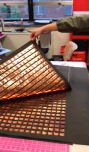
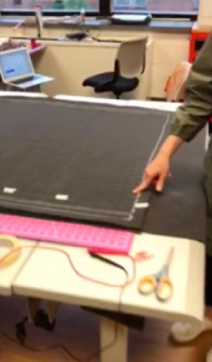
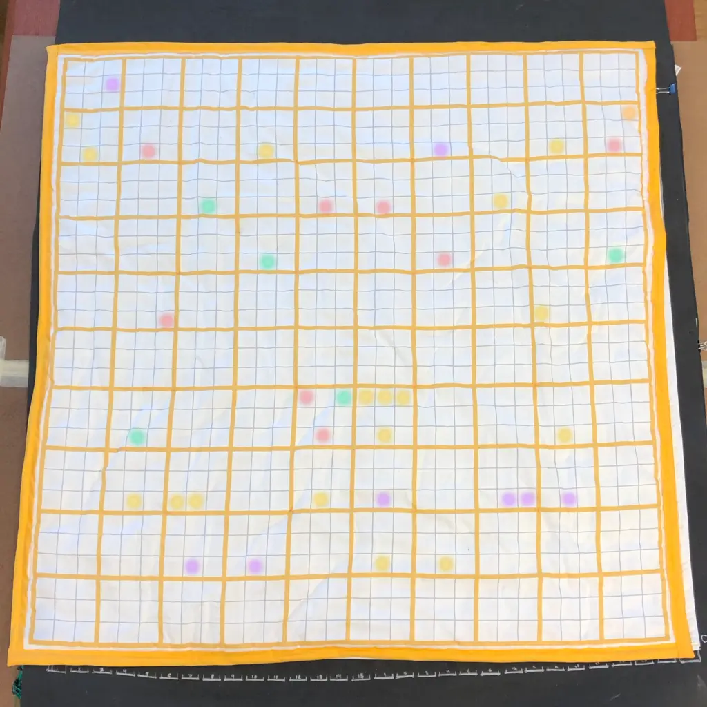
The absence of Peabody's mural charts from the archive has prompted me to undertake a project to reimagine and restage Peabody's immersive learning experience for the present.Working with my research group, in a team that has involved multiple cohorts of students over multiple years, we first created a touch matrix made of strips of copper tape.The matrix works like a computer keyboard, with columns and rows of conductive material--in this case, the copper tape--separated by foam spacer. When a person presses on a square of the grid, the two layers of copper tape touch each other, creating a connection. Above the touch matrix sits a cloth topper, also fabricated by members of the lab, that approximates the visual features of Peabody's original charts.The topper holds in place a series of strips of individually addressable LEDs, resulting in a 30 x 30 grid that can be programmed to display Peabody's "painted centuries," as she sometimes described them.While Peabody used a stick to point to specific events on the grid, the Floor Chart responds to touch; users can press on individual squares in order to cycle through the possible colors of each chart, allowing them to engage their whole bodies in the creation of chronological charts of their own.
The project has required a range of domain expertise, from electronics prototyping to signal processing to circuit board design. It has also required a truly tremendous amount of labor. Each yard-long strip of copper tape needed to be perfectly aligned, lest a small misalignment at one end result in a significant gap at the other. Each of the nine-hundred square-shaped holes of the membrane layer of the touch matrix was required to be cut out by hand, as laser-cutting the holes would have released harmful toxins. Each electrical connection was required to be soldered, tested, and then—in almost all cases—soldered again, so as to ensure that the circuit remained intact. As much as an exercise in physical fabrication, the project has become an exercise in the physicality of work itself—of the focus that is required, and the resultant fatigue, of any large-scale project that is made by human hands.
The tedious, time-intensive nature of the Floor Chart project provides another path of connection back to the original mural charts. For Peabody did not only demonstrate the charts as part of her sales pitch; as an additional incentive, she also promised an original mural chart to any teacher who purchased copies of one of her textbooks for their entire class. Writing to a friend in 1850, Peabody revealed that she was "aching from the fatigue of making Charts for the Schools who will take the book." The letter continues:
Every school must have a mural chart—& there is but one way of making them (until they can be made by ten thousands) & that is by stenciling [sic]... I can do one a day. But I must sell them cheap… To day I worked 15 hours—only sitting down to take my meals—& so I have done all week—so much fatigue stupefies one—but as soon as it is adopted in a few towns I shall be able to hire someone to do this drudgery for me.Elizabeth Peabody,Letter to Samuel Gray Ward, September 1850
While we cannot change the fact that we no longer have access to the original mural charts, letters like these help to attest to the physical labor that was required to produce them. With its reference to the "stencilling" through which Peabody created her colorful symbols, as well as to its characterization of the tasks involved in making the charts as "drudgery," the letter also underscores the gendered dimensions of Peabody's knowledge work.

Who else are we missing
when we fail to include examples like these in the stories we tell about the emergence of data visualization?
It's not a coincidence that Peabody understood the labor of making her mural charts as women's work, and that these same charts were not preserved. Then as now, there exists a hierarchy of work that aligns with the hierarchy of gender that governs the Anglo-Western world. Work that is performed outside the home is valued, both culturally and monetarily, over work that is performed within it. Work that is perceived as more rigorous, or more professional—like, for instance, the political economy that functioned as Playfair's primary trade—is valued, again, both culturally and monetarily, over work that is perceived as more intuitive, or more domestic—like, for instance, the teaching that functioned as Peabody's main employ. Even—or, more precisely, especially—within the art world, creative work that is perceived as high art is valued above work perceived as craft.These gendered divisions of labor are among primary reasons that Peabody's mural charts never entered the archive. And they are the same reasons that her charts have not (yet) been centered in the account of the rise of modern data visualization that is most commonly told. But who else are we missing when we fail to include examples like these in the stories we tell about the emergence of data visualization? And what possible future visualization designs are we foreclosing, either intentionally or inadvertently, when we do?
Women's work of various forms has much to contribute to larger narratives about the development of most scholarly disciplines and professional fields. A final example helps to underscore this point: most contemporary viewers, when seeing Peabody's charts for the first time, observe that they look like paintings by Piet Mondrian, the famous Dutch modernist.To be sure, Peabody's charts strongly resemble Mondrian's own bold, colorful, geometric grid. But Peabody's self-account of the work involved in making the mural charts brings to mind a second point of reference, which is not painting but quilting: an artform traditionally practiced by women, and that has long been relegated to the world of "folk art" and craft.
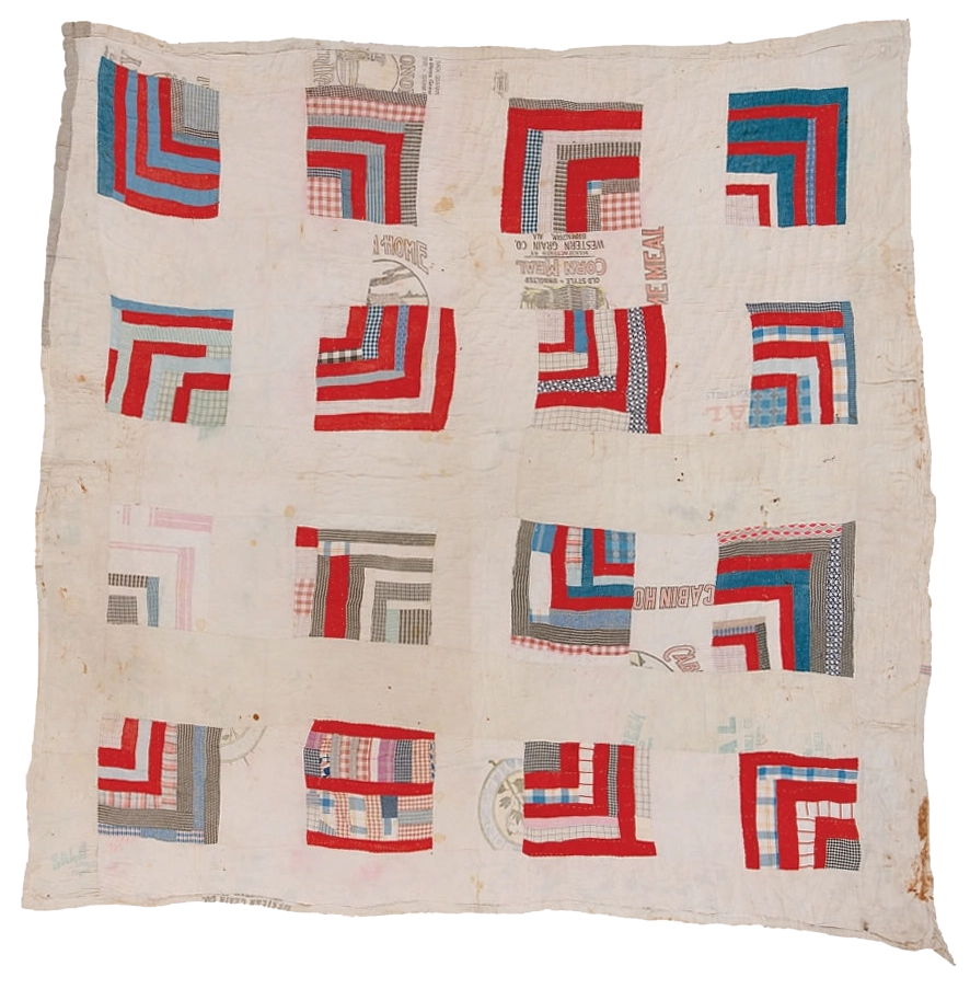
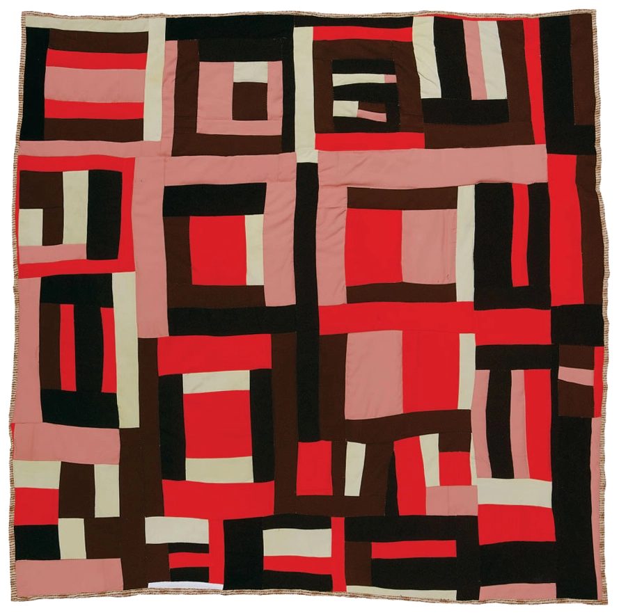
Left: "Housetop," by Rachel Carey George, ca. 1935.
Right: "Housetop" variation, design by Mary Lee Bendolph. 1998, quilted by Essie Bendolph Pettaway, 2001. Photos courtesy of Tinwood Media.
Permissions pending.
Pictured above are two quilts from the area of Alabama known as Gee's Bend, a small, rural Black community, 35 miles south of Selma, that can trace its roots to a cotton plantation that was established there in the early nineteenth century. While valued by the residents of Gee's Bend for centuries, both for their aesthetics and for the family histories that they encode, the quilts have only recently begun to be recognized by art historians as key contributors to the development of modernist art.Exhibitions at the Whitney Museum in New York, in 2002; the Turner Contemporary in London, in 2019; and others, have confirmed how the quilts "predate like-minded works by their more famous abstract art cousins."
As Black women who pursued their art while enslaved, and have continued to persist through slavery's perpetual wake, the life experiences of the Gee's Bend quilters could not be farther removed from those of Elizabeth Palmer Peabody, a white woman protected by her family's membership in the Boston elite. But the creative work of the Gee's Bend quilters, as distinguished historian Elsa Barkley Brown has shown, offers a model that can help structure a range of complex questions about epistemology, historiography, and pedagogy—indeed, the same questions in which Peabody's work was engaged. Drawing inspiration from the "polyrhythmic, 'nonsymmetrical,' and nonlinear" patterns of the Gee's Bend—among the Black women's quilts that she studies—Brown advocates for a pivoting of the center of the history classroom—that is, not decentering one perspective in favor of another but instead intentionally and continually shifting the focus from one perspective to the next.The result of this pedagogical strategy is capacious and multifold: it allows the artifacts and experiences under analysis to be understood in the context of their own creation, and it allows the students performing this interpretive work to "become the voices of authority in their own education."Ultimately, Brown concludes, "the class is a quilt. It is precisely the contrast which organizes the whole and holds it together."
We might similarly come to understand history as a quilt—as Brown strongly implies and as our project team has literally fabricated. But our work—and now I speak as a "we" in the general sense, on behalf of scholars of data visualization and those who design them—is far from complete. Consider the surprise that greeted me—along with no small degree of pleasure—upon discovering that a quilt created by Loretta Pettway, one of the Gee's Bend quilters, graces the cover of Edward Tufte's most recent book,Seeing with Fresh Eyes(2020). More than merely a compelling image—"unorthodox, fresh, amazing" is the extent of how Tufte describes it in the text—we must learn to see Pettaway's quilt, like Peabody's chart, as a system of knowledge making.These two systems of knowledge-making, moreover, helpfully converge. Both employ shape and color in order to represent and recall past events: the quilts in order commemorate a community's ancestors and their stories; and the charts, as we have learned, in order to craft new narratives about the nation's defining historical events. Both also rely upon sense perception—and more specifically, the tactile experiences of the body—in order to assimilate visual display into knowledge. Whether enveloping oneself in a quilt, or gathering together around a mural chart, the result is a more immersive encounter with the object—and with the events of the past that the object seeks to commemorate, on the one hand; or on the other, convey.
As Brown reminds us with respect to the quilts, these artifacts are "illustrative of a particular way of seeing, of ordering the world."We might extend this assertion to data visualization. Indeed, the images and interactions that we create reflect our own ways of seeing and ordering the world. This fact does not invalidate the insights that they prompt, or the knowledge that they help us to acquire. On the contrary, it informs the knowledge that any particular visualization helps bring to light. With a wider awareness of the multiple ways of seeing the world, and a wider range of methods for ordering its data, we can enrich the basis of what we presently know, and—as Peabody envisioned—open up new possibilities for future knowledge.
Throughout this project, I argue for the knowledge that can be gained by expanding the history of data visualization to include a wider range of forms and figures. To be sure, additional examples of early attempts at visualizing data help inspire us, in the present, to imagine new visual and interactive forms. But there is a deeper lesson that I have also sought to convey, which has to do with how visualization "produces the knowledge it draws," as Johanna Drucker explains.Elizabeth Palmer Peabody's method of making history, premised on visual abstraction and designed for prolonged engagement, encourages multiple individual interpretations of the data on display. In so doing, it advances a pluralistic and non-hierarchical view of how knowledge is produced.
In addition to advancing a belief in how knowledge is produced, Peabody's method advances a belief in whois authorized to produce knowledge. Peabody believed that her students were each capable of producing historical knowledge, and that together, they might arrive at a solution to the nation's most pressing political concerns. We might further expand Peabody's view of the value of bringing together multiple perspectives, enhanced by the example of the Gee's Bend quilts, into a broader claim about the need to expand the range of sources—and the range of people—who we enable, as visualization designers, to make knowledge claims. Following the theories and approaches of the scholars introduced in this essay, including Donna Haraway, Katherine McKittrick, and Elsa Barkley Brown, we might therefore employ Peabody's pedagogy as a path to understanding the situated and relational nature of all that we know. Moving forward, more specifically, we might better attempt to design visualizations that value the interpretations prompted by each viewer as they encounter (or interact with) the data on display.
Finally, we might employ Peabody's data creations—both the textbooks and workbooks that are preserved in the archive, and the mural charts that are not—in order to reflect upon the range of labor that is involved in knowledge work, and the range of people who perform it. How might we value the full range of labor that contributes to the creation of any particular visualization? How might we honor all of those we rely upon to perform this work? And how might we ensure that their contributions are no longer erased from history? Here, once again, Peabody's visual method becomes valuable. Because it authorizes us as viewers, as students, and as scholars, to fill in the details of the stories that we can only perceive in the abstract. Peabody's hope, which we might carry forward, is that when presented with the outlines of history, we might take it upon ourselves to color them in.
Play
The Peabody Chart for fun
How to play
FOOTNOTES
- For more on Peabody’s biography, see Bruce A. Rhoda, Elizabeth Palmer Peabody: A Reformer on Her Own Terms (Cambridge: Harvard Univ. Press, 1999), Megan Marshall, The Peabody Sisters: Three Women Who Ignited American Romanticism (New York: Mariner, 2006), and Monika Elbert, Julie E. Hall, and Katharine Rodier, eds., Reinventing the Peabody Sisters (Iowa City: Univ. of Iowa Press, 2006).
- Elizabeth Palmer Peabody, The Polish-American System of Chronology, reproduced, with some modifications, from General Bem’s Franco-Polish Method (Boston, 1850), p. 3.
- William Playfair, The Commercial and Political Atlas, 3rd ed. (London, 1801 [1786]), p. iv.
- While it exceeds the scope of this essay, it is worth noting the particular appeal of Bem’s Polish identity. Peabody had a particular interest in the ideas coming out of central and eastern Europe as a result of her ongoing engagement in theories of language. She had sustained correspondence with the Hungarian philologist Charles Kraitsir throughout the 1840s, and he traveled to Boston to meet with her in 1847. Peabody went on to support the (failed) Hungarian Revolution of 1848, which she viewed as allied with the aims of American Independence. Among her central concerns with standard accounts of US History was that they were written from the perspective of England. She would have likely imputed an anti-colonial stance inherent in Bem’s system. For more on her relationship with Kraitsir, see Ronda (1999, pp. 225-226). For more on her support for the Hungarian Revolution and her views on history, see Baym (1991).
- Daniel Rosenberg and Anthony Grafton, Cartographies of Time: A History of the Timeline (Princeton: Princeton Architectural Press, 2010), p. 205.
- Ronda, p. 227
- Peabody, Polish-American System, p. 10.
- For more on the role of mnemonics in nineteenth-century US history education, see “Mnemonics, Methods, and Memory: Organizing and Encoding the American Story,” in Barry Joyce, The First US History Textbooks: Constructing and Disseminating the American Tale in the Nineteenth Century (Lexington, KY: Lexington Books, 2015), pp. 61-100.
- Peabody, Chronological History, p. 7.
- Jake Silverstein, “Why We Published the 1619 Project,” The New York Times Magazine, December 20, 2019. https://www.nytimes.com/interactive/2019/12/20/magazine/1619-intro.html.
- See Donna Haraway, “Situated Knowledges: The Science Question in Feminism and the Privilege of Partial Perspective,” Feminist Studies 14.1 (1988), pp. 575-599. In this essay, Haraway elaborates her theory of situated knowledges via the notion of the “god trick” in data visualization—her phrase for the false impression, conveyed by the standard “view from above,” of being able to see “everything from nowhere” (p. 581). The view from above is godlike—that is the “god” part of the concept—but it is a “trick” because it only appears to be a view from above, from nowhere and no body. As Haraway argues, every visualization is a view from somewhere: a view from a particular place, created by a particular person at a particular time, and informed by a particular set of social and political conditions. In work with Catherine D’Ignazio, I have articulated a general approach to countering the god trick, and to acknowledging the situated nature of knowledge production in data visualization. See Catherine D’Ignazio and Lauren Klein, “Feminist Data Visualization,” VIS4DH: Proceedings of the Workshop on Visualization for the Digital Humanities, IEEE VIS 2016 (Baltimore: IEEE, 2016) and Catherine D’Ignazio and Lauren Klein, Data Feminism (Cambridge: MIT Press, 2020).
- Haraway, p. 584.
- Peabody’s nephew, Julian Hawthorne, who served as her first test subject, recalled that she “labored during some years to teach me all the leading dates of human history,” but that he nevertheless remained “most inapt and grievous” throughout the process, ultimately exhausting her patience (Ronda, p. 227).
- Peabody, Universal History; Arranged to Illustrate Bem’s Charts of Chronology (New York: 1859), p. v.
- In Peabody’s own words, the Polish-American System “does not pretend to be what an outline can never be, namely: a perfect frame work for history.” See “Bem’s Method of History: An Appeal to Teachers and Boards of Education,” The Indiana School Journal 1.2 (1856), p. 325.
- Elizabeth Palmer Peabody, ”The Origin and Growth of the Kindergarten,” Education 2 (1882), pp. 507-527. It is also worth noting that while Peabody was the sister-in-law of famed educational innovator and advocate Horace Mann, she did not maintain a close relationship with him after he married her sister Mary. In fact, there was significant tension between Elizabeth and Mary over the intensity of Elizabeth’s intellectual relationship with Mann. With that said, Mann’s death in 1859 seems to have reopened the possibility of the sisters’ shared interest in theories (and practices) of education. For more on this new phase of Peabody’s educational theories, developed in conversation with her sister, see Ronda pp. 269-317.
- Ronda, p. 227.
- Peabody, Chronological History, p. 7.
- For an extended analysis of Willard’s charts, see Susan Schulten, “Emma Willard’s Maps of Time,” Public Domain Review (2020). Web. https://publicdomainreview.org/essay/emma-willard-maps-of-time/
- Elizabeth Palmer Peabody, “Bem’s Method of History: An Appeal to Teachers and Boards of Education,” The Indiana School Journal 1.2 (1856), p. 326.
- Susan Schulten,Mapping the Nation: History and Cartography in Nineteenth-Century America (Chicago: Univ. of Chicago Press, 2012). p, 31.
- Elizabeth Palmer Peabody, “My Experience as a Teacher,”American Journal of Education 32 (1882), p. 785.
- Ronda, p. 236.
- Jessica Hullman, “The Purpose of Visualization is Insight, not Pictures: An Interview with Ben Shneiderman,” ACM Interactions. Web. https://interactions.acm.org/blog/view/the-purpose-of-visualization-is-insight-not-pictures-an-interview-with-ben
- Ronda, p. 234.
- Ronda, p. 227.
- Evidently, they measure five feet by three-and-a-half feet. Photos of the charts can be seen in an essay by Granville Ganter, “Mistress of Her Art: Anne Laura Clarke, Traveling Lecturer of the 1820s,” New England Quarterly 87.4 (2014), pp. 709-746.
- For papers discussing this process, see Caroline Foster et al., “The Shape of History: Reimagining Nineteenth-Century Data Visualization,” Digital Humanities 2017 (Association of Digital Humanities Organizations, 2017); and Alexandra Beall et al., “Reimagining Elizabeth Palmer Peabody’s Lost ‘Mural Charts,’”Digital Humanities 2018 (Association of Digital Humanities Organizations, 2018).
- The touch matrix was prototyped by Angela Vujic and Maninder Japra. The design was refined and further implemented by Courtney Allen, Alexandra Beall, and Gavin McGuire.
- The fabric topper was designed and fabricated by Sarah Schoemann.
- Peabody, Chronological History, p. 9. The LED system was prototyped by Svyatoslav Kucheryavykh. The design was further refined by Courtney Allen and Alexandra Beall. The final system was designed and implemented by Courtney Allen, Gavin McGuire, and Sarah Schoemann. Noah Sutter wrote the underlying code.
- For an overview of this gendered history of work, see “Show Your Work,” in D’Ignazio and Klein, Data Feminism, pp. 173-202.
- While not explored in this chapter, it’s worth noting that the history of computing provides another key example, one which—in the object-oriented way in which Peabody structures her event dataPeabody might also be engaged. On the history of women in computing, see Jennifer Light, “When Computers Were Women. Technology and Culture 40.3 (1999), pp. 455-83; Nathan Ensmenger, The Computer Boys Take Over: Computers, Programmers, and the Politics of Technical Expertise (Cambridge: MIT Press, 2010)l and Mar Hicks, Programmed Inequality: How Britain Discarded Women Technologists and Lots Its Edge in Computing(Cambridge: MIT Press, 2017).
- See, for example, William Ferris, ed., fro-American Folk Art and CraftsA (Boston: G.K. Hall, 1983); and S.J. Markowitz, “The Distinction between Art and Craft,”A Journal of Aesthetic EducationA 28.1 (Spring 1994): 55-70.
- See, for example, R. Kalina, “Gee’s Bend Modern.”Art in America 10 (2003): 104-149; and S.A. Duncan, “From Cloth to Canvas: Reinventing Gee’s Bend Quilts in the Name of Art,” Museum Anthropology 28.1 (March 2005): 27-28.
- Ryan Leahy,“The Alabama Women Who Made Their Quilts a Part of Modern Art,” Artsy (2018). https://www.artsy.net/article/artsy-editorial-alabama-women-made-quilts-modern-art
- Elsa Barkley Brown, “African-American Women’s Quilting: A Framework for Conceptualizing and Teaching African-American Women’s History,” Signs 14.4 (1989), p. 926.
- Brown, p. 927.
- Brown, p. 928.
- Edward Tufte, Seeing with Fresh Eyes: Meaning, Space, Data, Truth (Cheshire, CT: Graphics Press 2020), p. 29.
- Brown, p. 926.